1. Master how to rotate elements in CSS3
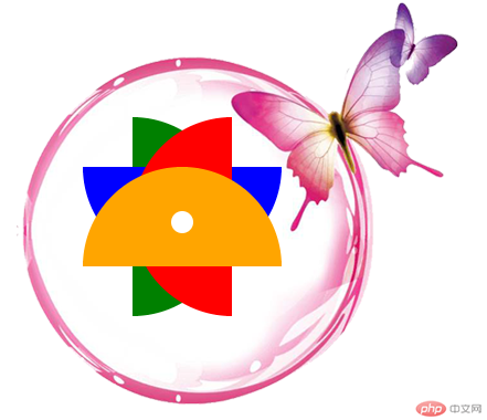
1. Achieve the following effects and use pure DIV CSS

Additional notes:
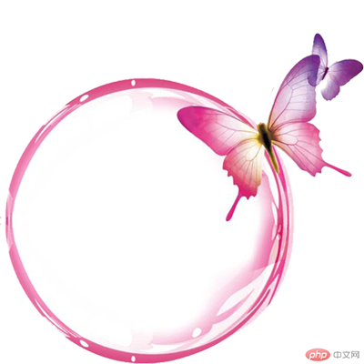
1. The pink circle with the butterfly is a picture
2. The "4-color flower" in the middle is composed of 4 Semicircles are generated by rotation. The diameter of each semicircle is 180px
1. Prepare the material: the material in the current case is a pink circle with a butterfly

2. Create index.html and write the architecture. How to analyze the architecture?
Idea analysis:
1. The target outer layer is a div, div The background picture is a pink circle with a butterfly
2. The div contains a 4-color flower, so the flower is composed of 5 parts, 4 petals and 1 small white hole
Okay, first follow the analysis and write the idea, and ignore the implementation of css for the time being
<!DOCTYPE html>
<html>
<head>
<meta charset="utf-8">
<title>CSS旋转案例</title>
</head>
<body>
<div class="wrapper">
    <div class="bottole">
        <div class="leaf leaf2"></div>
        <div class="leaf leaf3"></div>
        <div class="leaf leaf4"></div>
        <div class="leaf"></div>
        <div class="smallcircle"></div>
    </div>
</div>
</body>
</html>3. Write the style, create the css folder, and create a new index.css in it
Idea analysis:
.container * Public style
1. Define public style
.wrapper *{
    margin:0;
    padding:0;
}.bottole Outer div settings
1. Because we need to ensure that the background image is complete displayed, so it must be larger than the background image
2. The background image cannot be repeated
  .bottole{
    width: 640px;
    height: 420px;
    background-image: url(../images/CSS3 deformation-rotation to achieve 4-color flowers-case analysis (code example));
    background-repeat: no-repeat;
    background-position-x: 40px;
    background-position-y: -35px;
}.leaf semicircle leaf
1. Because the diameter of the semicircle is 180, the height must be 90px, then we can realize the semicircle through border-radius, and the default color is defined as orange. In order to make the four semicircles overlap, you must use position:absolute, and then you need to set margin-left and margin-top to make it The position presents the target effect (here we can get it through continuous debugging)
  .wrapper .leaf {
    width: 180px;
    height: 90px;
    border-radius: 180px 180px 0 0;
    background-color: orange;
    position: absolute;
    margin-left: 100px;
    margin-top: 150px;
}.leaf2 Set the leaves individually
1. The color of the leaf is green and needs to be rotated 90 degrees
.wrapper .leaf2 {
    background: green;
    -webkit-transform: rotate(90deg);
    transform: rotate(90deg);
}.leaf3 Leaves set individually
1. The color of the leaf is blue and needs to be rotated 180 degrees
  .wrapper .leaf3 {
    background: blue;
    -webkit-transform: rotate(180deg);
    transform: rotate(180deg);
}.leaf4 Leaves set individually
1. The color of the leaves is red, and the angle that needs to be rotated is 270 degrees
  .wrapper .leaf4 {
    background: red;
    -webkit-transform: rotate(270deg);
    transform: rotate(270deg);
}Small round hole flower center settings
1. The size of the small round holes is 20. We can make the size of a div 20, Then the border-radius can be made into a circle if it is also 20
2. The background color is white
3. In order to position the hole in the center of the flower, we need to set margin-left, margin-top
  .smallcircle{
    width: 20px;
    height: 20px;
    background-color: white;
    border-radius: 20px;
    position: absolute;
    margin-left: 180px;
    margin-top: 190px;
}Okay, so far, we have written all the styles we thought of. If the specifics are not correct, let’s modify it again
So far, all the css contents are as follows:
.wrapper *{
    margin:0;
    padding:0;
}
.bottole{
    width: 640px;
    height: 420px;
    border-radius: 400px;
    background-image: url(../images/CSS3 deformation-rotation to achieve 4-color flowers-case analysis (code example));
    background-repeat: no-repeat;
    background-position-x: 40px;
    background-position-y: -35px;
  }
  .wrapper .leaf {
    width: 180px;
    height: 90px;
    border-radius: 180px 180px 0 0;
    background-color: orange;
    position: absolute;
    margin-left: 100px;
    margin-top: 150px;
  }
.wrapper .leaf2 {
    background: green;
    -webkit-transform: rotate(90deg);
    transform: rotate(90deg);
  }
  .wrapper .leaf3 {
    background: blue;
    -webkit-transform: rotate(180deg);
    transform: rotate(180deg);
  }
  .wrapper .leaf4 {
    background: red;
    -webkit-transform: rotate(270deg);
    transform: rotate(270deg);
  }
  .smallcircle{
    width: 20px;
    height: 20px;
    background-color: white;
    border-radius: 20px;
    position: absolute;
    margin-left: 180px;
    margin-top: 190px;
}Introduce css into index.html
<!DOCTYPE html>
<html>
<head>
<meta charset="utf-8">
<title>CSS旋转案例</title>
<link href="css/index.css" rel="stylesheet" type="text/css">
</head>
<body>
<div class="wrapper">
    <div class="bottole">
        <div class="leaf leaf2"></div>
        <div class="leaf leaf3"></div>
        <div class="leaf leaf4"></div>
        <div class="leaf"></div>
        <div class="smallcircle"></div>
    </div>
</div>
</body>
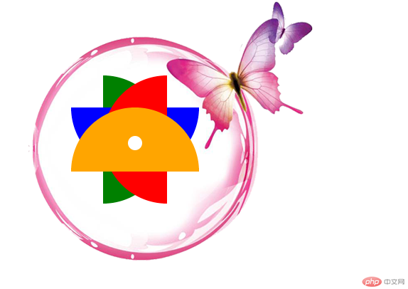
</html>The running effect is as follows:

The above is the detailed content of CSS3 deformation-rotation to achieve 4-color flowers-case analysis (code example). For more information, please follow other related articles on the PHP Chinese website!