In the previous article "html article: How to achieve the input box effect in the web page (detailed code explanation)", I introduced how to use html to achieve the input box effect. The following article will introduce to you how to use CSS to create a rounded button effect. Let’s see how to do it together.

1. Create a new html file, first# First enter a a tag in ##body and insert an empty link. Button, and then insert the code that introduces the inline style in title< ;style type="text/css">.
Code example
<!DOCTYPE html>
<html>
<head>
<title>...</title>
<style type="text/css">

</style>
</head>
<body>
    <a href="#">按钮</a>
</body>
</html>Code effect

btn-style], and define the width, height, background color, font color, and remove the underline of the button. Add disply:block, otherwise the width and height of the defined button will not take effect. Then introduce the btn-style style in the a tag.
Code example
<style type="text/css">
           .btn-style{
                width: 150px;
                height: 50px;
                color: #f8ff00;
                background:#010dfb;
                text-decoration: none;
                display: block;
           }
</style>
</head>
<body>
    <a href="#">按钮</a>
</body>Code effect

Code example
line-height: 50px;
text-align: center;
font-size:"微软雅黑";
Code effect

border-radius: 100px;
Code effect

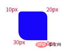
border-radius: 10px


border-radius: 10px 20px 0px 30px;

The above is the detailed content of Teach you step by step how to use css to create a rounded button effect (detailed code explanation). For more information, please follow other related articles on the PHP Chinese website!