

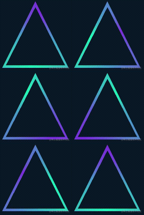
Recently a friend asked me that I saw a colorful triangle border animation implemented using SVG on a website and asked if it could be implemented using CSS:
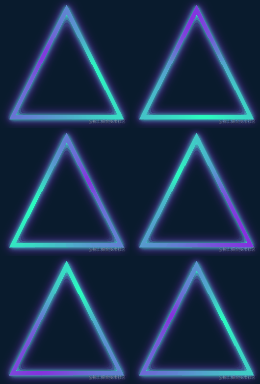
A very interesting animation effect, it immediately reminded me of the border animation I introduced in the article CSS Wonderful Border Animation, very Similar to:
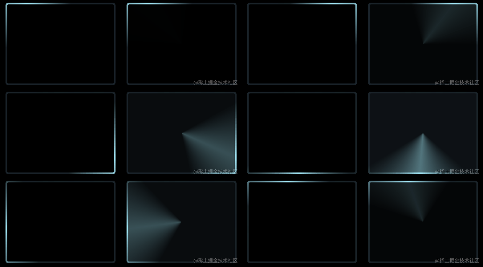
The core is to use the angular gradient (conic-gradient), and then cover the central area of the pattern with a small Graphical implementation of number.
However, there are two difficulties in this triangle animation:
The entire shape is a triangle
In CSS, we can achieve rectangles and circles relatively easily, but triangles are undoubtedly much more difficult here.
The entire border also has a shadow, and the shadows are still on both sides of the border
It doesn’t seem complicated here, In fact, there are many difficulties. If the above method is used to hollow out the central area of the pattern by covering it with a small graphic, how will the shadow on the other side be generated? Even if drop-shadow is used, it will be obscured by the covered inner graphics.
Of course, CSS can still realize this graphic. This article will explain how to use CSS to realize the above colorful triangle border animation.
First of all, we still need to use angular gradient conic-gradient to realize the main body of the entire animation.
<div></div>
@property --angle {
  syntax: '<angle>';
  inherits: false;
  initial-value: 0deg;
}

div {
    width: 260px;
    height: 260px;
    background: conic-gradient(from var(--angle), hsl(162, 100%, 58%), hsl(270, 73%, 53%), hsl(162, 100%, 58%));
    animation: rotate 3s infinite linear;
}

@keyframes rotate {
    to {
        --angle: 360deg;
    }
}The core is just an angular gradient pattern, combined with CSS @Property, to make the whole effect rotate:
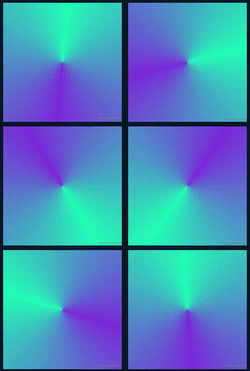
Of course, if you feel that CSS @ is here Property is difficult to understand or you are worried about compatibility issues. You can replace it by using pseudo elements to implement the same graphics, and then transform: rotate() to rotate, the effect will be the same.
OK, next, we need to get the triangle shape based on the rectangular shape. For the triangle in the outer circle, we can use clip -path is cut, and it is very simple:
div {
    width: 260px;
    height: 260px;
    background: conic-gradient(from var(--angle), hsl(162, 100%, 58%), hsl(270, 73%, 53%), hsl(162, 100%, 58%));
    animation: rotate 3s infinite linear;
  + clip-path: polygon(0 100%, 100% 100%, 50% 0);
}can get the following effect:
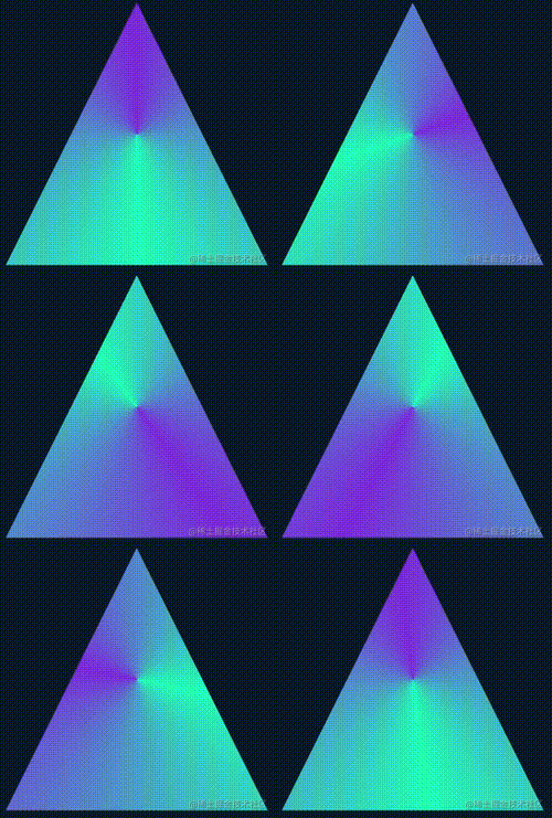
In this way, we get a solid triangle. Next, we need to find a way to hollow out the inside.
The simplest idea is to overlay a smaller graphic in the middle with the same color as the background color:
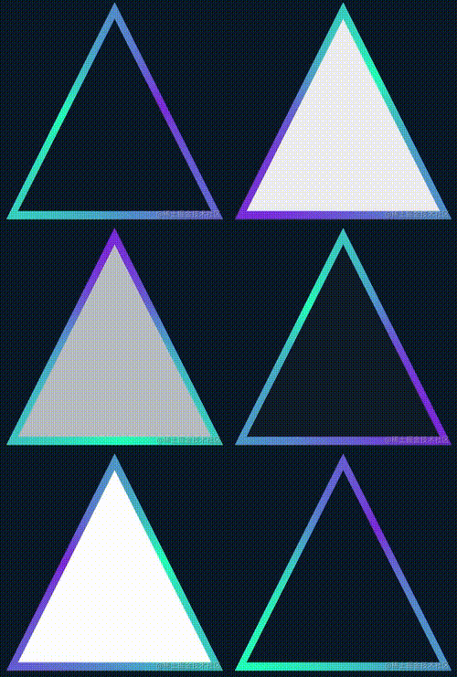
The complete code for you You can click here-- CodePen Demo -- Pure CSS Linear Triangle
However, there are two fatal problems with this:
If the background color It is not a solid color but a gradient color, so this method is invalid
The shadow effect cannot be added to the inside of the triangle border achieved by this method
These two Any defect is unacceptable, so we must find a way to truly hollow out the middle. After the hollowing is completed, its center must be transparent.
So, here we have to use mask.
However, it is more troublesome to use mask to implement a smaller triangle based on such a graphic. We are equivalent to realizing such a hollow triangle graphic. The schematic diagram is as follows:
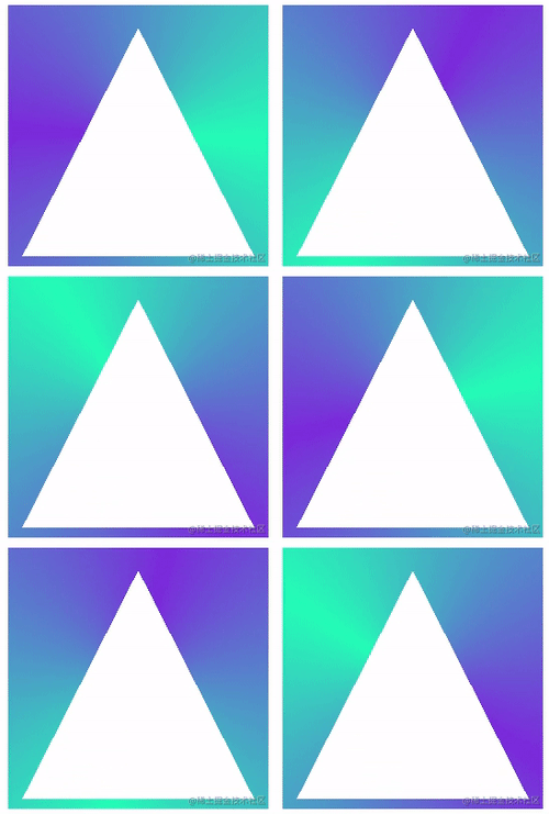
With such a graphic, combined with clip-path, you can get a triangular border graphic. What does it mean? I have made an animation here:
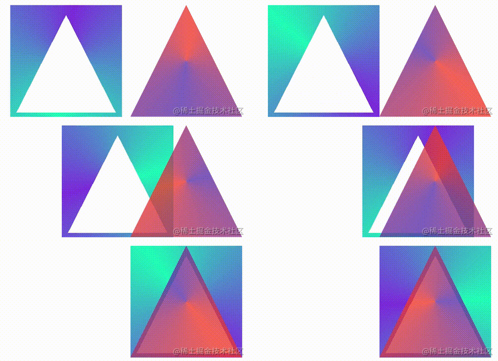
The left side is the graphics after masking using mask, and the right side is the graphics after cutting using clip-path. Their effects are superimposed together to achieve A border triangle.
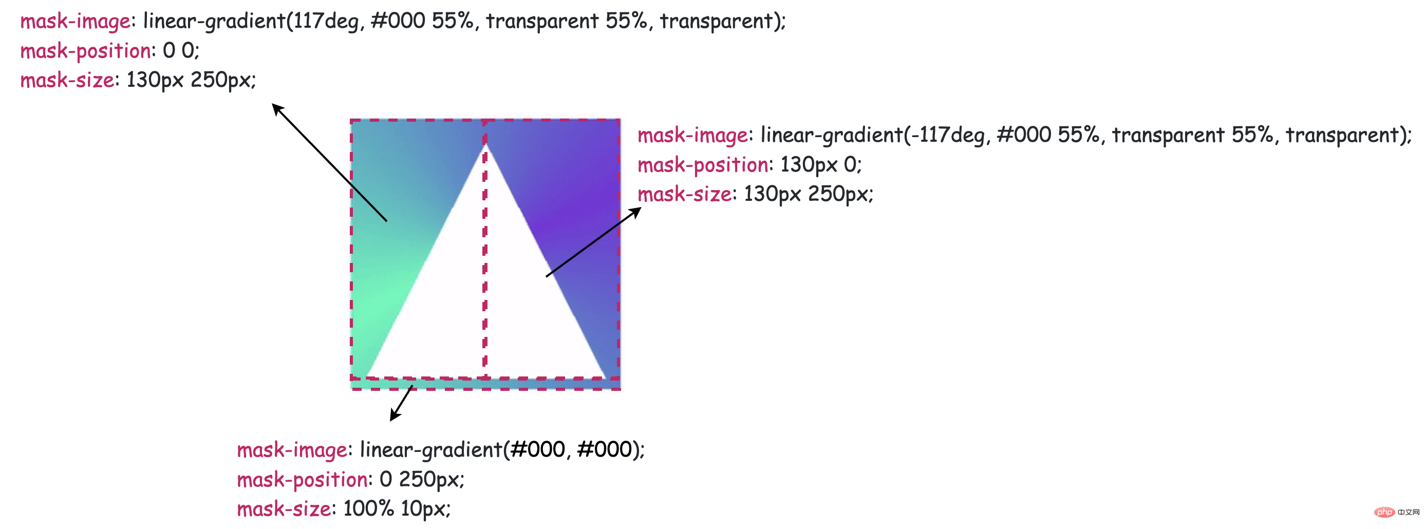
Of course, you need to have a deeper understanding of mask here. The schematic diagram of using mask to cut a hollow triangle is as follows:
@property --angle {
  syntax: '<angle>';
  inherits: false;
  initial-value: 0deg;
}

div {
    width: 260px;
    height: 260px;
    background: conic-gradient(from var(--angle), hsl(162, 100%, 58%), hsl(270, 73%, 53%), hsl(162, 100%, 58%));
    clip-path: polygon(0 100%, 100% 100%, 50% 0);
    mask:
        linear-gradient(117deg, #000 55%, transparent 55%, transparent),
        linear-gradient(-117deg, #000 55%, transparent 55%, transparent),
        linear-gradient(#000, #000);
    mask-position: 0 0, 130px 0, 0 250px;
    mask-size: 130px 250px, 130px 250px, 100% 10px;
    mask-repeat: no-repeat;
    animation: rotate 3s infinite linear;
}

@keyframes rotate {
    to {
        --angle: 360deg;
    }
}
最后一步就比较简单了,由于上述三角形已经是一个镂空图形,这里直接使用 drop-shadow 给元素加上一层光影效果即可,不过由于使用了 clip-path,直接在原元素上添加的 drop-shadow 无法展示,这个好解决,我们只需要多套一层结构,将 drop-shadow 添加到父元素上即可:
<div class="g-container">
    <div class="g-triangle"></div>
</div>
@property --angle {
  syntax: '<angle>';
  inherits: false;
  initial-value: 0deg;
}
.g-container {
    width: 260px;
    height: 260px;
    filter: drop-shadow(0 0 5px hsl(162, 100%, 58%)) drop-shadow(0 0 10px hsl(270, 73%, 53%));
}
.g-triangle {
    width: 260px;
    height: 260px;
    background: conic-gradient(from var(--angle), hsl(162, 100%, 58%), hsl(270, 73%, 53%), hsl(162, 100%, 58%));
    clip-path: polygon(0 100%, 100% 100%, 50% 0);
    mask:
        linear-gradient(117deg, #000 55%, transparent 55%, transparent),
        linear-gradient(-117deg, #000 55%, transparent 55%, transparent),
        linear-gradient(#000, #000);
    mask-position: 0 0, 130px 0, 0 250px;
    mask-size: 130px 250px, 130px 250px, 100% 10px;
    mask-repeat: no-repeat;
    animation: rotate 3s infinite linear;
}
@keyframes rotate {
    to {
        --angle: 360deg;
    }
}这里又是一个小技巧,drop-shadow 是可以重复添加多个的,这里添加的两个阴影颜色就是 conic-gradient() 里设置的颜色,最终,我们就得到了题图所示效果:

完整的代码你可以戳这里 -- CodePen Demo -- Pure CSS Glowing Triangle
上面利用了 clip-path 剪切外三角形,mask 镂空内三角形,经提醒,其实 clip-path 可以独自裁剪出一个环形三角形。
上述代码也可以简化成:
<div class="g-container">
    <div class="g-triangle"></div>
</div>
@property --angle {
  syntax: '<angle>';
  inherits: false;
  initial-value: 0deg;
}
.g-container {
    width: 260px;
    height: 260px;
    filter: drop-shadow(0 0 5px hsl(162, 100%, 58%)) drop-shadow(0 0 10px hsl(270, 73%, 53%));
}
.g-triangle {
    width: 200px;
    height: 200px;
    clip-path:
        polygon(
        50% 0%,
        0% 100%,
        8% 100%,
        50% 15%,
        88% 93%,
        7% 93%,
        7% 100%,
        100% 100%
    );
    background: conic-gradient(from var(--angle), hsl(162, 100%, 58%), hsl(270, 73%, 53%), hsl(162, 100%, 58%));
    animation: rotate 3s infinite linear;
}
@keyframes rotate {
    to {
        --angle: 360deg;
    }
}效果一样:

完整的代码你可以戳这里 -- CodePen Demo -- Pure CSS Glowing Triangle
这里有必要讲解一下,使用 clip-path 切割一个环形图案,是可以做到的。假设,我们需要一个正方形环形,其点顺序如下:
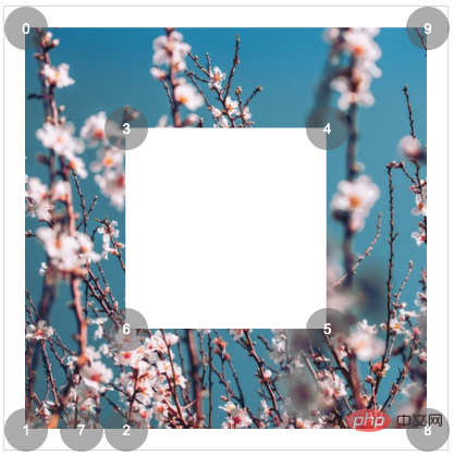
{
    clip-path: polygon(0% 0%,0% 100%,25% 100%,25% 25%,75% 25%,75% 75%,25% 75%,14% 100%,100% 100%,100% 0%);
}即可得到:

同理,需要得到一个三角形环形,只需要 7 个点即可:
{
    clip-path: polygon(50% 0%,0% 100%,13% 100%,50% 20%,85% 90%,8% 90%,8% 100%,100% 100%);
}效果如下:
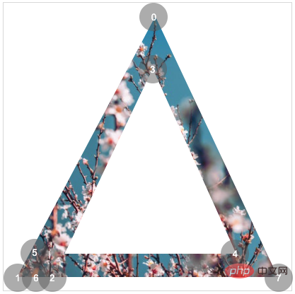
这里有个很好用的工具,辅助制作 clip-path 图形, 感兴趣可以试下:CSS clip-path Editor
了解上述完整代码,你可能还需要补齐一些基础 CSS 知识,可以按需点进去了解:
好了,本文到此结束,希望本文对你有所帮助
原文地址:https://www.cnblogs.com/coco1s/p/15958444.html
作者:ChokCoco
更多编程相关知识,请访问:编程视频!!
The above is the detailed content of Take you step by step to create a colorful triangle border animation using CSS. For more information, please follow other related articles on the PHP Chinese website!