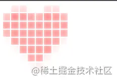
How to turn pictures into "pseudo-pixel style"? This article will introduce to you how to use CSS to process images and convert them into "pixel style". I hope it will be helpful to you!

Pixel style is a kind of using fixed-size solid color pixel squares as the basic unit for creation, including but not limited to painting,Architecture, Game is an art style in various fields.
The most familiar one is of course the pixel graphics of the early video games~
["Mario" on the early red and white consoles Pixel image]
Of course, early video games adopted pixel style, which was actually a historical helplessness. The limitations of hardware conditions forced game developers to choose this Strong liquidity, Performance overhead low art style.
However, Today pixel style is still popular in various fields, and it has been given more aesthetic and retro meanings.
First look at the original picture of the "Love Picture" to be processed this time:
[Love Picture]
To turn such a picture into pixels, the first idea popped into my mind:
Use canvas to cut the picture into N*N blocks, and then calculate the median color value of each area separately and fill it with a solid color. Yes, this idea can undoubtedly solve the problem quickly and flexibly.
But in this way, without using CSS, wouldn’t colleague Ayang’s first date be completely ruined?
❌❌
No, no, no! I have to change my mind and use CSS to implement it! (Recommended learning: css video tutorial)
The main idea is as follows:
Divide the image into N divs, each div holds a part of the image.
Each div is passed through css-filter onceblur (Gaussian blur), visually achieveTake the median value and fill the div Effect.
According to this idea, there is actually only one difficulty. How to make each div hold part of the image?
Oh, this is not a problem for me I have a big heart to help my colleagues.
It’s actually not difficult:
First, we use 8*8 to divide a div into 64 parts, which is undoubtedly the grid layout.
Code:
<style>
.mask-group {
width: 128px;
height: 128px;
display: grid;
grid-template-columns: repeat(8,1fr);
grid-template-rows: repeat(8,1fr);
}
</style>
<script>
const el = document.querySelector('.mask-group')
for(let i = 0; i< 64; i++) {
const itemEl = document.createElement('div')
itemEl.className = 'mask-item'
el.appendChild(itemEl)
}
}
</script>Then we set a heart shape for each .mask-item element Background
Then the effect becomes like this, because the background of each picture starts from the upper left corner, so it definitely does not meet expectations.
Next: We need to insert this sentence in the js traversal:
itemEl.style.backgroundPosition = `-${Math.floor(i%8) * 16}px -${Math.floor(i/8) * 16}px `The function of this line of code is to give each .mask-item The element is individually assigned a background-position style, and the upper left corner of the background image of all .mask-item elements is calculated to overlap with a coordinate point.
The effect is as shown:
3. Add interval and Gaussian blur
According to the idea, we only need to add interval to div, and then add Gaussian blur to achieve the effect.
So the code is as follows:
.mask-group {
  /* 以下为新增 */
  grid-row-gap: 2px;
  grid-column-gap: 2px;
}
.mask-item {
  /* 以下为新增 */
  filter: blur(8px)
}But the effect is:
What is the problem? Gaussian Blur actually affects areas outside inner-box! !
No way, in order to limit the Gaussian blur effect area, I can only use mask-image.
First make a 16*16 pixel pure black all-black.png file.
The code is as follows:
.mask-item {
  /* 以下为新增 */
  -webkit-mask-image: url('./all-black.png');
  mask-image: url('./all-black.png');
}Rendering:
Hey, it’s like that now, but because of Gauss## Because of #, the color is a lot lighter, it’s okay, just fine-tune it.
.mask-item {
  /* 以下为更改 */
  filter: blur(8px) contrast(400%) saturate(400%);
}
大功告成!!
万万没想到,同事阿洋还是没能完成和产品妹妹小美的约会。
原因居然是:产品妹妹觉得我写代码的样子过于靓仔,非要和我约会!

--全剧终--
(学习视频分享:web前端)
The above is the detailed content of You can also use CSS to process images and turn them into 'pixel style'!. For more information, please follow other related articles on the PHP Chinese website!