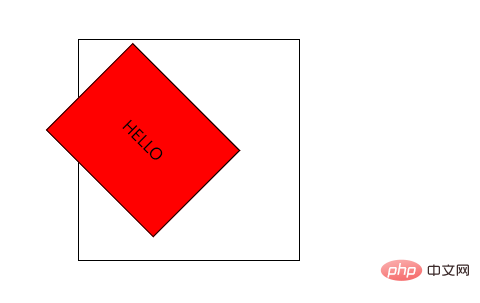
In CSS3, you can use the "transform-origin" attribute to set the rotation point when rotating the element. This attribute is used to change the position of the transformed element and can change the center point of the rotation. The syntax is "transform-origin" : x-axis y-axis z-axis;”.

The operating environment of this tutorial: Windows 10 system, CSS3&&HTML5 version, Dell G3 computer.
2D rotation refers to rotating the element clockwise or counterclockwise in a 2-dimensional plane. (The experience is better when used with transition transition)
Grammar format:
transform:rotate(度数);
Notes:
rotate is followed by degrees and the unit is deg, for example transform: rotate(180deg) means rotating 180 degrees;
When the angle is positive, it rotates clockwise, and when it is negative, it rotates counterclockwise, such as transform:rotate(180deg) and transform:rotate(-180deg );
The default rotation center point is the center point of the element.
Change the center point of rotation:
transform-origin
We can set the position at which the element is rotated.
The transform-Origin property allows you to change the position of the transformed element.
2D transform elements can change the X and Y axes of the element. Transform elements in 3D and also change the Z-axis of the element.
Grammar format:
transform-origin: x-axis y-axis z-axis;
Notes:
The following parameters x and y are separated by spaces, not commas;
xy is the center of the default conversion The point is the center point of the element (50% 50%);
You can also set pixels or orientation nouns for xy, for example: top bottom left right center.
The example is as follows:
<html>
<head>
<meta charset="utf-8">
<title>123</title>
<style>
#div1
{
    position: relative;
    height: 200px;
    width: 200px;
    margin: 100px;
    padding:10px;
    border: 1px solid black;
}
#div2
{
    padding:50px;
    position: absolute;
    border: 1px solid black;
    background-color: red;
    transform: rotate(45deg);
    transform-origin:20% 40%;
    -ms-transform: rotate(45deg); /* IE 9 */
    -ms-transform-origin:20% 40%; /* IE 9 */
    -webkit-transform: rotate(45deg); /* Safari and Chrome */
    -webkit-transform-origin:20% 40%; /* Safari and Chrome */
}
</style>
</head>
<body>
<div id="div1">
  <div id="div2">HELLO</div>
</div>
</body>
</html>Output result:

(Learning video sharing: css video Tutorial)
The above is the detailed content of How to set rotate rotation point in css3. For more information, please follow other related articles on the PHP Chinese website!