
Recommended tutorial: CSS video tutorial
Learning CSS is a way to build beautiful web pages. However, during the learning process, we tend to limit ourselves (most of the time) to using the same attributes over and over again. After all, we are creatures of habit and we use what we are accustomed to and familiar with.
Therefore, in this article, I will introduce to you 7 relatively rare and easy-to-use CSS properties. I hope it will be helpful to you.
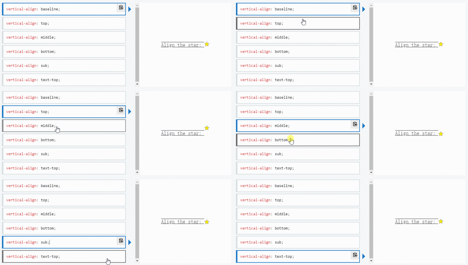
CSS attributevertical-align is used to specify the vertical alignment of inline elements (inline) or table-cell elements (table-cell) Way.
As the definition says, this property allows you to vertically align text. It is useful for sequence indicators (st, nd, etc.), required input asterisks (*) or icons that are not centered correctly. vertical-alignTake one of the values: super | top | middle | bottom | baseline (default) | sub | text-top | text-bottom, or the length from the baseline ( px, %, em, rem, etc.).
baseline: Aligns the element's baseline with the parent element's baseline. The HTML specification does not specify the baseline for some replaceable elements, such as <textarea></textarea>, which means that the behavior of these elements using this value will vary from browser to browser.
sub: Aligns the element's baseline with the parent element's subscript baseline.
super: Aligns the element's baseline with the parent element's superscript baseline.
text-top: Aligns the element's baseline with the parent element's superscript baseline.
text-bottom: Aligns the bottom of the element with the font bottom of the parent element.
middle: Align the middle of the element with the parent element's baseline plus half of the parent element's x-height (Annotation: x-height).

Note vertical-align Only takes effect on inline elements and table cell elements: you cannot use it to vertically align block-level elements.
Resource: https://developer.mozilla.org/en-US/docs/Web/CSS/vertical-align
The writing-mode attribute defines the horizontal or vertical layout of text and the direction in which text travels within block-level elements. When setting book for the entire document, it should be set on the root element (for HTML documents it should be set on the html element). It takes one of the following values horizontal-tb (default) | vertical-rl | vertical-lr.
horizontal-tb: For left-aligned (ltr) scripts, content flows horizontally from left to right. For right-aligned (rtr) scripts, content flows horizontally from right to left. The next horizontal row is below the previous row.
vertical-rl: For left-aligned (ltr) scripts, content flows vertically from top to bottom, with the next vertical line to the left of the previous line. For right-aligned (rtr) scripts, content flows vertically from bottom to top, with the next vertical line to the right of the previous line.
vertical-lr: For left-aligned (ltr) scripts, content flows vertically from top to bottom, with the next vertical line to the right of the previous line. For right-aligned (rtr) scripts, content flows vertically from bottom to top, with the next vertical line to the left of the previous line.
Resource: https://developer.mozilla.org/en-US/docs/Web/CSS/writing-mode
font-variant-numeric CSS property controls the use of alternative glyphs for numeric, fraction, and ordinal markers.
It takes one of these values: normal | ordinal | slashed-zero | lining-nums | oldstyle-nums | proportional-nums | tabular-nums | diagonal-fractions | stacked-fractions.
This property is useful for setting number styles. Depending on the situation, you may want to display old-fashioned numbers or zeros with slashes, for these cases font-feature-settings is useful.
Please note thatfont-variant-numericis part of thefont-feature-settingsgroup properties. Properties such asfont-variant-capsorfont-variant-ligaturesalso belong to this group.
Also note that, like allfont-feature-settingsproperties, your font needs to implement the above features to work properly. The font I used isFira Sans.
Resource: https://developer.mozilla.org/en-US/docs/Web/CSS/font-variant-numeric
Whenever we have text that we don’t want the user to select, or conversely, if a double click or context click occurs and we want all text to be selected, user -select attribute will be very useful.
This property takes one of the following values: none | auto | text | all.
none: The text of the element and its sub-elements cannot be selected. Please note that this Selection object can contain these elements. Starting in Firefox 21, none behaves like -moz-none, so you can use -moz-user-select: text to re-enable selection on child elements . The specific value of
autoauto depends on a series of conditions, as follows:
: :before and ::after On pseudo-elements, the attribute value used is none
contain
user-select adopted attribute value of this element's parent element is all, then the attribute adopted by this element The value is also all
user-select attribute with a value of none, then this element The attribute value adopted is also none
text
text: User can select text.
all: In an HTML editor, when a child element or context is double-clicked, the top-level element containing the child element will also be selected.
Resource: https://developer.mozilla.org/en-US/docs/Web/CSS/user-select
clip-path CSS property can create a clipping area where only part of the element can be displayed. Parts within the area are displayed and parts outside the area are hidden. The clipping region is a path defined by a reference to an embedded URL or an external svg, or as a shape such as circle(). The clip-path property replaces the now deprecated clip clip property.
This attribute takes one of the following values: circle() | ellipse() | polygon() | path() | url().
Since this is an introduction to the property, we won't delve into each value here.
The two values I use the most are circle and polygon. circle(radius at pair)The value has two parameters. The first parameter is the radius of the circle, and the second parameter is the point representing the center of the circle. polygon(pair, pair, pair...)The value takes 3 or more points, representing a triangle, a rectangle, etc.
shape-outside CSS property defines a shape that can be non-rectangular, adjacent Inline content should be wrapped around the shape. By default, inline content wraps its margin box; shape-outside provides a way to customize this wrapping to wrap text around a complex object instead of a simple box. It takes the same value as clip-path.
clip-pathDefines how users view the element, shape-outsideDefines how other HTML elements view the element.

Resource: https://developer.mozilla.org/en-US/docs/Web/CSS/shape-outside
Finally, the backgroundclip CSS property sets whether the element's background extends to its border, padding, or content below the box.
This property takes one of the following values: border-box (default) | padding-box | content-box | text
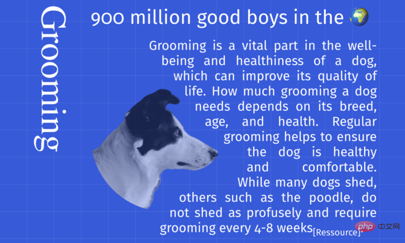
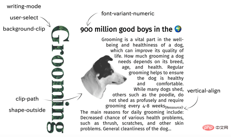
##Resource: https://developer.mozilla.org/en-US/docs/Web/CSS/background-clipSummaryThe following picture is combined with the above The layout implemented by 7 attributes will deepen your impression.

English original address: https://dev.to/mustapha/7-amazing-css-properties-you-may-not-know-yet-eejAuthor: Mustapha AouasFor more programming-related knowledge, please visit:
Programming Course! !
The above is the detailed content of 7 amazing CSS properties you may not know yet!. For more information, please follow other related articles on the PHP Chinese website!