
How to implement adaptive dividers in CSS? The following CSS column will introduce to you N ways to implement adaptive dividers in CSS. It has certain reference value. Friends in need can refer to it. I hope it will be helpful to everyone.
(Recommended tutorial: CSS tutorial)
The dividing line is a common type of design in web pages. For example, Zhihu’s more Answer more
The adaptive here means that the horizontal lines on both sides will adapt according to the number of text and the width of the parent
Look secretly After looking at the implementation on Zhihu, it is obvious that it is covered with a white background. Adding a little background reveals the secret

I thought: Is Zhihu’s front-end not that good? Maybe other people’s focus is not on these.
The following are some better implementation methods, the kind that will not reveal the secret
The main principle is to set the text to be centered text-align: center;, and then given two pseudo-elements, each of which is absolutely positioned, then the pseudo-element will also follow Horizontally center , set enough width, and then move the left one 100% to the left. Remember to hide the parent.
The specific implementation is as follows
htmlThe structure is
<div class="title">我是分割线</div>
cssThe style is
.title{
    position: relative;
    text-align: center;
    overflow: hidden;
    font-size: 14px;
    color: #999;
}
.title::before,.title::after{
    content: '';
    display: inline-block;
    width: 100%;
    height: 1px;
    position: absolute;
    background: #ccc;
    top: 50%;
}
.title::before{
    margin-left: -10px;
    transform: translateX(-100%);
}
.title::after{
    margin-left: 10px;
}CSS separator line (pseudo element transform)
This is easier to understand, set display:flex, and then two pseudo elements Cover the remaining space separately.
The specific implementation is as follows
htmlThe structure is
<div class="title">我是分割线</div>
cssThe style is
.title{
    display: flex;
    align-items: center;
    font-size: 14px;
    color: #999;
}
.title::before,.title::after{
    content: '';
    flex: 1;
    height: 1px;
    background: #ccc;
}
.title::before{
    margin-right: 10px;
}
.title::after{
    margin-left: 10px;
}CSS divider (pseudo element flex)
Also use text-align: center to make the text Center it with the pseudo element, and then generate a large enough box-shadow or outline. Since a single direction is not supported, use clip-path or clip Crop out
The specific implementation is as follows
htmlThe structure is
<div class="title">我是分割线</div>
cssThe style is
.title{
    text-align: center;
    font-size: 14px;
    color: #999;
    overflow: hidden;
}
.title::before,.title::after{
    content: '';
    display: inline-block;
    width: 0;
    height: 1px;
    box-shadow: 0 0 0 9999px #ccc;
    vertical-align: middle;
}
.title::before{
    margin-right: 10px;
    clip-path: polygon(0 0, -9999px 0, -9999px 100%, 0 100%);
}
.title::after{
    margin-left: 10px;
    clip-path: polygon(0 0, 9999px 0, 9999px 100%, 0 100%);
}CSS divider (pseudo element box-shadow/outline clip-path)
This implementation requires one more layer of tags , the outside is still text-align: center, add two pseudo-elements to the internal text for absolute positioning, the left one is set to 100% from the right (relative to the text label)
Specific The implementation is as follows
htmlThe structure is
<div class="title">
   <span class="inner">我是分割线</span>
</div>
cssThe style is
.title{
    text-align: center;
    font-size: 14px;
    color: #999;
    overflow: hidden;
}
.inner{
    position: relative;
}
.inner::before,.inner::after{
    position: absolute;
    content: '';
    width: 9999px;
    height: 1px;
    background: #ccc;
    top: 50%;
}
.inner::before{
    right: 100%;
    margin-right: 10px;
}
.inner::after{
    margin-left: 10px;
}CSS separator (pseudo element right :100%)
This idea does not require pseudo elements, but it requires additional tags to give the internal text left and right large enough 1pxBorder, you need to set line-height:1px at this time. Since the internal whole is large enough (exceeding the parent), you can use absolute positioning and transform: translateX(-50%)center
The specific implementation is as follows
htmlThe structure is
<div class="title">
    <span class="inner">我是分割线</span>
</div>cssThe style is
.title{
    position: relative;
    text-align: center;
    font-size: 14px;
    color: #999;
    overflow: hidden;
    padding: .6em 0;/**把高度撑起来**/
}
.inner{
    position: absolute;
    left: 50%;
    transform: translateX(-50%);
    white-space: nowrap;
    line-height: 1px;
    border-left: 9999px solid #ccc;
    border-right: 9999px solid #ccc;
    padding: 0 10px;
}CSS divider line (border transform)
This idea only requires one pseudo element, and generates a pseudo element inside the text, which is enough Large border and the same negative value (absolute positioning left/right) restore the position
The specific implementation is as follows
htmlThe structure is
<div class="title">
    <span class="inner">我是分割线</span>
</div>cssThe style is
.title{
    text-align: center;
    font-size: 14px;
    color: #999;
    overflow: hidden;
}
.inner{
    position: relative;
    padding: 0 10px;
}
.inner::before{
    content: '';
    position: absolute;
    height: 1px;
    top: 50%;
    border-left: 9999px solid #ccc;
    border-right: 9999px solid #ccc;
    right: -9999px;
    left: -9999px;
}CSS divider (pseudo element border left/right)
The main idea is to set the parent level display:table, set the pseudo element display:table-cell, and set a large enough width
The specific implementation is as follows
htmlThe structure is
<div class="title">
    <span class="inner">我是分割线</span>
</div>cssThe style is
.title{
    display: table;
    font-size: 14px;
    color: #999;
}
.inner{
    display: table-cell;
    white-space: nowrap;
    padding: 0 10px;
}
.title::before,.title::after{
    content: '';
    display: table-cell;
    width: 9999px;
    overflow: hidden;
    background: linear-gradient(#ccc 0,#ccc) center no-repeat;/**这里用线性渐变生成的,也可以用其他方式**/
    background-size: 100% 1px;
}CSS separator (pseudo Element table-cell)
利用fieldset和legend标签组合,可以天然实现分隔线效果,参考至张鑫旭的这篇文章
具体实现如下
html结构为
<fieldset class="title">
    <legend class="inner">我是分割线</legend>
</fieldset>css样式为
.title{
    font-size: 14px;
    color: #999;
    border: 0;
    border-top: 1px solid #ccc;
    padding: 0;
}
.inner{
    margin: 0 auto;;
    padding: 0 10px;
}上面一共列举了8中方式来实现分隔线的效果,每种方法思路各不相同,重要的是可以发散自己的想象力,可能这才是CSS与其他语言所不同的吧~
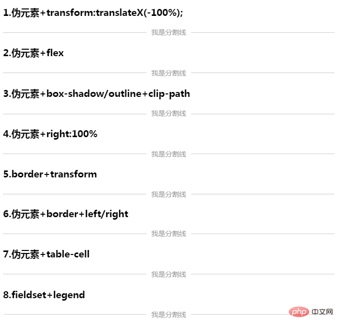
这里整理了一下,整体效果如下,可访问这里查看,大家在实际项目中可自行选取所需要的方式

可能还有其他方式没有想到,欢迎大家集思广益,在下方留言讨论
更多编程相关知识,请访问:编程入门!!
The above is the detailed content of How to implement adaptive dividers in CSS? Method introduction. For more information, please follow other related articles on the PHP Chinese website!