This article mainly introduces the relevant information and examples of how to set up multi-column layout with equal heights in CSS. It has a certain reference value. Friends in need can refer to it. I hope it will be helpful to you.
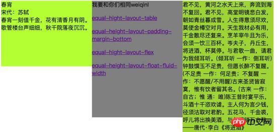
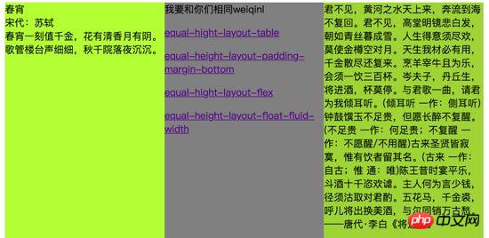
Initially, the contents of multiple columns are of different sizes and heights. Now you need to set different backgrounds to display, and the height of each column needs to be consistent. Then this requires the use of multi-column equal-height layout.

Final required effect:

1. Real contour layout
flex technical point: flexible box layout flex, the default value is the feature of equal height layout.
When defining flex layout, there are some default values.
flex-direction Property defines the direction of the main axis. The default value is row, which is generally displayed horizontally. The main axis of the flex container is defined to be the same as the text direction. Spindle start and spindle end are in the same direction as the content.
align-item The attribute defines the alignment of flex items in the direction of the cross axis (vertical axis) of the current row of the flex container. The default value is stretch and the element is stretched to fit the container.
<p class="box">
  <p class="left"></p>
  <p class="center"></p>
  <p class="right"></p>
</p>
css
.box {
  display: flex;
}
.left {
  width: 300px;
  background-color: grey;
}
.center {
  flex: 1;
  background: red;
}
.right {
  width: 500px;
  background: yellow;
}See the Pen equal-hight-layout-flex by weiqinl ( @weiqinl ) on CodePen .
2. Real equal-height layout
table-cell Technical point: The table layout naturally has the characteristics of equal height.
display is set to table-cell, then this element will be displayed as a table cell. Similar to using the tags <td> or <th> .
HTML structure
<p class="box">
  <p class="left"></p>
  <p class="center"></p>
  <p class="right"></p>
</p>
CSS style
.left {

  display: table-cell;

  width:30%;

  background-color: greenyellow;

}

.center {

  display: table-cell;

  width:30%;

  background-color: gray;

}

.right {

  display: table-cell;

  width:30%;

  background-color: yellowgreen;

}3. False equal height column layout, positive and negative values at the bottom of the inner and outer margins
Implementation: Set the overflow attribute of the parent container to hidden. Set a relatively large bottom padding for each column, and then use negative margins of similar values to eliminate this height.
Regardless of scalability, you only need to set padding-bottom/margin-bottom to the height difference between the highest column and the lowest column to get the equal height effect.
Considering scalability, in order to prevent the height of a certain column from increasing or decreasing significantly in the future, we set a relatively large value.
Technical points
Background will fill the padding, but not the margin. Margin is collapsible and can be set to negative values.
float:left. With float, the element is taken out of the document flow, causing it to float to the nearest document flow element. The function here is to place three p elements side by side.
overflow:hidden; Set the overflow attribute to hidden, and a block-level formatting context (BFC) will be generated to eliminate the impact of float. At the same time, as needed, the content will be intercepted to fit the fill box, and the portion beyond the container will be hidden.
HTML structure
<p class="box">

  <p class="left"></p>

  <p class="center"></p>

  <p class="right"></p>

</p>
CSS
.box {
  overflow: hidden;
}
.box > p{
  /**
  * padding-bottom 设置比较大的正值。
  * margin-bottom 设置绝对值大的负值。
  **/
  padding-bottom: 10000px;
  margin-bottom: -10000px;
  float:left;
  width:30%;
}
.left {
  background-color: greenyellow;
}
.center {
  background-color: gray;
}
.right {
  background-color: yellowgreen;
}4. Fake contour layout, background visual effect
Technical point: float floats and sets the width of each column. Set the parent element to an inline block-level element, and then use a linear gradient image to set the background of the parent element to highlight the equal height effect
CSS linear-gradient The function is used to create a representation of two A picture of a linear gradient of one or more colors.
display: inline-block, set to inline block-level elements.
<p class="box five-columns">
    <p class="col"></p>
    <p class="col"></p>
    <p class="col"></p>
    <p class="col"></p>
    <p class="col"></p>
</p>css
/** 需要自己算出平均每列的宽度 */

.box {

  display: inline-block;

  background: linear-gradient(

    to right,

    red,

    red 20%,

    blue 20%,

    blue 40%,

    yellow 40%,

    yellow 60%,

    orange 60%,

    orange 80%,

    grey 80%,

    grey);

}

.col {

  float: left;

  width: 16%;

  padding: 2%;

}Summary: The above is the entire content of this article, I hope it will be helpful to everyone's learning. For more related tutorials, please visit CSS Video Tutorial!
Related recommendations:
php public welfare training video tutorial
The above is the detailed content of Example of how to set a multi-column equal-height layout using css. For more information, please follow other related articles on the PHP Chinese website!