

 Web Front-end
CSS Tutorial
Find another way! See how to use CSS filters to create rounded corners and wavy effects
Web Front-end
CSS Tutorial
Find another way! See how to use CSS filters to create rounded corners and wavy effects
Find another way! See how to use CSS filters to create rounded corners and wavy effects

This article will take you to find a new way to talk about how to use CSS filters to create rounded corners, and how to use rounded corners to achieve the wave effect. I hope it will be helpful to everyone!

[Learning video sharing: css video tutorial, web front-end]
First, let’s take a look Such a graphic:

A rectangle, nothing special, the code is as follows:
div {
    width: 200px;
    height: 40px;
    background-color: #000;
}If, we now need to add # to both ends of this rectangle ##Rounded corners, like this, how to do it:

border-radius:
div {
    width: 200px;
    height: 40px;
  + border-radius: 40px;
    background-color: #000;
}

filter: contrast() and filter: blur().
filter: contrast() Combined with the wonderful chemical effect of filter: blur()
is a magical filter in ! In the article Cleverly Achieving Concave Smooth Rounded Corners, we have already introduced alternative uses of this combination.
Friends who often read my articles must be familiar with the combination offilter: contrast() and filter: blur(). Here is a classic one Picture:
filter: blur ()
: Set a Gaussian blur effect to the Find another way! See how to use CSS filters to create rounded corners and wavy effects.filter: contrast()
: Adjust the contrast of the Find another way! See how to use CSS filters to create rounded corners and wavy effects.
blur and contrast filters can not only be used for this blending effect, but their special properties allow their combination to turn right angles into rounded corners!
Let’s take a look at the previous example: First of all, we only need to implement such a graphic:<div> <div> <div></div> </div> </div>
.g-container {
    position: relative;
    width: 300px;
    height: 100px;

    .g-content {
        height: 100px;

        .g-filter {
            height: 100px;
            background: radial-gradient(circle at 50% -10px, transparent 0, transparent 39px, #000 40px, #000);
        }
    }
}

filter: contrast() and filter: blur().
.g-container {
    position: relative;
    width: 300px;
    height: 100px;

    .g-content {
        height: 100px;
        filter: contrast(20);
        background-color: white;
        overflow: hidden;

        .g-filter {
            filter: blur(10px);
            height: 100px;
            background: radial-gradient(circle at 50% -10px, transparent 0, transparent 29px, #000 40px, #000);
        }
    }
}filter: contrast(20 ) and background-color: white, added filter: blur(10px) to .g-filter. A magical thing happened, we got such an effect:
Use the contrast filter to remove the blurry edges of the Gaussian blur, 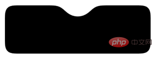 Turn the original right angle into a rounded corner
Get a more intuitive feeling through a Gif:
You can click here for the complete code:CodePen Demo - Smooth concave rounded corners By filter
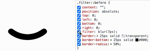
通过滤镜实现圆角圆弧
到这里,你应该知道如何通过直角圆弧得到圆角圆弧了。就是借助 filter: contrast() 配合 filter: blur() 的组合。
直接上代码:
div {
    position: relative;
    width: 250px;
    height: 250px;
    filter: contrast(20);
    background-color: #fff;
    overflow: hidden;
}
div::before {
    content: "";
    position: absolute;
    top: 0;
    left: 0;
    bottom: 0;
    right: 0;
    filter: blur(7px);
    border: 25px solid transparent;
    border-bottom: 25px solid #000;
    border-radius: 50%;
}效果如下:
通过 Gif 看,更加直观:
CodePen Demo -- Arc with rounded corners
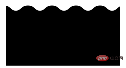
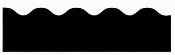
使用 filter: contrast() 配合 filter: blur() 实现波浪效果
好了,有了上面的铺垫,我们再来看一个有意思的。使用 filter: contrast() 配合 filter: blur() 实现波浪效果。
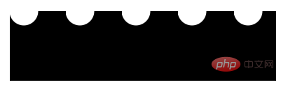
在之前,我们如果想使用纯 CSS,实现下述的波浪效果,是非常的困难的:
这种波浪效果,通常会使用在优惠券等切图中:
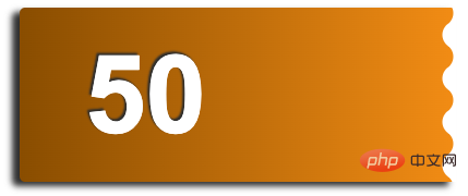
在之前,我们是怎么去做的呢?如果不切图,使用纯 CSS 的话,需要使用两层渐变进行叠加,大概是这样,感受一下:
其代码也比较复杂,需要不断的调试渐变,使两个径向渐变吻合:
div {
    position: relative;
    width: 400px;
    height: 160px;
    background: linear-gradient(90deg, #945700 0%, #f49714 100%);

    &::before,
    &::after {
        content: "";
        position: absolute;
        top: 0;
        right: 0;
        bottom :0;
    }
    &::before {
        width: 10px;
        background-Find another way! See how to use CSS filters to create rounded corners and wavy effects: radial-gradient(circle at -5px 10px, transparent 12px, #fff 13px, #fff 0px);
        background-size: 20px 20px;
        background-position: 0 15px;
    }
    &::after {
        width: 15px;
        background-Find another way! See how to use CSS filters to create rounded corners and wavy effects: radial-gradient(circle at 15px 10px, #fff 12px, transparent 13px, transparent 0px);
        background-size: 20px 40px;
        background-position: 0 15px;
    }
}那么,如果使用 filter: contrast() 配合 filter: blur() 的话,整个过程将会变得非常简单。
我们只需要实现这样一个图形:
这个图形使用渐变是容易得到的:
div {
    background: radial-gradient(circle at 20px 0, transparent, transparent 20px, #000 21px, #000 40px);
    background-size: 80px 100%;
}按照上文介绍的技巧,只需要应用上 filter: contrast() 配合 filter: blur(),就能将锐利的直角转化成圆角。我们尝试一下:
<div>
    <div></div>
</div>
.g-container {
    position: relative;
    margin: auto;
    height: 200px;
    padding-top: 100px;
    filter: contrast(20);
    background-color: #fff;
    overflow: hidden;
}

.g-inner {
    position: relative;
    height: 200px;
    background: radial-gradient(circle at 20px 0, transparent, transparent 20px, #000 21px, #000 40px);
    background-size: 80px 100%;
    filter: blur(10px)
}可以写在 1 个 DIV 里面(通过元素和它的伪元素构造父子关系),也可以用 2 个,都可以,问题不大。
得到如下所示的波浪图形:
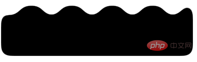
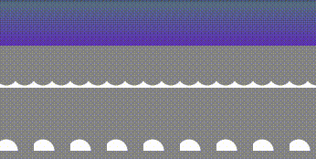
我们希望它波浪的地方的确是波了,但是我们不希望的地方,它也变成了圆角:
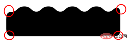
这是 filter: blur() 的一个问题,好在,我们是可以使用 backdrop-filter() 去规避掉这个问题的,我们简单改造下代码:
.g-container {
    position: relative;
    width: 380px;
    padding-top: 100px;
    filter: contrast(20);
    background-color: #fff;
    overflow: hidden;

    &::before {
        content: "";
        position: absolute;
        top: 0;
        left: 0;
        bottom: 0;
        right: 0;
        backdrop-filter: blur(10px);
        z-index: 1;
    }
}
.g-inner {
    position: relative;
    width: 380px;
    height: 100px;
    background: radial-gradient(circle at 20px 0, transparent, transparent 20px, #000 21px, #000 40px);
    background-size: 80px 100%;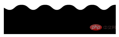
}这样,我们就实现了一份完美的波浪效果:
部分同学可能对上面的
padding-top 100px有所疑惑,这个也是目前我所发现的一个 BUG,暂未解决,不影响使用,你可以尝试将 padding-top: 100px 替换成 height: 100px。
基于这种方式实现的波浪效果,我们甚至可以给它加上动画,让他动起来,也非常的好做,简单改造下代码:
.g-inner {
    position: relative;
  - width: 380px;
  + width: 480px;
    height: 100px;
    background: radial-gradient(circle at 20px 0, transparent, transparent 20px, #000 21px, #000 40px);
    background-size: 80px 100%;
  + animation: move 1s infinite linear;
}

@keyframes move {
    100% {
        transform: translate(-80px, 0);
    }
}通过一个简单的位移动画,并且使之首尾帧一致,看上去就是连续的:
完整的代码,你可以戳这里:CodePen Demo -- Pure CSS Wave
SVG 滤镜,让使用更简单
这就结束了吗?没有!上述双滤镜的组合固然强大,确实还是有一点麻烦。
再补充一种 SVG 滤镜的方案。这里,对于大部分场景,我们可以借助 SVG 滤镜,在 CSS 中一行引入,实现同样的功能。
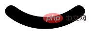
看这样一个 DEMO,我们有这样一个三角形:

我们想通过它得到一个圆角三角形:

借助 SVG 滤镜,其实也可以快速达成,省去了上面还需要叠加一个 filter: contrast() 的烦恼:
<div></div>
<svg>
    <filter>
      <fegaussianblur></fegaussianblur>
      <fecomponenttransfer>
          <fefunca></fefunca>
      </fecomponenttransfer>
    </filter>
</svg>
div {
        border: 60px solid transparent;
        border-left: 120px solid #f48;
        filter: url(#blur);
}效果如下:

是的,利用 filter: url(xxx) 可以快速引入一个定义好的 SVG 滤镜。也可以这样,直接嵌入到 URL 中:
div {
        border: 60px solid transparent;
        border-left: 120px solid #f48;
        filter: url("data:Find another way! See how to use CSS filters to create rounded corners and wavy effects/svg+xml,%3Csvg xmlns='http://www.w3.org/2000/svg'%3E%3Cfilter id='blur' color-interpolation-filters='sRGB'%3E%3CfeGaussianBlur stdDeviation='10'/%3E%3CfeComponentTransfer%3E%3CfeFuncA type='table' tableValues='0 0 10'/%3E%3C/feComponentTransfer%3E%3C/filter%3E%3C/svg%3E#blur");
}完整的代码,你可以戳这里:CodePen Demo -- triangle with rounded corners and shadow
总结一下
本文介绍了一种使用 filter: contrast() 配合 filter: blur() 的方式,将直角图形变为圆角图形的方式,在一些特定的场景下,可能有着妙用。同时,在很多场景下,可以使用 SVG 滤镜简化操作。
不过,这种方式也有几个小缺陷:
使用了
filter: contrast()之后,图形的尺寸可能相对而言会缩小一点点,要达到固定所需尺寸的话,要一定的调试此方式产生的图形,毕竟经过了一次
filter: blur(),放大来看图形会有一定的锯齿,可以通过调整 contrast 和 blur 的大小尽可能的去除,但是没法完全去掉
当然,我觉得这两个小缺点瑕不掩瑜,在特定的场景下,此方式还是有一定的用武之地的。
原文地址:https://www.cnblogs.com/coco1s/p/16516585.html
作者:ChokCoco
更多编程相关知识,请访问:编程视频!!
The above is the detailed content of Find another way! See how to use CSS filters to create rounded corners and wavy effects. For more information, please follow other related articles on the PHP Chinese website!

Hot AI Tools

Undresser.AI Undress
AI-powered app for creating realistic nude photos

AI Clothes Remover
Online AI tool for removing clothes from photos.

Undress AI Tool
Undress images for free

Clothoff.io
AI clothes remover

AI Hentai Generator
Generate AI Hentai for free.

Hot Article
Hot Tools

Notepad++7.3.1
Easy-to-use and free code editor

SublimeText3 Chinese version
Chinese version, very easy to use

Zend Studio 13.0.1
Powerful PHP integrated development environment

Dreamweaver CS6
Visual web development tools

SublimeText3 Mac version
God-level code editing software (SublimeText3)
Hot Topics
 1377
1377
 52
52

 How to resize bootstrap
Apr 07, 2025 pm 03:18 PM
How to resize bootstrap
Apr 07, 2025 pm 03:18 PM
To adjust the size of elements in Bootstrap, you can use the dimension class, which includes: adjusting width: .col-, .w-, .mw-adjust height: .h-, .min-h-, .max-h-
 How to insert pictures on bootstrap
Apr 07, 2025 pm 03:30 PM
How to insert pictures on bootstrap
Apr 07, 2025 pm 03:30 PM
There are several ways to insert images in Bootstrap: insert images directly, using the HTML img tag. With the Bootstrap image component, you can provide responsive images and more styles. Set the image size, use the img-fluid class to make the image adaptable. Set the border, using the img-bordered class. Set the rounded corners and use the img-rounded class. Set the shadow, use the shadow class. Resize and position the image, using CSS style. Using the background image, use the background-image CSS property.
 How to use bootstrap button
Apr 07, 2025 pm 03:09 PM
How to use bootstrap button
Apr 07, 2025 pm 03:09 PM
How to use the Bootstrap button? Introduce Bootstrap CSS to create button elements and add Bootstrap button class to add button text
 How to set up the framework for bootstrap
Apr 07, 2025 pm 03:27 PM
How to set up the framework for bootstrap
Apr 07, 2025 pm 03:27 PM
To set up the Bootstrap framework, you need to follow these steps: 1. Reference the Bootstrap file via CDN; 2. Download and host the file on your own server; 3. Include the Bootstrap file in HTML; 4. Compile Sass/Less as needed; 5. Import a custom file (optional). Once setup is complete, you can use Bootstrap's grid systems, components, and styles to create responsive websites and applications.
 How to write split lines on bootstrap
Apr 07, 2025 pm 03:12 PM
How to write split lines on bootstrap
Apr 07, 2025 pm 03:12 PM
There are two ways to create a Bootstrap split line: using the tag, which creates a horizontal split line. Use the CSS border property to create custom style split lines.
 The Roles of HTML, CSS, and JavaScript: Core Responsibilities
Apr 08, 2025 pm 07:05 PM
The Roles of HTML, CSS, and JavaScript: Core Responsibilities
Apr 08, 2025 pm 07:05 PM
HTML defines the web structure, CSS is responsible for style and layout, and JavaScript gives dynamic interaction. The three perform their duties in web development and jointly build a colorful website.
 How to view the date of bootstrap
Apr 07, 2025 pm 03:03 PM
How to view the date of bootstrap
Apr 07, 2025 pm 03:03 PM
Answer: You can use the date picker component of Bootstrap to view dates in the page. Steps: Introduce the Bootstrap framework. Create a date selector input box in HTML. Bootstrap will automatically add styles to the selector. Use JavaScript to get the selected date.
 How to use bootstrap in vue
Apr 07, 2025 pm 11:33 PM
How to use bootstrap in vue
Apr 07, 2025 pm 11:33 PM
Using Bootstrap in Vue.js is divided into five steps: Install Bootstrap. Import Bootstrap in main.js. Use the Bootstrap component directly in the template. Optional: Custom style. Optional: Use plug-ins.
