
It turns out that jigsaw puzzles can also be realized using pure CSS! This article will introduce you to a technique that uses multiple CSS techniques to the extreme and uses pure CSS to implement a jigsaw puzzle.

This technique is derived from CodePen CSS Only Puzzle game by Temani Afif. A puzzle game implemented entirely in CSS.
What we have to do is to restore the scattered picture fragments into a complete picture, like this:
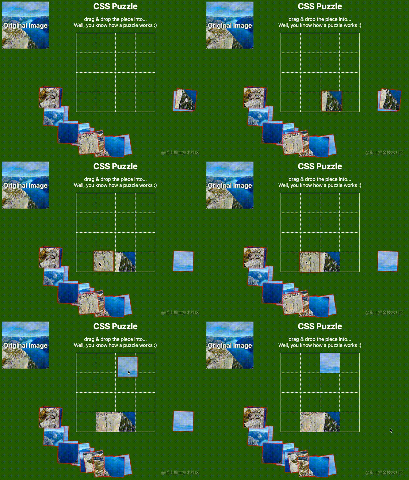
Note that this is a complete picture Implemented by CSS, let’s break down the core difficulty:
How to make an element draggable?
How to make an element stay in another position by dragging it from a fixed position?
The most difficult thing is, based on (2), drag the element and release it. Only when it is released at a specific position, the element will be fixed to the new position, otherwise, it will return to the original position.
Oh No, (2) and (3) above do not look like problems that can be solved by simple CSS.
So, how can we cleverly match and combine them and finally use CSS to achieve such an effect? Let’s break down the process step by step.
Based on the first point above, How to make an element draggable is the easiest to solve.
In HTML5, a new draggable attribute is added to the tag. After setting it to true, the draggable effect of the element can be achieved.
Simply put:
<div>draggable false</div>
<div draggable="true">draggable true</div>
We implement two divs like this, the second one is set with draggable="true":

If the element with draggable="true" is set, long press and hold the mouse to drag the element:
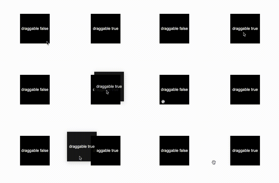
In this way, The dragging problem is solved. CodePen Demo -- HTML draggable Demo
OK, the next difficulty is how to move the element from position A Move to position B.
The core here lies in the clever application of transition elements.
Let's look at an example. If there is an element that has been offset translate(120px, 120px), when we hover the element, let it return to its original position:
div {
    transform: translate(120px, 120px);
}
div:hover {
    transform: translate(0, 0);
}The effect is as follows:
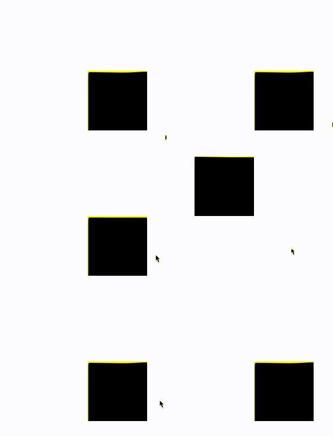
What is very interesting here is:
When we hover the element, the element returns Bit
Because the element returns to its position, it loses the hover state, changes back to its original state, and then re-triggers the hover state. This repeats, so you will see violent beating
Then, is there any way to reset it so that it doesn’t jump back again?
Yes, we can make the entire transition effect very slow by setting a very large transition-duraiotn and a very large transition-delay. So slow that we can’t notice it:
div {
    transform: translate(120px, 120px);
    transition: 999999s 999999s;
}
div:hover {
    transform: translate(0, 0);
    transition: 0s;
}In this way, after the element is reset, it will never jump back (in theory):
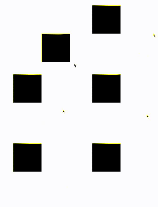
If we set the above transition: 999999s 999999s, that is, the transition duration and transition delay time** are set shorter, for example, if they are both set to 2s, transition: 2s 2s, the effect is as follows:
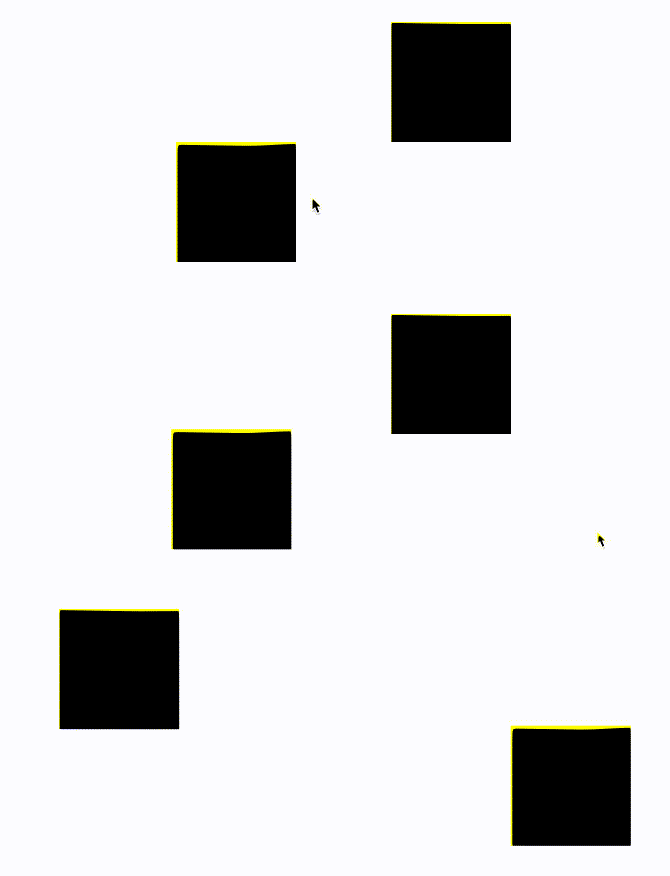
In this way, you should be able to roughly understand what happened.
Of course, the above knowledge alone is not enough.
First of all, the movement of elements is not triggered by hover. Instead, the movement of elements needs to be achieved by dragging to a specific position and releasing the dragging effect of the mouse. Moreover, the element can only be moved when released at a specific position.
How is this achieved? Here, we also need to pass event bubbling.
Let’s simply transform the code, add a parent element to the element, and then add a mark element:
<div class="g-wrap">
    <div class="g-flag">FLAG</div>
    <div class="g-box" draggable="true"></div>
</div>
.g-flag:hover ~ .g-box {
    transform: translate(0, 0);
    transition: 0s;
}
.g-box {
    width: 120px;
    height: 120px;
    background: #000;
    transform: translate(120px, 120px);
    transition: 9999s 9999s;
}其中,.g-flag 是我们实现的一个触发器,我们不再通过 hover 元素本身实现元素的移动,而是通过 hover 这个特殊的触发器来实现元素的移动,这个应该很好理解:
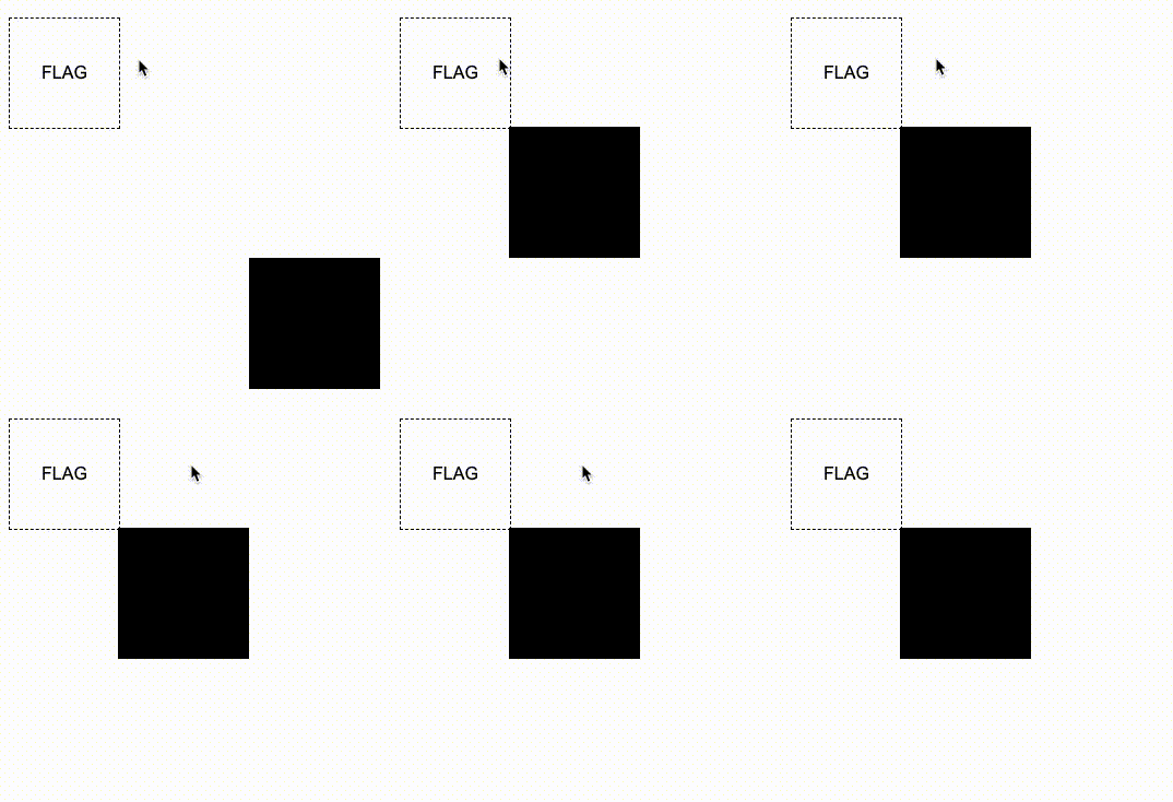
好!最为关键的步骤来了!
我们需要通过事件的冒泡,当开始拖拽 .g-box 元素本身的时候,才让我们的触发器显现,并且设置一个极为短暂的停留时间,这样让鼠标放下的一瞬间,触发元素的复位。
什么意思呢?看看效果图:
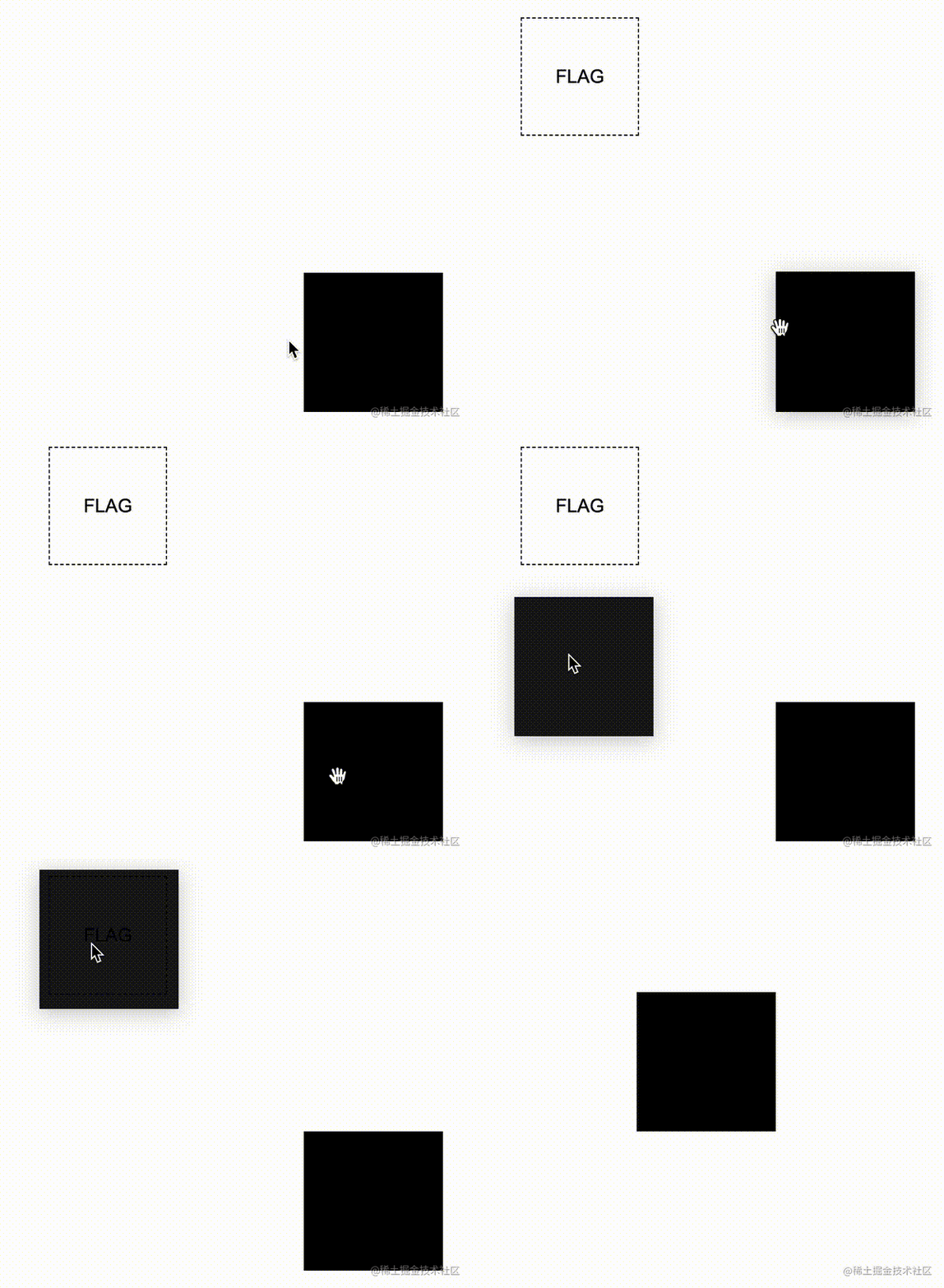
核心代码如下:
<div class="g-wrap">
    <div class="g-flag">FLAG</div>
    <div class="g-box" draggable="true"></div>
</div>
.g-wrap {
    position: relative;
    width: 120px;
    height: 120px;
}
.g-box {
    width: 120px;
    height: 120px;
    background: #000;
    transform: translate(120px, 120px);
    transition: 9999s 9999s;
}
.g-flag {
    position: absolute;
    width: 0;
    height: 0;
    top: -100px;
    left: -100px;
    transition: 0 0.5s;
}
.g-wrap:active .g-flag {
    border: 1px dashed #000;
    width: 100px;
    height: 100px;
}
.g-flag:hover ~ .g-box {
    transform: translate(0, 0);
    transition: 0s;
}这里运用到非常核心的一点是,在拖拽 .g-box 元素的过程中,触发了它的 :active 事件,同时,这个事件还会冒泡到它的父元素 .g-wrap 上。利用事件的冒泡,我们可以让元素在拖拽的过程中,让触发器显示,并且通过鼠标释放后立即触发了触发器的 hover 事件,让元素从位置 A,移动到了位置 B,实在是妙不可言!
最后,我们只需要让触发器的位置,与我们希望元素去到的位置,保持一致,即可实现拼图的原理:
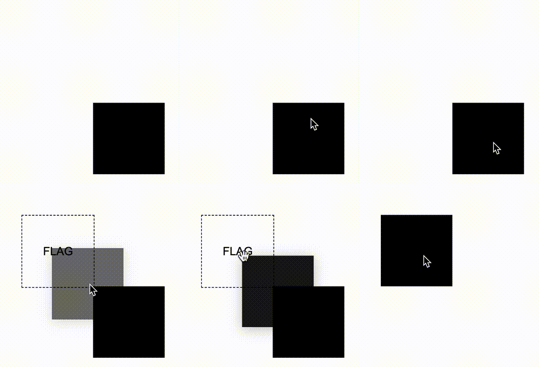
完整的单个元素从 A 点通过拖拽到移动到 B 点的 DEMO,你可以戳这里:CodePen Demo -- HTML draggable Demo
掌握了上述的原理后,上述的拼图游戏的就迎刃而解了。感兴趣的可以去看看它的源码:CSS Only Puzzle game。剩下的大部分工作在于,将完整的图片切割成不同份数,随机放置不同到不同的位置。
这里,借助同样的原理,我再给出一个类似的 DEMO,一个简单的拼字游戏,给出完整的代码:
<p class="source">请把文字摆放到正确的位置:橘皮乌龙</p>
<div class="g-container">
    <div class="g-wrap">
        <div class="g-flag"></div>
        <div class="g-box" draggable="true">橘</div>
    </div>
    <div class="g-wrap">
        <div class="g-flag"></div>
        <div class="g-box" draggable="true">皮</div>
    </div>
    <div class="g-wrap">
        <div class="g-flag"></div>
        <div class="g-box" draggable="true">乌</div>
    </div>
    <div class="g-wrap">
        <div class="g-flag"></div>
        <div class="g-box" draggable="true">龙</div>
    </div>
</div>
.g-container {
    display: flex;
    width: 400px;
    height: 100px;
}
.g-wrap {
    position: relative;
    margin: auto;
    width: 100px;
    height: 100px;
    border: 1px dashed #000;
    box-sizing: border-box;
}
.g-flag {
    position: absolute;
    top: 0;
    left: 0;
    width: 0;
    height: 0;
    background: rgba(0, 0, 0, .15);
}
.g-box {
    width: 100%;
    height: 100%;
    background-color: #000;
    cursor: grab;
    color: #fff;
    text-align: center;
    line-height: 100px;
    font-size: 48px;
}
.g-wrap:active .g-flag {
    width: 100%;
    height: 100%;
}
@for $i from 1 to 5 {
    .g-wrap:nth-child(#{$i}) .g-box {
        transform:
            rotate(#{random(180)}deg)
            translate(#{random(400) - 150}px, #{random(100) + 60}px);
    }
}
.g-box {
    transition: 99999s 999999s;
}
.g-flag:hover + .g-box {
    transform: translate(0, 0);
    transition: 0s;
}为了方便理解,每次拖拽元素的时候,需要放置的位置都会被高亮,当然,这一点提示效果完全是可以去掉的:
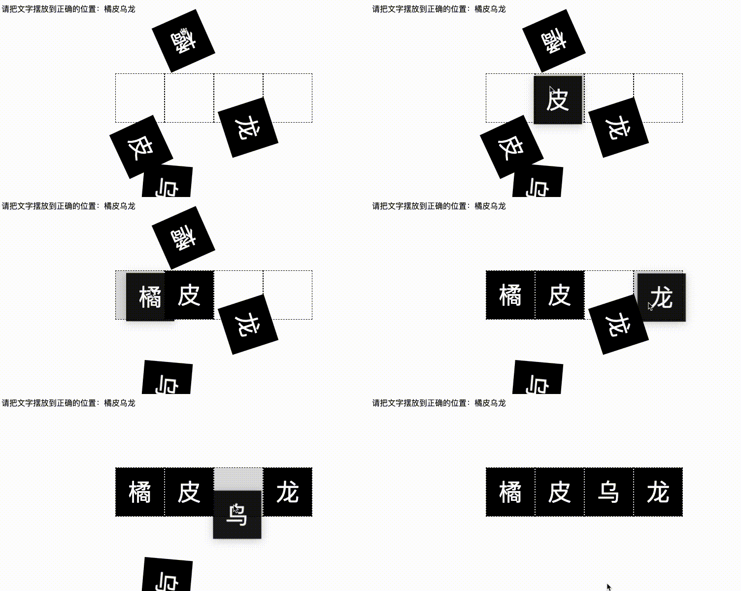
完整的 DEMO,你也可以戳这里 CodePen Demo -- Pure CSS Spelling game
在上述的代码中,我们利用了 SASS 快速实现了不同块的文字的位置的随机摆放,增加一定的随机性。同时,利用 SASS 减少了一些重复性代码的工作量。
原文地址:https://www.cnblogs.com/coco1s/p/16615333.html
作者:ChokCoco
更多编程相关知识,请访问:编程视频!!
The above is the detailed content of It turns out that jigsaw puzzles can also be realized using pure CSS!. For more information, please follow other related articles on the PHP Chinese website!