


This article will introduce to you how to use CSS to achieve an interesting mouse-following 3D rotation effect, making the interaction more vivid. I hope it will be helpful to everyone!

Today, a group of friends asked a question, how to implement the mouse following interaction effect as shown below:
A brief analysis shows that this interactive effect mainly has two cores:
With the help of CSS 3D capabilities
The rotation of elements requires and Combined with the movement of the mouse
This article will describe how to use pure CSS to achieve similar interactive effects, and how to quickly restore the above effects by binding mouse events with JavaScript. [Recommended learning:css video tutorial]
How to implement it without JavaScript, just CSS What about a similar 3D rotation effect?
A little trick calledpositive and negative rotation cancellationorpositive and negative rotation cancellationwill be used here. Well, the name is very strange, it seems like a mathematical concept.
In animation, rotation is a very commonly used attribute.
{ transform: rotate(90deg); }
What will happen if we add rotation in different directions to elements at different levels?
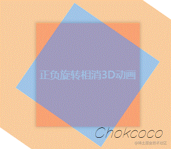
First assume the scenario, we have such a layer of HTML structure:
正负旋转相消3D动画
The style is as follows:

.contentis our main content. Okay, now imagine that if the parent element.rotateperforms a forward linear 360° rotation, the outermost parent element.reverseRotateWhat will be the effect of reverse linear 360° rotation?
The CSS code is as follows:
.rotate { animation: rotate 5s linear infinite; } .reverseRotate { animation: reverseRotate 5s linear infinite; } @keyframes rotate { 100% { transform: rotate(360deg); } } @keyframes reverseRotate { 100% { transform: rotate(-360deg); } }
We can get such an animation (note that the picture below is a GIF, not a PNG):

magic! Because one rotates forward and the other reversely, and the easing function is the same, the entire.contentstill looks stationary! Note that it is very important that the entire.contentis still.
Some readers will curse when they see this. Author, you are a retarded person. If you stop, won’t there be no animation? Where did you get your animation skills?
Don’t worry! Although it looks stationary, both elements of the ancestor are actually rotating! This may appear to be a calm effect, but underneath it is actually an undercurrent. Using the developer tools to select the outermost ancestor element is like this:
In this case, let’s continue to think about it. If I add some other elements to a parent element that is rotated, What will be the effect of the animation? It’s exciting to think about.
First, let’s add CSS 3D transformation to these elements:
div { transform-style: preserve-3d; perspective: 100px; }
Then, try to modify the above rotation animation and add an additional rotateX to the inner rotation:
@keyframes rotate { 0% { transform: rotateX(0deg) rotateZ(0deg); } 50% { transform: rotateX(40deg) rotateZ(180deg); } 100% { transform: rotateX(0deg) rotateZ(360deg); } }
The effect is as follows:
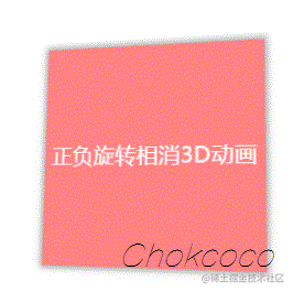
Wow, you need to understand it carefully here. Since the content.contentlayer is static but actually the two outer layers are rotating, by setting additionalrotateX(40deg), it is equivalent to superimposing one more animation. Since The forward and reverse rotations are offset, and the entire animation can only see the rotatedrotateX(40deg)animation, which produces the above effect.
In this way, without JavaScript intervention, we simulate the 3D effect shown in the title picture. Of course, this alone is not enough to link with the user. If it must be combined with mouse movement, we will need some assistance from JavaScript.
Our goal is to achieve such an animation effect:
Here, we actually have two core elements:
Mouse activity area
The rotating object itself
The movement of the mouse within themouse active areawill affect the3D rotation of the rotating object itself, and the direction of rotation can actually be decomposed into the X-axis direction and the Y-axis direction. .
Let’s take a look, assuming our HTML structure is as follows:
Get such a graphic:

这里,body的范围就是整个鼠标可活动区域,也是我们添加鼠标的mousemove事件的宿主 target,而#element就是需要跟随鼠标一起转动的旋转物体本身。
因为整个效果是需要基于 CSS 3D 的,我们首先加上简单的 CSS 3D 效果:
body { width: 100vw; height: 100vh; transform-style: preserve-3d; perspective: 500px; } div { width: 200px; height: 200px; background: #000; transform-style: preserve-3d; }
效果如下:
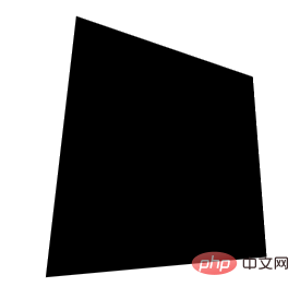
没有什么不一样。这是因为还没有添加任何的 3D 变换,我们给元素添加 X、Y 两个方向的rotate()试一下(注意,这里默认的旋转圆心即是元素中心):
div { transform: rotateX(15deg) rotateY(30deg); }
效果如下,是有那么点意思了:
好,接下来,我们的目标就是通过结合 mouseover 事件,让元素动起来。
当然,为了更加容易理解,我们把动画拆分为 X、Y 两个方向上的移动。首先看 X 方向上的移动:
这里,我们需要以元素的中心为界:
当鼠标在中心右侧连续移动,元素绕 Y 轴移动,并且值从 0 开始,越来越大,范围为(0, +∞)deg
反之,当鼠标在中心左侧连续移动,元素绕 Y 轴移动,并且值从 0 开始,越来越小,范围为(-∞, 0)deg
这样,我们可以得到这样一个公式:
rotateY = (鼠标 x 坐标 - 元素左上角 x 坐标 - 元素宽度的一半)deg
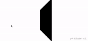
通过绑定 onmousemove 事件,我们尝试一下:
const mouseOverContainer = document.getElementsByTagName("body")[0]; const element = document.getElementById("element"); mouseOverContainer.onmousemove = function(e) { let box = element.getBoundingClientRect(); let calcY = e.clientX - box.x - (box.width / 2); element.style.transform = "rotateY(" + calcY + "deg) "; }
效果如下:
好吧,旋转的太夸张了,因此,我们需要加一个倍数进行控制:
const multiple = 20; const mouseOverContainer = document.getElementsByTagName("body")[0]; const element = document.getElementById("element"); mouseOverContainer.onmousemove = function(e) { let box = element.getBoundingClientRect(); let calcY = (e.clientX - box.x - (box.width / 2)) / multiple; element.style.transform = "rotateY(" + calcY + "deg) "; }
通过一个倍数约束后,效果好了不少:
同理,我们利用上述的方式,同样可以控制 Y 方向上的移动:
const multiple = 20; const mouseOverContainer = document.getElementsByTagName("body")[0]; const element = document.getElementById("element"); mouseOverContainer.onmousemove = function(e) { let box = element.getBoundingClientRect(); let calcX = (e.clientY - box.y - (box.height / 2)) / multiple; element.style.transform = "rotateX(" + calcX + "deg) "; };
效果如下:
当然,在这里,我们会发现方向是元素运动的方向是反的,所以需要做一下取反处理,修改下calcX的值,乘以一个-1即可:
let calcX = (e.clientY - box.y - (box.height / 2)) / multiple * -1;
OK,到这里,我们只需要把上述的结果合并一下即可,同时,上面我们使用的是onmousemove触发每一次动画移动。现代 Web 动画中,我们更倾向于使用requestAnimationFrame去优化我们的动画,确保每一帧渲染一次动画即可。
完整的改造后的代码如下:
const multiple = 20; const mouseOverContainer = document.getElementsByTagName("body")[0]; const element = document.getElementById("element"); function transformElement(x, y) { let box = element.getBoundingClientRect(); let calcX = -(y - box.y - (box.height / 2)) / multiple; let calcY = (x - box.x - (box.width / 2)) / multiple; element.style.transform = "rotateX("+ calcX +"deg) " + "rotateY("+ calcY +"deg)"; } mouseOverContainer.addEventListener('mousemove', (e) => { window.requestAnimationFrame(function(){ transformElement(e.clientX, e.clientY); }); });
至此,我们就能简单的实现题图所示的鼠标跟随 3D 旋转动效:
现在,还有最后一个问题,就是当我们的鼠标离开活动区域时,元素的 transform 将停留在最后一帧,正确的表现应该是复原到原状。因此,我们还需要添加一些事件监听做到元素的平滑复位。
通过一个mouseleave事件配合元素的transition即可。
div { // 与上述保持一致... transition: all .1s; }
mouseOverContainer.addEventListener('mouseleave', (e) => { window.requestAnimationFrame(function(){ element.style.transform = "rotateX(0) rotateY(0)"; }); });
至此,我们就可以完美的实现平滑出入,整体效果最终如下:
完整的代码,你可以戳这里:CodePen Demo -- CSS 3D Rotate With Mouse Move
(学习视频分享:web前端)
The above is the detailed content of Cleverly use CSS to realize the mouse-following 3D rotation effect, making the interaction more vivid!. For more information, please follow other related articles on the PHP Chinese website!


![[Web front-end] Node.js quick start](https://img.php.cn/upload/course/000/000/067/662b5d34ba7c0227.png)


