


Let's talk about how to use SVG to achieve image mosaic effect

How to use SVG to achieve image mosaic effect without using Javascript? The following article will give you a detailed understanding, I hope it will be helpful to you!
I forwarded an article by my friend Vajoy on the public account before - Skillfully use CSS to stylize the image mosaic.
The core is to use an interesting property in CSS--image-rendering, which can be used to set the image scaling algorithm. [Recommended learning: css video tutorial]
What is image-rendering?
CSS property image-rendering is used to set the image scaling algorithm. It applies to the element itself, to images in other attributes of the element, and to child elements.
The syntax is relatively simple:
{
    image-rendering: auto;              // 默认值,使用双线性(bilinear)算法进行重新采样(高质量)
    image-rendering: smooth;         // 使用能最大化图像客观观感的算法来缩放图像。让照片更“平滑”
    image-rendering: crisp-edges;  // 使用可有效保留对比度和图像中的边缘的算法来对图像进行缩放
    image-rendering: pixelated;      // 放大图像时, 使用最近邻居算法,因此,图像看着像是由大块像素组成的
}Among them, image-rendering: pixelated is more interesting and can mosaic a low-precision image.
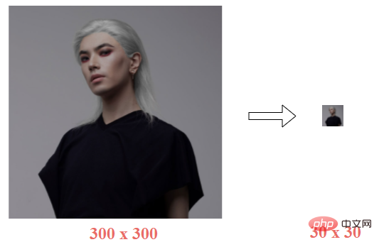
For example, suppose we have an image of 300px x 300px, and we let it be converted into 30px x 30px:
Let’s enlarge the distorted image to 300px x 300px:
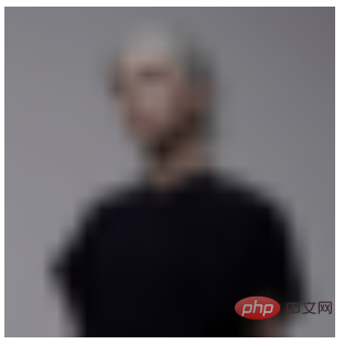
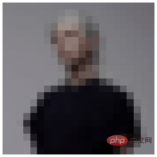
image-rendering: pixelated, you can get a mosaic image:
<img src="pic.jpeg?30x30" />
img {
    width: 300px;
    height: 300px;
    image-rendering: pixelated
}
##image-rendering: pixelated<strong></strong> Limitations of achieving mosaic effectOK, then why do you need to reduce and then enlarge first, and then use
image-rendering: pixelated? Let's make a comparison and set image-rendering: pixelated directly to the original image:
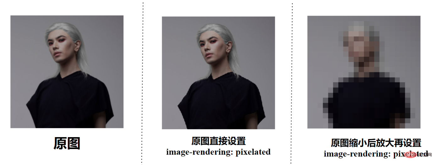 Set
Set
will only make the image more jagged, but will not directly produce a mosaic effect. This is also consistent with the description of
. When enlarging the image, the nearest neighbor algorithm is used, so the image looks like it is composed of large blocks of pixels. Only based on the enlarged and blurred image can we use
to get a mosaic picture!
So, suppose we only have a clear original image and want to use CSS to get a mosaic effect. Is it feasible? Following this idea, we can think:
Can we use CSS to reduce the image and then enlarge it, and then use
image-rendering: pixelated?
. So, if you want to get a blurry image when there is only one original image, you have to turn to Canvas, which is a little troublesome. We just want a mosaic effect.
SVG filter overlay to achieve mosaic effectThis can lead to today’s protagonist,
SVG filter, using several layers of SVG filters By superposing, you can actually achieve a mosaic effect filter very easily. And, SVG filters can be easily introduced through CSS filters.
The code is actually very simple. SVG defines a filter and uses the superposition effect of multiple layers of filters to achieve a mosaic effect. Then, it is introduced through CSS filter and can be applied to any element:
<img src="任意无需缩放的原图.png" alt="">
<svg>
  <filter id="pixelate" x="0" y="0">
    <feFlood x="4" y="4" height="2" width="2"/>
    <feComposite width="8" height="8"/>
    <feTile result="a"/>
    <feComposite in="SourceGraphic" in2="a" operator="in"/>
    <feMorphology operator="dilate"radius="5"/>
  </filter>
</svg>
img {
    width: 300px;
    height: 300px;
    filter: url(#pixelate);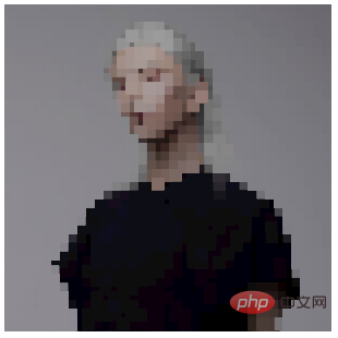
}In this way, we get a mosaic effect:
 If you just want to use this effect, you don’t even need to understand the entire SVG
<ul>
<li><a href="https://github.com/chokcoco/cnblogsArticle/issues/27" target="_blank">interesting! Powerful SVG filters</a></li>
<li><a href="https://github.com/chokcoco/iCSS/issues/106" target="_blank">Interesting! The generation scheme of irregular borders</a></li>
<li><a href="https://github.com/chokcoco/iCSS/issues/107" target="_blank">Shocking! Can you use SVG filters to create emoticons? </a></li>
</ul>
<h2 id="strong-Limitations-of-CSS-SVG-to-implement-mosaic-strong"><strong>Limitations of CSS/SVG to implement mosaic</strong></h2>
<p>Of course, the limitation of CSS/SVG filter to implement mosaic is that if you don’t want to If the user can see the original image, then using this method directly on the client is equivalent to directly exposing the original image. </p>
<p>Because the CSS/SVG filter method is to mosaic images on the front end, and the original image is required. </p>
<p>Of course, using the two above-mentioned image mosaic techniques, we can still use it to create some simple interactive effects, like this: </p>
<p><img src="/static/imghw/default1.png" data-src="https://img.php.cn/upload/article/000/000/024/deade6439637a00749d538cc6e2a383e-5.gif" class="lazy" alt="" loading="lazy"></p>
<p> You can find all the codes for the above DEMO and SVG filters in these two DEMOs: </p>
<ul>
<li><a href="https://codepen.io/Chokcoco/pen/gOXEJJE" target="_blank">CodePen Demo - image-rendering pixelated application</a></li>
<li><a href="https://codepen.io/Chokcoco/pen/JjOVjop" target="_blank" textvalue="SVG Pixel Filter">SVG Pixel Filter</a></li>
</ul>
<blockquote>
<p>Original address: https://www.cnblogs.com/coco1s/p/16134088.html<br></p>
<p>Author: ChokCoco</p>
</blockquote>
<p> (Learning video sharing: <a href="//m.sbmmt.com/course/list/1.html" target="_blank" textvalue="web前端">web front-end</a>)</p>
The above is the detailed content of Let's talk about how to use SVG to achieve image mosaic effect. For more information, please follow other related articles on the PHP Chinese website!

Hot AI Tools

Undresser.AI Undress
AI-powered app for creating realistic nude photos

AI Clothes Remover
Online AI tool for removing clothes from photos.

Undress AI Tool
Undress images for free

Clothoff.io
AI clothes remover

AI Hentai Generator
Generate AI Hentai for free.

Hot Article
Hot Tools

Notepad++7.3.1
Easy-to-use and free code editor

SublimeText3 Chinese version
Chinese version, very easy to use

Zend Studio 13.0.1
Powerful PHP integrated development environment

Dreamweaver CS6
Visual web development tools

SublimeText3 Mac version
God-level code editing software (SublimeText3)
Hot Topics
 1378
1378
 52
52

 Let's talk about how to use SVG to achieve image mosaic effect
Sep 01, 2022 am 11:05 AM
Let's talk about how to use SVG to achieve image mosaic effect
Sep 01, 2022 am 11:05 AM
How to use SVG to achieve image mosaic effect without using Javascript? The following article will give you a detailed understanding, I hope it will be helpful to you!
 How to convert svg to jpg format
Nov 24, 2023 am 09:50 AM
How to convert svg to jpg format
Nov 24, 2023 am 09:50 AM
svg can be converted to jpg format by using image processing software, using online conversion tools, and using the Python image processing library. Detailed introduction: 1. Image processing software includes Adobe Illustrator, Inkscape and GIMP; 2. Online conversion tools include CloudConvert, Zamzar, Online Convert, etc.; 3. Python image processing library, etc.
 An in-depth analysis of how to use svg icons in vue3+vite
Apr 28, 2022 am 10:48 AM
An in-depth analysis of how to use svg icons in vue3+vite
Apr 28, 2022 am 10:48 AM
svg images are widely used in projects. The following article will introduce how to use svg icons in vue3 + vite. I hope it will be helpful to everyone!
 VUE3 introductory tutorial: Use Vue.js plug-in to play with SVG
Jun 16, 2023 am 09:48 AM
VUE3 introductory tutorial: Use Vue.js plug-in to play with SVG
Jun 16, 2023 am 09:48 AM
With the continuous development of modern Web front-end development, more and more technologies are widely used in actual development. Among them, Vue.js is currently one of the most popular JavaScript frameworks. It is based on the MVVM model and provides a rich API and component library, making it easier to develop responsive, reusable, and efficient web applications. The latest version of Vue.js3 has better performance and richer features than the old version, which has attracted widespread attention and research. This article will introduce to you a
 Detailed explanation of using SVG to add logo to favicon
Sep 07, 2022 am 10:30 AM
Detailed explanation of using SVG to add logo to favicon
Sep 07, 2022 am 10:30 AM
How to add logo to favicon using SVG? The following article will introduce to you how to use SVG to generate favicon with logo. I hope it will be helpful to you!
 How to use svg method in vue3+vite2
May 11, 2023 pm 05:55 PM
How to use svg method in vue3+vite2
May 11, 2023 pm 05:55 PM
1. Install vite-plugin-svg-icons. You also need to install fast-glob related dependencies. Otherwise, when vite runs npmrundev, it will report the Cannotfindmodule'fast-glob' error npmifast-glob@3.x-Dnpmivite-plugin-svg. -icons@2.x-D 2. Create a new component index.vueimport{computed}from'vue';cons under src/components/svgIcon
 How to use svg in vue3+vue-cli4
May 11, 2023 pm 05:58 PM
How to use svg in vue3+vue-cli4
May 11, 2023 pm 05:58 PM
1. Install svg-sprite-loadernpminstallsvg-sprite-loader--save-dev 2. Create a new component under src/components/svgIcon index.vueimport{computed}from"@vue/reactivity";exportdefault{name:"baseSvgIcon", props:{iconClass:{type:String},className:{type:String},},setup
 Draw SVG files on HTML5 canvas
Sep 15, 2023 pm 03:09 PM
Draw SVG files on HTML5 canvas
Sep 15, 2023 pm 03:09 PM
To draw HTMLImageElements on a canvas element, use the drawImage() method. This method defines an Image variable using src="mySVG.svg" and uses drawImage when loading. varmyImg=newImage();myImg.onload=function(){ ctx.drawImage(myImg,0,0);}img.src="http://www.example.com/files/sample.svg";
