In the previous article "Excel chart learning through cases, talk about how to draw a graduated cylinder column chart", we learned about the method of drawing a graduated cylinder column chart. Today we will share another Excel chart tutorial and talk about a method to make Excel charts move like a web page. As long as you enter keywords, the table data and charts will automatically change. Especially when the company's data needs to be divided into departments, it is simply too confusing. Convenient!

When we browse the web, the web page will display different content according to our choices. Have you ever thought about making the excel table "enter keywords, What about a dynamic table that automatically displays corresponding data and charts? For example, when we want to make salary statistics, we use department as a keyword. Every time we enter a department name, the salary details and statistical charts corresponding to that department will be automatically displayed.
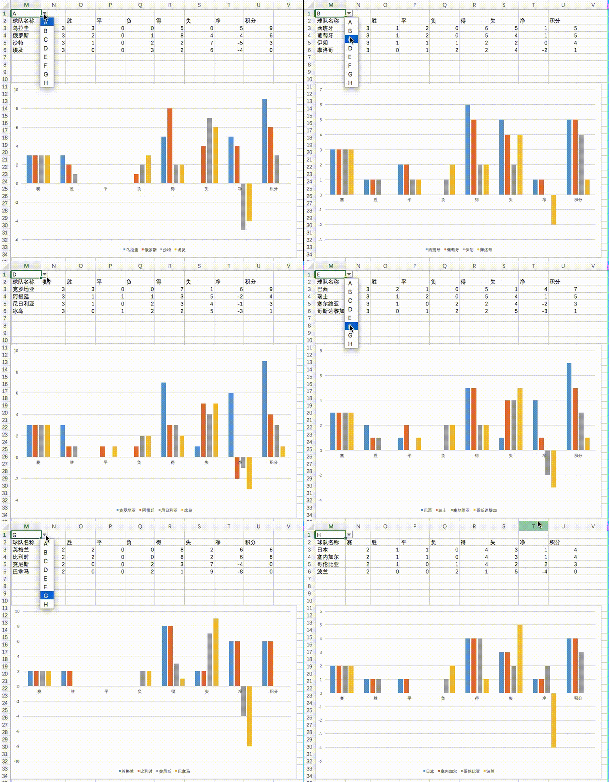
The World Cup is very popular recently. Let’s take the World Cup statistics as an example. The final effect is as follows:
1. Learning objectives
A dynamic chart is a chart that displays different information in real time based on our choices. This time we used the results of each team in the World Cup group stage as data to create dynamic charts. The original data is as follows:
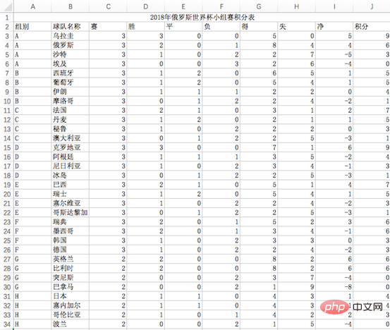
The conditions that need to be met to achieve the goal are:
1. There is a drop-down box with 8 options for groups A-H;
2. Select any option to automatically display the data of the group , and automatically draw the corresponding column chart;
2. Production method
Processing Original data
After we obtain the data, we generally need to perform certain processing on the original data before it can be used as mapping data.
As shown in the picture above, insert a new column before column A to distinguish different teams in the same group. Enter the formula in cell A3:
=B3&COUNTIF(B$2:B3,B3). Double-click to fill down and you will get the result shown above.
1, COUNTTF(counting area, counting condition):
If the cells in the counting area meet the counting condition, add 1 . Analyzing the formula in cell A3, in the area B2:B3, the number of occurrences of the content (letter A) in cell B3 is returned. It can be counted once, so COUNTIF returns 1;
2. Why is it (B$2:B3,B3), not (B2:B3, B3)
We first change the formula to =B3&COUNTIF(B2:B3,B3). The final result presented in column A is as follows:

At this time, you can see that in the data in column A, only the first two teams in each group have the correct results. This is because there is no absolute reference to the cells in the counting area. When filling in the formula downwards, the counting area will automatically change the row numbers, in order B2:B3, B3:B4, B4:B5..., you will find that all counts at this time The ranges are all 2 cells, so the largest number in column A is 2.
If you want the count to accumulate, you need to lock the row number of the starting cell of the counting area, so the counting area in the formula is B$2:B3. When you drag the formula downward, the order is B$2:B3, B $2:B4, B$2:B5...
3, & The function of the symbol
& is to change the content of cell B3 Spliced together with the content returned by the COUNTTF function. For example, in the formula of cell A3, the content of B3 is "A", and the COUNTIF function returns 1, so the final value is "A1".
3. Create a drop-down box
Select cell M1, click "Data" on the menu bar, click "Data Verification", and in the pop-up Click "Data Verification" in the window

In the pop-up window, set "Allow" to the list and "Source" to "A,B,C,D,E,F ,G,H", separated by commas.

Select cell M1, and a drop-down box will appear

4. Production assistance Data
As shown below, we use area M2:U6 as the auxiliary data area, which is also the real cartographic data. Creating an auxiliary data area is also very simple. Directly copy the contents of cells C2-K2 in the source data to the cell area M2-U2, and then enter the formula in cell M3:
=IFERROR(VLOOKUP($M$1&ROW(A1),$A$3:$K$34,3 COLUMN(A1)-COLUMN($A1),0),""), right Pull down to get the table below.

Formula analysis:
IFERROR(VLOOKUP($M$1&ROW(A1),$A$3:$K$34,3 COLUMN( A1)-COLUMN($A1),0),"")
1.COLUMN (specified cell/cell range) function
its The function is to return the column number of the specified cell or cell range. As above, COLUMN(A1) will return 1;
2.ROW (specified cell/cell range) function
its function is to return the specified cell or Row number of the cell range. As above, ROW(A1) will return 1;
3.VLOOKUP (search value, search area, return value column number, 0) function
is in the M3 unit In the grid, to get the first team name of Group A, the first parameter is $M$1&ROW(A1), and the search value A1 is obtained, and the second parameter is $A$3:$ K$34 means searching in the cell range A3-K34 of the source data. The third parameter is 3 COLUMN(A1)-COLUMN($A1). Since our formula needs to be pulled to the right, So we need to find some mathematical rules. Starting from cell M3, the column numbers that need to be returned in sequence are 3 0, 3 1, 3 2, 3 3..., so the third parameter of the formula in cell M3 is
3 COLUMN(A1)-COLUMN(A1). At this time, drag one cell to the right, and the third parameter of the formula in cell N3 becomes
3 COLUMN(B1) -COLUMN(B1), at this time we have to find a way to subtract the two column numbers after 3 to get 1. Use the B1 column number minus the A1 column number to get 1, so we need to reference the second COLUMN The cell column number is locked, so the third parameter of the final formula is 3 COLUMN(A1)-COLUMN($A1).
4.IFERROR (return value when correct, return value when error) function
Its function is to define the response when an error occurs. Returns the first parameter if correct and the second parameter if incorrect.
5. Make a column chart
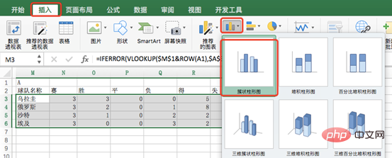
Select the data M3:U6, click the insert option, select the column chart, modify the chart title, and then The performance bar chart of Group A teams can be obtained as follows.

Okay, that’s it for today’s tutorial. Have you finished it? Quickly try to modify the content of cell M1 to B, and see if the data area M3:U6 will change, and whether the column chart will change automatically. If it becomes like the following, it means that the dynamic chart you made is successful~
Related learning recommendations: excel tutorial
The above is the detailed content of Learning Excel Charts: How to Make Charts Move Like Web Pages. For more information, please follow other related articles on the PHP Chinese website!
 Compare the similarities and differences between two columns of data in excel
 excel duplicate item filter color
 How to copy an Excel table to make it the same size as the original
 Excel table slash divided into two
 Excel diagonal header is divided into two
 Absolute reference input method
 java export excel
 Excel input value is illegal


