How to draw lion animation using CSS? The following article will take you step by step to draw a cute cartoon lion animation using CSS. I hope it will be helpful to you.

In this issue, we are going to use pure CSS to draw a cute and cute cartoon lion. Through this chestnut, we can become familiar with more CSS drawing techniques. I believe that in the future interface More comfortable in drawing tasks. [Recommended learning: css video tutorial]
Basic drawing
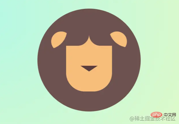
Let’s first look at the parts of Kangkang’s lion:
Through the above view, this lion is composed of ears eyes nose beard mouth mane front legs claws tail these parts. I believe it is not difficult for everyone to see that many parts can be completed by simply making rectangles and rounded corners. For example, eyes are formed by stacking two circles. You can see the code demonstration above for details. I won’t go into too much detail about these basic graphics here.
Next, let’s talk about some graphics that are difficult to draw in detail.
EAR
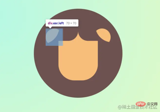
You can see that it looks like a semicircle, like petals. It is definitely not easy to do it with conventional methods, but it can be done by clip-path attribute, which uses clipping to create a displayable area of the element. Parts within the area are displayed and parts outside the area are hidden. To draw the ears, we use this area to crop. For the ellipse method of elliptical cropping, the two passed in represent the radius of the cropping, and the two values after at represent the cropping. The coordinates of the x and y axes.
.ear {
    width: 70px;
    height: 70px;
    position: absolute;
    top: 10px;
    background-color: var(--skin-color);
    z-index: 9;
    border-radius: 40px;
    clip-path: ellipse(100% 100% at -20% -10%);
}
Similarly, the body similar to a semicircle is also achieved through clip-path: ellipse. Of course, he can cut more than this. Any graphics can be said to be very powerful. Nose # Set to 0, simply use the
attribute to complete, set border-width to replace the width and height of the block, but the inside of the block is made up of four small triangles It is a rectangle, and because the arrangement is in the order of top, right, bottom, and left, a triangle can be realized by assigning a color to one of the corners.
.nose {
    width: 0px;
    height: 0px;
    border-width: 20px 30px;
    border-style: solid;
    border-color: var(--eye-color) transparent transparent transparent;
    position: absolute;
    left: 50%;
    top: 50%;
    transform: translate(-50%, -50%);
    margin-top: 40px;
    z-index: 3;
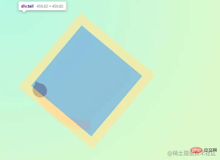
}TailThe tail is mainly implemented using border
border-radius: 40% 50% to give it a curved feel and he was done.
.tail {
    width: 320px;
    height: 320px;
    position: absolute;
    top: -137px;
    border-style: solid;
    border-width: 30px;
    border-radius: 40% 50%;
    border-color: transparent var(--tail-color) transparent transparent;
    transform: rotate(125deg);
    left: -180px;
}Animation production
wagging tail
The power of the tail originates from the root of the tail, so a slight swinging rotation animation needs to be performed from the root. Therefore, we use the transform-origin attribute, which allows you to change the origin of an element's transformation, such as , when the root exerts force, set it directly to transform-origin: 50% 100% or it can be written as
transform-origin: center bottom. The first parameter represents the offset value that defines the deformation center from the left side of the box model.
keywordvalue
| 0% | |
|---|---|
center | ##50% |
| |
| keywordvalue |
##top
##50% | |
100% | <p>后面的动画微微的旋转偏移就看下方的代码块了,非常简单只需要微调一些角度和偏移即可。这里再多补充一句,<code>transform 的变换必须是盒模型定位的元素哦。.tail {
// ...
animation: 1s wagging ease-in-out infinite alternate forwards;
transform-origin: 50% 100%;
}
@keyframes wagging {
0% {
transform: rotate(125deg) translateX(0) translateY(0px);
}
100% {
transform: rotate(130deg) translateX(15px) translateY(-15px);
}
}Copy after login
眨眼睛 眼睛一眨一眨会显得狮子会更生动,但是如果通过缩小高度做动画实现的画,会显得非常难看因为连眼白眼珠都会压缩变形。所以我们依然是通过 .eye {
// ...
animation: 4s blinking infinite forwards;
overflow: hidden;
}
@keyframes blinking {
0%,
40%,
80% {
clip-path: ellipse(100% 100% at 50% 48%);
}
60%,
100% {
clip-path: ellipse(100% 2% at 50% 48%);
}
}Copy after login 看简简单单的几段css代码就让一只灵动乖巧的狮子就坐在你的面前,赶紧尝试一下吧~ (学习视频分享:web前端) The above is the detailed content of Take you step by step to draw a cute cartoon lion animation using CSS. For more information, please follow other related articles on the PHP Chinese website!
Previous article:Web front-end written test question bank CSS chapter
Next article:How to change the color of the first letter in css3
Statement of this Website
The content of this article is voluntarily contributed by netizens, and the copyright belongs to the original author. This site does not assume corresponding legal responsibility. If you find any content suspected of plagiarism or infringement, please contact admin@php.cn
Latest Articles by Author
Latest Issues
Related Topics
More>
|