
You can also create pixel creative animations using CSS! The following article will introduce to you how to use CSS box-shadow to create pixel creative animation. It has certain reference value. Friends in need can refer to it. I hope it will be helpful to everyone.

In this issue we are going to use the box-shadow attribute in CSS3 to paint. I believe everyone is familiar with the box-shadow attribute. It is mainly used in the frame of elements. Add a shadow effect to the image, but have you ever thought about simply using it to complete the drawing of the image? So, right away, we will use the box-shadow attribute to draw a pixel animation with you - a pixel light bulb. [Recommended learning: css video tutorial]
What we want to do is pixel painting, which is composed of small pixel blocks. . Since we want to use box-shadow to implement drawing, let's first talk about what parameters can be passed to box-shadow so that it can implement a small pixel block.
Usually when we use box-shadow we often pass in 5 parameters, namely x offset, y offset, shadow blur radius, shadow diffusion radius, shadow color, and then Next, we draw a 10x10 pixel rectangular projection (note: here width and height determine how big a pixel is when the pixel painting is displayed).
.box{
    width: 10px;
    height: 10px;
    background-color: red;
    /* x偏移量 | y偏移量 | 阴影模糊半径 | 阴影扩散半径 | 阴影颜色 */
    box-shadow: 10px 10px 10px 10px black;
}But our intention in drawing pixel art is to cancel its shadow, you can use the optional parameter inset, if inset is not specified , the default shadow is outside the border, that is, the shadow spreads outward.
Using the inset keyword will cause the shadow to fall inside the box, making it look like the content is pushed down. At this time, the shadow will be within the border (even a transparent border), above the background, and below the content.
Next, add inset to draw this rectangle again to see the changes.
.box{
    width: 10px;
    height: 10px;
    background-color: red;
    /* x偏移量 | y偏移量 | 阴影模糊半径 | 阴影扩散半径 | 阴影颜色 | 阴影向内扩散 */
    box-shadow: 10px 10px 10px 10px black inset;
}Such a small pixel block appears, and covers the original red background, but success is alsoinset Failure is alsoinset, precisely because it can suppress the box, but is also limited by the size of the box and cannot arrange a large number of pixel blocks well, so this approach was abandoned.
Now let’s change our mind. Since we don’t want shadow display, then we simply don’t need to pass in the information related to the shadow. So, we only need to pass in the x offset and y offset. Shadow color can also achieve this small block of pixels.
.box{
    width: 10px;
    height: 10px;
    background-color: red;
    /* x偏移量 | y偏移量 | 阴影颜色 */
    box-shadow: 10px 10px black;
}
See we also implemented a small pixel block but found another small problem.
.box{
    width: 10px;
    height: 10px;
    background-color: red;
    box-shadow:
        0px 0px black,
        10px 10px black,
        20px 20px black,
        30px 30px black,
        40px 40px black;
}When we inline, we will find that the pixel block at the origin cannot be covered because it is always on the lower layer. Even if the background of the main block becomes transparent, it cannot be covered. Yes, but we can be lucky because only one point is like this, so we can fill in the points of the main block and it will naturally solve the problem.
Then, we continue to connect box-shadow to draw the graphics, and we will find that a pixel painting is completed.

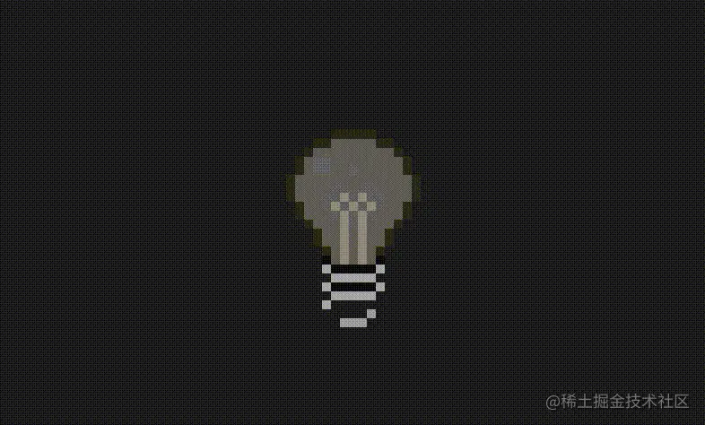
In the previous step we drew the shape of the light bulb, but we want it to be blinking. How does the effect come out in box-shadow? In fact, the most violent method is to draw another luminous effect and replace all the grids at intervals to achieve the luminous effect.
But what does the light bulb represent? It represents inspiration. How can we use violent means to draw it? The size of the style script is very large and needs to be more elegant.
So, I used scss to extract a lot of things from the code and disassemble the light bulb part by part, such as:
$size:10px;
$light-color:rgb(75,73,81);
$wick-color:rgb(130,129,136);
$line-color:rgb(12,12,12);
$bottom-color:rgb(153,152,157);
$active-bottom-color:rgb(185,182,193);
$active-light-color:rgb(241,218,126);
$active-wick-color:rgb(255,236,201);

$light-bg:
    -1*$size 1*$size 0 $light-color,
    1*$size 1*$size 0 $light-color,
    // ...
   -3*$size 5*$size 0 $light-color;

$wick-active:
  -1*$size 0 0 rgb(248,203,58),
   // ...
   1*$size 7*$size 0 rgb(246,198,65);

$wick:
  -1*$size 0 0 $wick-color,
   // ...
  1*$size 7*$size 0 $wick-color;

// ...more最后,我们只要把拆出来的这几部分重新组合起来,就又变成灯泡了。当然闪烁动画也是同样拼接组合起来。
.light{
  width:$size;
  height:$size;
  position: absolute;
  left:50%;
  top:50%;
  transform: translate(-50%,-$size*2);
  background-color:$light-color;
  box-shadow:
    $line,
    $wick,
    $light-bg,
    $light-bottom;
   animation:flash 2s linear infinite;
}

@keyframes flash {
  0%,48%,58%,78%,94%,100%{
    background-color:$light-color;
    box-shadow:
      $line,
      $wick,
      $light-bg,
      $light-bottom;
  }
  50%,80%{
    background-color:$active-wick-color;
     box-shadow:
      $line-active,
      $wick-active,
      $light-bg-active,
      $light-bottom-active;
  }
}
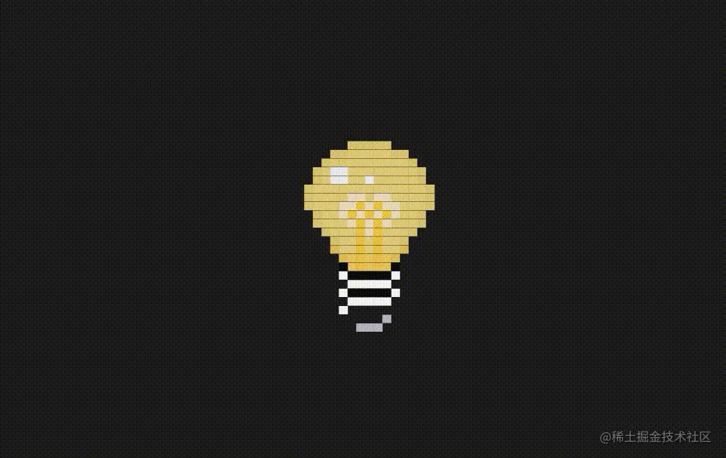
最后,我们还要加入一个手动点亮的效果也是非常的简单。就是利用 checkbox 当选中时的 checked 伪类来找到 div.light 触发点亮效果,当然其样式依然需要你提前绘制拼接好。
.point{
    &:checked + .light{
        animation:none;
        background-color:$active-wick-color;
        box-shadow:
            $line-active,
            $wick-active,
            $light-bg-active,
            $light-bottom-active,
            $light-star;
    }
}
现在看绘制的像素画,我们会发现其实并不难,只是想好要创作出什么画面,然后机械性的用 box-shadow 绘制一个个的像素点,非常的消耗时间和精力。这里推荐我之前制作的一款在线编辑像素画的软件——PXDragon ,虽然鸽了很久但是目前还是可以完成一些简单像素画绘制的,也可以导入图片自动生成像素画,同时可以导出 css 和 scss 代码来抹除很多机械性费时费力的绘制任务,如果想尝试此类展示可以一试,把创意用于构思构图而非机械劳动。
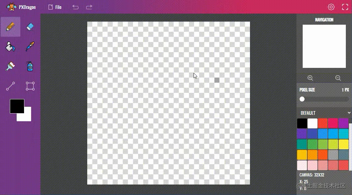
(学习视频分享:web前端)
The above is the detailed content of Let's talk about how to use CSS box-shadow to create pixel creative animations. For more information, please follow other related articles on the PHP Chinese website!