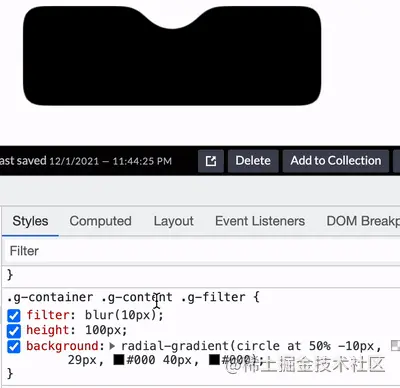
How to use CSS to achieve concave and smooth rounded corners? The following article will show you how to skillfully use CSS filters to achieve concave and smooth rounded corners. I hope it will be helpful to you!

One day, the group members raised a question in the group, how to use CSS to achieve the following layout:

In the CSS world, if it is just the following effects, it is still very easy to achieve:

Once the rounded corners or wave effects are involved, the difficulty will increase. a lot of.
It is actually quite troublesome to achieve this kind of continuous smooth curve. Of course, it is not completely impossible. This article will show you some possible ways to use CSS to achieve the above-mentioned concave and smooth rounded corners effect. [Recommended learning: css video tutorial]
The first method is relatively stupid. We can use the connection of multiple circles to achieve this.
First, we will implement a rectangle with a rectangle dug out inside:
<div></div>
The core CSS code is as follows:
div {
    height: 200px;
    background:
        linear-gradient(90deg, #9c27b0, #9c27b0 110px, transparent 110px, transparent 190px, #9c27b0 190px),
        linear-gradient(90deg, #9c27b0, #9c27b0);
    background-size: 100% 20px, 100% 100%;
    background-position: 0 0, 0 20px;
    background-repeat: no-repeat;
}Get such a graphic (there are many ways to implement it, Here I am using gradients):
Next, I use pseudo elements to superimpose three circles, which is probably like this:
div {
    ...
    &::before {
        position: absolute;
        content: "";
        width: 40px;
        height: 40px;
        border-radius: 50%;
        background: #000;
        left: 90px;
        box-shadow: 40px 0 0 #000, 80px 0 0 #000;
    }
}Slightly modify the colors of the three circles, and we can get the following effect:
As you can see, this kind of effect through the three circles The effect achieved by superposition is not very good. It can only be said to be barely restored. If the background color is not a solid color, it will be confusing:
You can click here for the complete code Here: CodePen Demo - Smooth concave rounded corners
https://codepen.io/Chokcoco/pen/oNGgyeK
The following is this article The key point is to introduce a way to use filters to achieve this effect.
You may be surprised when you hear about filters, huh? This effect seems to have nothing to do with filters, right?
The following is the moment to witness the miracle.
First of all, we only need to implement such a graphic:
<div class="g-container">
    <div class="g-content">
        <div class="g-filter"></div>
    </div>
</div>.g-container {
position: relative;
width: 300px;
height: 100px;
.g-content {
height: 100px;
.g-filter {
height: 100px;
background: radial-gradient(circle at 50% -10px, transparent 0, transparent 39px, #000 40px, #000);
}
}
}Get such a simple graphic:
See this, definitely You may be wondering, why does this graphic need to be nested with 3 layers of divs? Wouldn't a div be enough?
is because we have to use the magical combination of filter: contrast() and filter: blur().
Let’s simply transform the above code and carefully observe the similarities and differences with the above CSS:
.g-container {
    position: relative;
    width: 300px;
    height: 100px;

    .g-content {
        height: 100px;
        filter: contrast(20);
        background-color: white;
        overflow: hidden;

        .g-filter {
            filter: blur(10px);
            height: 100px;
            background: radial-gradient(circle at 50% -10px, transparent 0, transparent 29px, #000 40px, #000);
        }
    }
}We added filter: contrast(20 ) and background-color: white, added filter: blur(10px) to .g-filter. The magic happened, we got such an effect:
 Use the contrast filter to remove the blurred edges of the Gaussian blur,
, Amazing. Get a more intuitive feeling through a Gif:
 There are several details to note here:
This layer needs to set the background and overflow: hidden (you can try to remove it yourself to see the effect)
At this layer, we can add a pseudo element to this layer to cover the four corners into right angles: <div class="code" style="position:relative; padding:0px; margin:0px;"><pre class="brush:js;toolbar:false;">.g-container {
&::before {
content: "";
position: absolute;
top: 0;
left: 0;
bottom: 0;
right: 0;
z-index: 1;
background: radial-gradient(circle at 50% -10px, transparent 0, transparent 60px, #000 60px, #000 0);
}
}</pre><div class="contentsignin">Copy after login</div></div>We can get that only the middle part is a concave rounded corner , the remaining four corners are right angles: <p></p>
<p><img src="https://img.php.cn/upload/image/580/955/635/164817512716894Lets%20talk%20about%20how%20to%20use%20CSS%20filters%20to%20achieve%20concave%20and%20smooth%20rounded%20corners." title="164817512716894Lets talk about how to use CSS filters to achieve concave and smooth rounded corners." alt="Lets talk about how to use CSS filters to achieve concave and smooth rounded corners."></p>You can click here for the complete code: CodePen Demo - Smooth concave rounded corners By filter<blockquote><p>https://codepen.io/Chokcoco/pen/JjroBPo</p></blockquote>
<p> Of course, due to the blur filter applied to the above smooth concave rounded corners, it is not recommended to place DOM inside. It is best to treat it as For background use, internal content can be superimposed on top of it in other ways. </p>
<blockquote>
<p> Regarding the magical fusion effect of <code>filter: contrast() and filter: blur(), you can click on this article to learn more - you Unknown CSS filter skills and details
https://github.com/chokcoco/iCSS/issues/30
implementation of this article There are several other ways to create concave smooth rounded corners. The essence is similar to the first method in this article. They are all superimposed deception methods and will not be listed one by one. The core purpose of this article is to introduce the second filter method.
Okay, this article ends here, I hope this article will be helpful to you :)
(Learning video sharing: web front-end)
The above is the detailed content of Let's talk about how to use CSS filters to achieve concave and smooth rounded corners.. For more information, please follow other related articles on the PHP Chinese website!