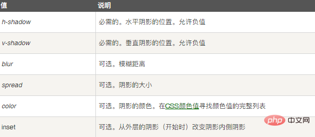
In CSS, you can use the "box-shadow" attribute to achieve the edge blur effect of the image. You only need to add the "box-shadow:0 0 blur distance shadow size #ffffff inset;" style to the image element.

The operating environment of this tutorial: Windows 7 system, CSS3&&HTML5 version, Dell G3 computer.
How to achieve image edge blur effect in css
We can achieve image edge blur effect through box-Shadow attribute.
The syntax of this attribute is as follows:
box-shadow: h-shadow v-shadow blur spread color inset;
Among them, the box-Shadow attribute adds one or more drop-down shadows to the box. This property is a comma-separated list of shades, each shade specified by 2-4 length values, an optional color value, and an optional inset keyword. The value for omitted length is 0.

Let’s take a look at it through an example. The example is as follows:
<!DOCTYPE html>
<html lang="en">
<head>
<meta charset="UTF-8">
<meta name="viewport" content="width=device-width, initial-scale=1.0">
<meta http-equiv="X-UA-Compatible" content="ie=edge">
<title>Document</title>
</head>
<body>
<style>
.img-edge-cover {
width: 180px;
height: 180px;
position: relative;
}
.img-edge-cover:after {
position: absolute;
content: '';
width: 100%;
height: 100%;
top: 0;
left: 0;
box-shadow:0 0 50px 30px #ffffff inset;
}
.img-edge-cover img{
width: 180px;
height: 180px;
display: block;
margin-bottom: 20px;
}
</style>
<div class="img-edge-cover">
<img src="/static/imghw/default1.png" data-src="1118.02.png" class="lazy" alt="photo">
</div>
</body>
</html>Output result:

css video tutorial)
The above is the detailed content of How to achieve image edge blur effect with css. For more information, please follow other related articles on the PHP Chinese website!