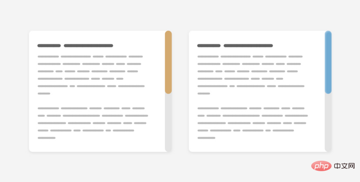
Customized scroll bars are becoming more and more popular now and are worth studying. The following article will take you to understand the components of the scroll bar and introduce how to use CSS to customize the scroll bar style.

(Learning video sharing: css video tutorial)
Why do you need to customize scrolling? The browser's default scroll bars make the UI look inconsistent across multiple operating systems. Using defined scrolling we can unify the style.
I've always been interested in how to customize scrollbars in CSS, but never had the chance to do so. Today, I will record my learning process.

First of all, we need to introduce the components of the scroll bar. The scroll bar contains track and thumb, as shown in the following figure:
track is the scroll bar Basics, where thumb is the user dragging to support scrolling within the page or chapter.
Another important thing to remember is that scroll bars can work horizontally or vertically, depending on the design. Also, this changes when working on a multilingual website that works in both left-to-right (LTR) and right-to-left (RTL) directions.
Having a custom scroll bar used to be a webkit patent, so Firefox and IE were Excluded from the game. We have a new syntax, only used in Firefox, that will make our jobs easier when it is fully supported. Let's look at the old Webkit syntax first, and then introduce the new syntax.
Scroll bar width
First, we need to define the size of the scroll bar. This can be the width of a vertical scrollbar or the height of a horizontal scrollbar.
.section::-webkit-scrollbar {
    width: 10px;
}With this setting, we can set the style of the scroll bar itself.
Scroll bar track
This represents the basis of the scroll bar. We can style it by adding background, shadows, border-radius and border.
.section::-webkit-scrollbar-track {
    background-color: darkgrey;
}Scroll bar thumb
After preparing the foundation of the scroll bar, we need to style the thumb of the scroll bar. This is important because the user may drag this thumb to interact with the scrollbar.
.section::-webkit-scrollbar-thumb {
    box-shadow: inset 0 0 6px rgba(0, 0, 0, 0.3);
}So far, we have introduced the old method of customizing scroll bars in CSS. Let's explore the new syntax.
Scrollbar Width
As it says, this definition The width of the scroll bar has two values: auto and thin. The bad thing is that we can't define a specific number like webkit's syntax.
.section {
  scrollbar-width: thin;
}Scrollbar Color
With this property we can define pairs of values for the scrollbar track and thumb s color.
.section {
    scrollbar-color: #6969dd #e0e0e0;
    scrollbar-width: thin;
}Although this new syntax is simple, it has limitations. We can only add color. We can't add shadows`, gradients, rounded, or anything like that, all we are allowed to customize is the color.
An important question to know is where to customize the scroll bar. Do you want the style to be universal and valid for all scrollbars on the site? Or do you want it to be used only for a specific section?
Using the old syntax we can write selectors without having to attach them to elements and they will apply to all scrollable elements.
::-webkit-scrollbar {
    width: 10px;
}

::-webkit-scrollbar-track {
    background-color: darkgrey;
}

::-webkit-scrollbar-thumb {
    box-shadow: inset 0 0 6px rgba(0, 0, 0, 0.3);
}If you want to apply only to a specific section, you need to append the element before the selector.
.section::-webkit-scrollbar {
    width: 10px;
}

.section::-webkit-scrollbar-track {
    background-color: darkgrey;
}

.section::-webkit-scrollbar-thumb {
    box-shadow: inset 0 0 6px rgba(0, 0, 0, 0.3);
}With the new syntax, it's almost the same. What I noticed is that if you want a universal style, it should be applied to the <html> element, not the <body>.
html {
    scrollbar-color: #6969dd #e0e0e0;
    scrollbar-width: thin;
}I tried adding the above for <body> but it didn't work as expected.
Now that we know how the old and new syntax works, we can start customizing some scroll bar designs.
Example 1
在研究定制滚动条之前,值得讨论一下Mac OS中的默认样式。下面是它的外观。
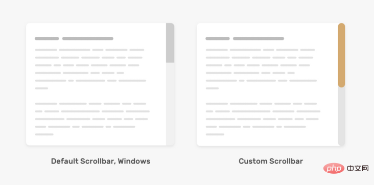
track 的左右两边都有边框,背景色为纯色。thumb是圆形的,左右两边都有空间。对于Windows,它有点不同。

下面是我们根据上面的模拟图来定制滚动条。
.section::-webkit-scrollbar {
    width: 16px;
}

.section::-webkit-scrollbar-track {
    background-color: #e4e4e4;
    border-radius: 100px;
}

.section::-webkit-scrollbar-thumb {
    background-color: #d4aa70;
    border-radius: 100px;
}为 track 和thumb添加border-radius是必要的,因为它在::webkit-scrollbar上不起作用。
在新的语法中,我们不能调整滚动条的宽度,唯一能做的的是改变 track 和thumb的背景颜色。
.section {
    scrollbar-color: #D4AA70 #e4e4e4;
}例2
对于这个例子,设计有点重,因为它包含渐变和阴影。我们可以应用内部阴影和渐变来模仿这种效果。来看看怎么做!
.section::-webkit-scrollbar-thumb {
    background-image: linear-gradient(180deg, #D0368A 0%, #708AD4 99%);
    box-shadow: inset 2px 2px 5px 0 rgba(#fff, 0.5);
    border-radius: 100px;
}示例地址:https://codepen.io/shadeed/pen/VwpOReG
例3
我们还可以为 thumb 和track添加边框,这可以帮助我们处理一些棘手的设计。
.section::-webkit-scrollbar-thumb {
    border-radius: 100px;
    background: #8070D4;
    border: 6px solid rgba(0,0,0,0.2);
}基于同样的例子,我们可以重置顶部和底部边界为零,这样thumb获得一个有趣的效果。注意thumb顶部和底部的那些小元素。
示例地址:https://codepen.io/shadeed/pen/qBrGvOx
我们可以为新旧语法的滚动条thumb添加悬停效果。
/* 旧语法 */
.section::-webkit-scrollbar-thumb:hover {
    background-color: #5749d2;
}

/* 新语法 */
.section {
    scrollbar-color: #d4aa70 #e4e4e4;
    transition: scrollbar-color 0.3s ease-out;
}

.section:hover {
    scrollbar-color: #5749d2;
}创建一个可滚动的元素是可以通过给overflow属性添加一个除visible以外的值。建议使用auto关键字,因为它只在内容超过其容器时才会显示滚动条。
.section {
    overflow-y: auto;
}在定制滚动条设计时,请记住在 thumb 和 track之间要有良好的对比,这样它就容易被用户注意。
考虑一下下面这个自定义滚动条的 "坏 "例子。
thumb 的颜色几乎看不出来。这对用户来说不是好事,因为如果他们习惯于通过thumb 滚动,这将增加他们的难度。
英文原文地址:https://ishadeed.com/article/custom-scrollbars-css/
作者:ishadeed
更多编程相关知识,请访问:编程入门!!
The above is the detailed content of Teach you step by step how to use CSS to customize beautiful scroll bar styles!. For more information, please follow other related articles on the PHP Chinese website!