This article will introduce to you how to draw a heart using pure CSS. It has certain reference value. Friends in need can refer to it. I hope it will be helpful to everyone.

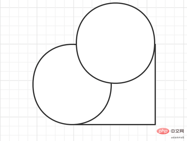
1. First draw a square circle and place it as follows:
2. Add a circle.

3. Finally, rotate the entire shape 45 degrees clockwise.
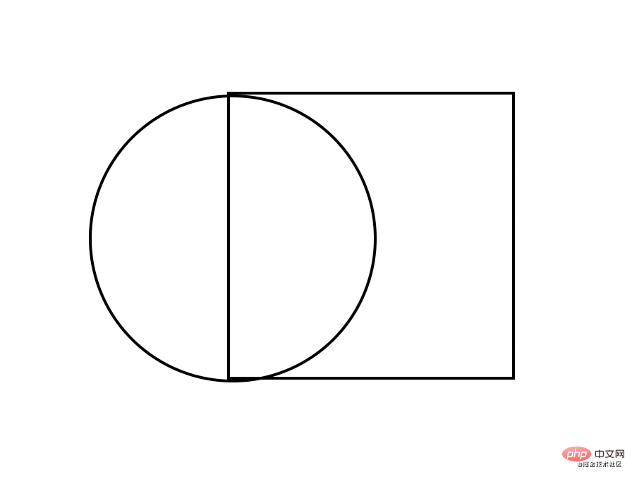
1. First draw a square:
<body>
    <div id="heart"></div>
</body>#heart{
height: 300px;
width: 300px;
border: 2px solid black;
}2. Add a circle to the left side of the square. Use the pseudo class: before here. Implementation
     #heart{
            height: 200px;
            width: 200px;
            border: 2px solid black;
            position: relative;
        }
    #heart:before{
        content: '';
        width: 200px;
        height: 200px;
        border: 2px solid black;
        border-radius: 50%; // 正方形加圆角变成圆
        position: absolute;
        left: -100px;  // 向左位移正方形一半的长度
}At this time, the graphic looks like this:

3. Add another circle, which is implemented here using the after pseudo-class.
    #heart{
            height: 200px;
            width: 200px;
            border: 2px solid black;
            position: relative;
        }
        // 这里偷个懒.直接写一块了
    #heart:before,#heart:after{
        content: '';
        width: 200px;
        height: 200px;
        border: 2px solid black;
        border-radius: 50%;
        position: absolute;
        left: -100px;
    }
    // 第二个圆, 只需要向上位移正方形一半的高度
    #heart:after{
        left: 0;
        top: -100px;
}4. The last step, rotate it, and then add a color. Remove the border added before to see clearly.
    /*给heart进行旋转并加上颜色*/
  transform: rotate(45deg);
  background-color: red;
Complete Code:
A heart can be composed of a square and two circles. The before and after pseudo-classes are used here. Then, the two pseudo-classes are displaced respectively. Finally, the extrusion By adding color, you can realize a love.
For more programming related knowledge, please visit: Programming Video! !
The above is the detailed content of Through interesting and vivid pictures, learn how to draw a heart using pure CSS! !. For more information, please follow other related articles on the PHP Chinese website!