This article will introduce to you three effects of CSS3 to achieve blurred background. It has certain reference value. Friends in need can refer to it. I hope it will be helpful to everyone.

No need to start, let’s go directly to the topic.
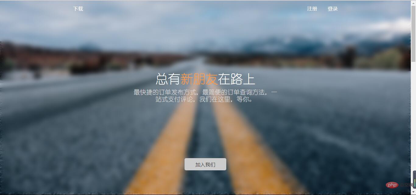
Normal background blur effect is as follows:

Use attributes:
filter:(2px)
#Normal background blur
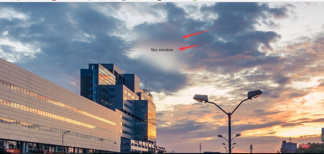
For the sake of beauty, the text in front of the background cannot be blurred, and thefilter attribute will make the descendants of the entire p and white edges
appear. In other words, this effect cannot be achieved. How to do it? We can use pseudo elements, which also solves the problem of white edges. Implementation ideas: Set the background in the parent container and use relative positioning to facilitate the overlap of pseudo elements. In :after, you only need to inherit the background, set blur, and absolutely position it to cover the parent element. This way the child elements in the parent container are not affected by the blur. Because the blurriness of a pseudo-element cannot be inherited by the descendants of the parent element. Having said so much, let’s refresh ourselves with some code. Simple html layout:like window
/*背景模糊*/ .bg{ width:100%; height:100%; position: relative; background: url("../image/banner/banner.jpg") no-repeat fixed; padding:1px; box-sizing:border-box; z-index:1; } .bg:after{ content: ""; width:100%; height:100%; position: absolute; left:0; top:0; background: inherit; filter: blur(2px); z-index: 2; } .drag{ position: absolute; left:50%; top:50%; transform: translate(-50%,-50%); width:200px; height:200px; text-align: center; z-index:11; }
So what is the effect of writing code like this?

#The background is partially blurred
Compared with the previous effect , it is relatively simple to partially blur the background. At this time, the parent element does not need to set the pseudo element to be blurry at all. Directly analogize the above code to blur the child elements,
but the descendants of the child elements may not be blurred(note this, the solution is as described in the previous effect).
The HTML layout has changed slightly:
like window
css code is as follows: (please pay attention to comparison)
/*背景局部模糊*/ .bg{ width:100%; height:100%; background: url("../image/banner/banner.jpg") no-repeat fixed; padding:1px; box-sizing:border-box; z-index:1; } .drag{ margin:100px auto; width:200px; height:200px; background: inherit; position: relative; } .drag >div{ width:100%; height: 100%; text-align: center; line-height:200px; position: absolute; left:0; top:0; z-index: 11; } .drag:after{ content: ""; width:100%; height:100%; position: absolute; left:0; top:0; background: inherit; filter: blur(15px);/*为了模糊更明显,调高模糊度*/ z-index: 2; }
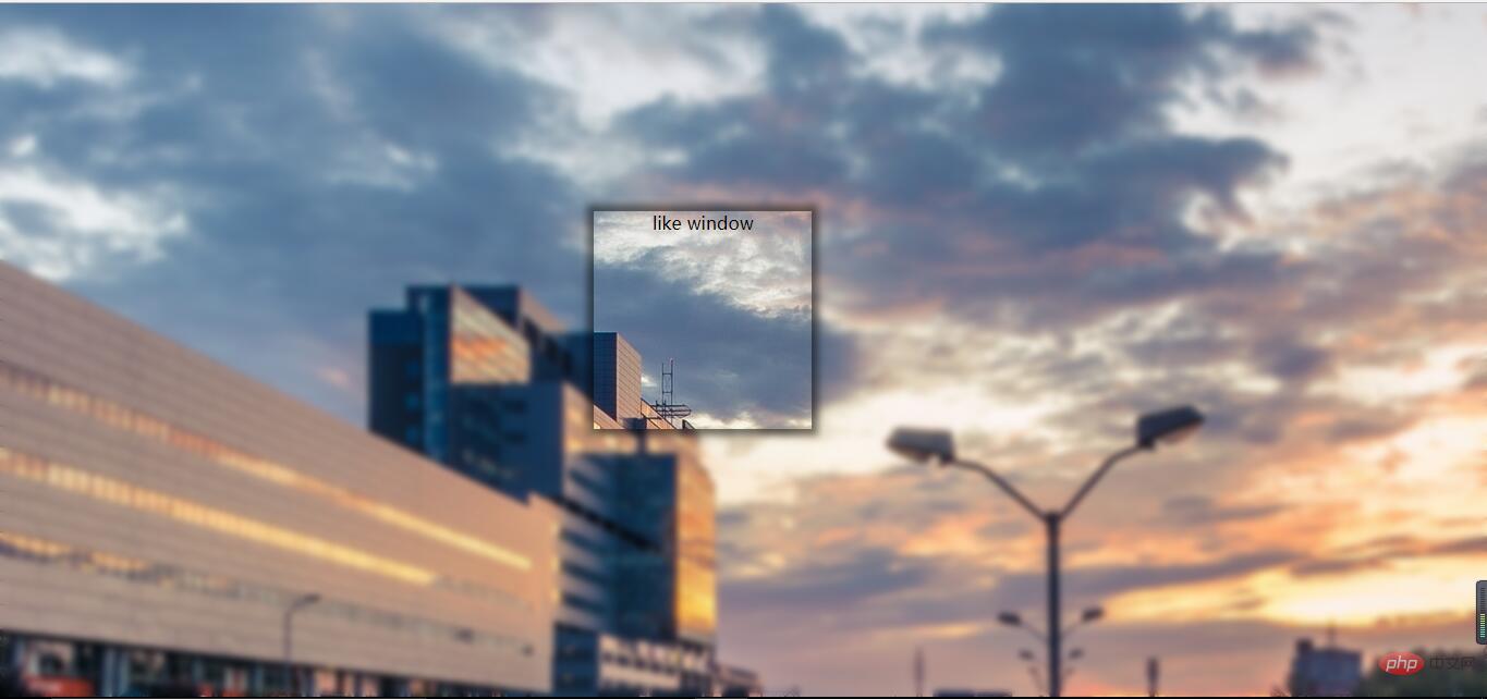
The effect is as follows:
#The background is partially clear
The background is partially clear. This effect is neither simple nor difficult. The key is to apply the background:inherit attribute.
You can’t use transform here to center it vertically
, you should choose flex layout. If the transform attribute is used here, the background will also be offset. In this way, there is no local clear effect. The html layout remains unchanged, pay attention to the changes in css:/*背景局部清晰*/ .bg{ width:100%; height:100%; position: relative; background: url("../image/banner/banner.jpg") no-repeat fixed; padding:1px; box-sizing:border-box; } .bg:after{ content: ""; width:100%; height:100%; position: absolute; left:0; top:0; background: inherit; filter: blur(3px); z-index: 1; } .drag{ position: absolute; left:40%; top:30%; /*transform: translate(-50%,-50%);*/ width:200px; height:200px; text-align: center; background: inherit; z-index:11; box-shadow: 0 0 10px 6px rgba(0,0,0,.5); }
 Effect display:
For more programming-related knowledge, please visit : ###Introduction to Programming###! ! ###
The above is the detailed content of Detailed explanation of three CSS3 blur background effects (code examples). For more information, please follow other related articles on the PHP Chinese website!