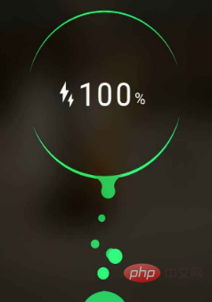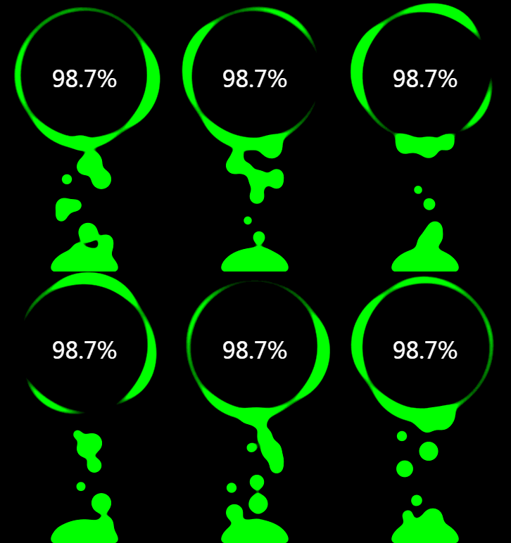
This article will introduce to you how to use CSS to achieve cool charging animation effects. It has certain reference value. Friends in need can refer to it. I hope it will be helpful to everyone.

#Step by step, see what kind of charging animation effect you can create using only CSS.(Learning video sharing:css video tutorial)
Of course, to charge the battery, you must first draw a battery with CSS. This is not difficult, just make one as you like:
Oh, that’s it. Now that you have the battery, let’s just charge it. The simplest animation is to fill the entire battery with color.
There are many methods and the code is very simple. Just look at the effect:

##It has an internal smell. If the requirements are not high, this will be enough. The power is represented by a blue gradient, and the charging animation is realized through the displacement animation of the color block. But it always felt like something was missing.
##Use filter: hue-rotate() to perform color transition animation on gradient colors
Complete Demo of the above example:
CodePen Demo -- Battery Animation OneAdd waves
The effect after transformation:
##
Using CSS to achieve this wavy scrolling effect is actually just a blinding method. The specific article can be found in this article I wrote earlier:
Pure CSS to achieve wave effect!
One of the knowledge points here is the above-mentioned use of CSS to achieve a simple wave effect, which is achieved through blindness. Just look at the picture and you will understand:

#Complete Demo of the above example:CodePen Demo -- Battery Animation Two
##OK, here it is, The above effects plus digital changes are already considered a relatively good effect. Of course, the above effect still looks very CSS, but at first glance, I feel that it can be done using CSS.
##What about the one below?

After some attempts, I found that using CSS can also simulate this animation effect very well:

Complete Demo of the above example:
HuaWei Battery Charging Animationandfilter: blur(). You can This fusion effect is achieved very well.Take out the two filters separately. Their functions are:
Let’s look at a simple example first:
Look carefully at the process of intersecting two circles. When the edges touch each other, a boundary fusion effect will be produced. Use the contrast filter to remove the blurred edges of Gaussian blur and use Gaussian blur. Achieve a fusion effect.
Of course, this effect has been mentioned many times in previous articles. For more details, you can take a look:
Of course, color transformation can also be added here, and the effect is also very good:
##Complete Demo of the above example:HuaWei Battery Charging Animation
By adjustingfilter: blur()andfilter: contrast()The value of the attribute, the animation effect will actually change to a great extent, and good effects require constant debugging. Of course, experience also plays a very important role in it. In the final analysis, you still need to try more.
For more programming-related knowledge, please visit:This article is reproduced from: https://juejin.cn/post/6844904029336649741
Author: ChokCoco
Programming Video! !
The above is the detailed content of Share tips on using CSS to achieve cool charging animation effects. For more information, please follow other related articles on the PHP Chinese website!