This article will share with you some CSS tips for handling short content and long content. It has certain reference value. Friends in need can refer to it. I hope it will be helpful to everyone.

When we use CSS to build layouts, it is important to consider the long and short text content. If we can clearly know what needs to be done when the text length changes, we can avoid many unnecessary mistakes. question.
In many cases, adding or removing a word can change the look of the UI, or worse, it can break the original design, making it inaccessible. In my early days of learning CSS, I underestimated the power of adding or removing a word. In this article, I’ll introduce a few different techniques that you can use right away to handle text of varying lengths in CSS.
Before discussing the techniques for handling text content, let’s first explain the problem. Suppose we have a vertical navigation.
#The length of the name can vary, especially if you are working on a multilingual website. In the example above, as the name gets longer, it is wrapped to the second line. Here are some questions
Should this text be truncated
Should it be replaced with multiple lines? If so, how many lines can be wrapped at most?
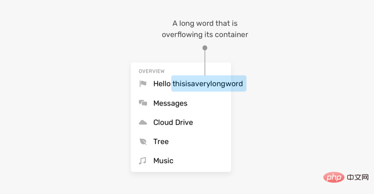
This case has more words than expected, but what happens when a word is too long? By default, it will overflow its container.

#As a professional front-end developer, it is important to determine what to do in this situation. Fortunately, there are some CSS properties specifically designed to solve this problem.
Beyond that, the problem isn’t just with long content, short content can also break the UI, or at least make it look weird. As in the example below
the width of the button withoktext is very small. I'm not saying this is a fatal issue, but it can make the buttons look weak or hard to notice.
What should we do in this situation? Maybe setmin-widthon the button? Provides a safe width regardless of content length.
Now that you have some idea of the problem, let’s delve into CSS techniques that can provide solutions for handling long content.
CSS propertyoverflow-wrapis used to indicate when a string that cannot be separated is too long to fill it. When wrapping a box, to prevent it from overflowing, does the browser allow such words to break newlines.
CSS propertyhyphenstells the browser how to use hyphens to connect words when wrapping. You can prevent the use of hyphens entirely, you can control when the browser uses them, or you can let the browser decide when to use them.
.element { hyphens: auto; }
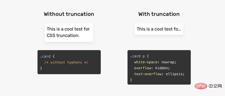
Truncation means adding a dot to the end of a sentence to indicate that there is more text content.

There is notext-truncationattribute or anything, but it has some CSS properties mixed in that do the job for us.
.element { white-space: nowrap; overflow: hidden; text-overflow: ellipsis; }
If you want to truncate multiple lines, you can use theline-clampattribute.
.element { display: -webkit-box; -webkit-line-clamp: 3; -webkit-box-orient: vertical; overflow: hidden; }
For this to work,display: -webkit-boxmust be used.-webkit-line-clampSpecifies the maximum number of lines for truncation work.
The disadvantage of this technique is that it can easily fail if you want to addpaddingto the element. Whenpaddingis added, it causes part of the next line to be displayed, which should be truncated. See the image below:
Sometimes, truncating or concatenating a word is not always possible. For example, JavaScript code can become difficult to read when a long word is replaced by a new line. In this case, horizontal scrolling will make the reading experience better.
在某些情况下,大家可能会忘记添加padding,直到我们注意到一个视觉问题。考虑以下问题:
这里有一个复选框列表,其中有一个非常接近它的兄弟项。发生这种情况的原因是网格上没有间距。这是来自Techcrunch网站的一个真实的例子。
这对大家来说并不常见,但在设计和构建UI时,也是一个要重要考虑的事项。
回到本文开头向大家展示的一个示例。 我们要如何增强它并使按钮看起来更好?
我们可以通过在按钮上添加min-width来解决此问题,这样一来,它就不会低于该宽度。
现在大家已经对问题及其解决方案有了一定的了解,我们来探索web上的一些用例和示例。
这是长内容的常见示例。 很难预测名称的长度。 我们应该如何应对呢?
/* 方案1 */ .card__title { text-overflow: ellipsis; white-space: nowrap; overflow: hidden; } /* 方案2 */ .card__title { display: -webkit-box; -webkit-line-clamp: 2; -webkit-box-orient: vertical; overflow: hidden; }
在处理多语言布局时,内容长度会发生变化。考虑以下示例
LTR(从左到右)的导航项About比RTL(从右到左)的导航项大。在RTL中,项目看起来太小了。可点击区域太小不利于用户体验。我们能做什么?在这种情况下,最好为导航项设置最小宽度。
.nav__item { min-width: 50px; }

一个长词或一个链接是很常见的,尤其是在手机上。考虑以下
上面有一个很长的单词,它会上容器溢出导致水平滚动。我们可以通过使用overflow-wrap或hyphens来解决这个问题。
.article-content p { overflow-wrap: break-word; }
产品名可以从一个单词到多行不等。在本例中,由于没有在它们之间添加足够的间距,产品名称太接近删除按钮。
这个解决方案可以通过添加padding或margin来实现,这取决于你们的上下文,为了简单起见,这里使用margin解决方案。
.product__name { margin-right: 1rem; }
flexbox
和长内容会发生某种行为,从而导致元素溢出其父元素。 考虑以下示例:
html
Ahmad Shadeed
css
.user { display: flex; align-items: flex-start; } .user__name { text-overflow: ellipsis; white-space: nowrap; overflow: hidden; }
然而,当内容很长时,这就不起作用了。文本将溢出它的父文件。
原因是 flex 项不会收缩到其最小内容大小以下。为了解决这个问题,我们需要在flex项目.user__meta上设置min-width: 0。
.user__meta { /* other styles */ min-width: 0; }

我希望智米们已经学会了处理CSS中短内容和长内容的不同技巧。我很喜欢这篇文章,因为它帮助我记住了一些小细节,这对未来的项目会很有帮助。
原文地址:https://isheed.com/article/css-short-long-connt/
作者:shadeed
译文地址:https://segmentfault.com/a/1190000038665888
译者:前端小智
更多编程相关知识,请访问:编程入门!!
The above is the detailed content of Detailed explanation of several CSS tips for processing long and short text content (worth collecting). For more information, please follow other related articles on the PHP Chinese website!