
(Learning video sharing: css video tutorial)
Grid layout can divide the web page into rows and columns of simple attributes, CSS page layout Technology allows us to pick up elements in a web page and control their position relative to the normal layout flow, surrounding elements, parent containers, or the main viewport/window.
Holy Grail Layout
Holy Grail Layout is a three-column layout with fixed width on both sides and adaptive middle:
css:
* {
        box-sizing: border-box;
    }
    html, body{
        width: 100%;
        height: 100%;
        margin: 0;
    }
    .container{
        width:100%;
    }
    .container:after{
        display: table;
        content:".";
        clear:both;
    }

    .container .cl{
        float:left;
        border: 1px solid red;
        height: 200px;
    }

    .main{
        width:100%;
        padding 0 290px 0 320px;
        background-color: blue;
    }
    .sub{
        width: 320px;
        margin-left:-100%;
        background-color: white;
    }
    .extra{
        width: 290px;
        margin-left:-290px;
        background-color: yellow;
    }

CSSHTML:
<body>
<div class="container">
    <div class="cl main">
    </div>
    <div class="cl sub"></div>
    <div class="cl extra"></div>
</div>
</body>The principle of holy grail layout is that when the child element is in a floating state, set a negative margin, and the child element will overlap the brothers above the elements.
So if you want to divide the blue area into three areas again, I believe there are many ways. But can it be achieved through nesting? We can try it:
<!DOCTYPE html>
<html>
<head>
<meta http-equiv="Content-Type" content="text/html;charset=utf-8"/>
<meta http-equiv="window-target" content="_top">
<title>Writing to Same Doc</title>
<style type="text/css">
    * {
        box-sizing: border-box;
    }
    html, body{
        width: 100%;
        height: 100%;
        margin: 0;
    }
    .container{
        width:100%;
    }
    .container:after{
        display: table;
        content:".";
        clear:both;
    }

    .container .cl{
        float:left;
        border: 1px solid red;
        height: 200px;
    }

    .main{
        width:100%;
        padding: 0 290px 0 320px;
        background-color: blue;
    }
    .sub{
        width: 320px;
        margin-left:-100%;
        background-color: white;
    }
    .extra{
        width: 290px;
        margin-left:-290px;
        background-color: yellow;
    }
</style>
</head>
<body>
<div class="container">
    <div class="cl main">
        <div class="container">
            <div class="cl main"></div>
            <div class="cl sub"></div>
            <div class="cl extra"></div>
        </div>
    </div>
    <div class="cl sub"></div>
    <div class="cl extra"></div>
</div>

</body>
</html>The principle of grid system
Assumption: Flowline The width of is W, the width of column is c, the width of Gutter is g, the width of Margin is m, and the number of grid columns is N
W = c*N g*(N-1) 2m; g The width of is usually twice that of m, so:
W = (c g) * N; record c g as C, we get:
W = C * N;
Most grid systems are variations of this formula.
Bootstrap’s grid system
Let’s take a look at common grid layout designs and design implementations in bootstrap. To properly use grid layout in BootStrap, columns must be placed in rows, and rows must be placed in containers. The container class has two main functions in layout:
Provide width restrictions in different width intervals (responsive breakpoints). When the width changes, take a different width.
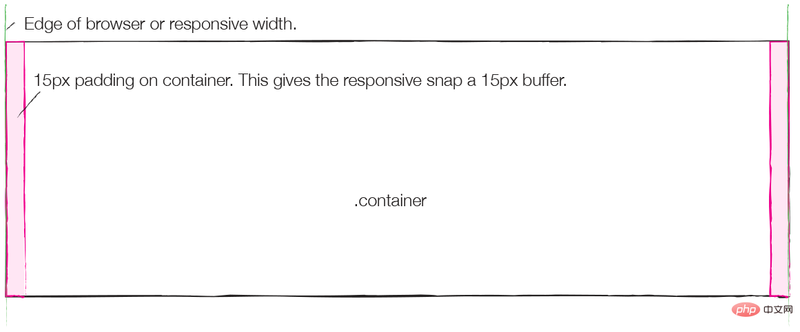
Provide a padding to prevent internal content from touching the browser borders.
Padding is used in Bootstrap instead of the margin mentioned above. The size is 15px, as shown in the picture below, and the pink color is the padding size.

Row is a container of columns. The sum of columns in each row must be 12, but we can expand it by nesting. The left and right margins of Row are -15px, which is used to offset the padding in the container, as shown in the blue part of the figure below:
This design of row is mainly for the convenience of nesting. , will be mentioned later.
Colomn is the protagonist of the grid system. The left and right padding of each column is 15px. The negative margin of the row above offsets the padding of the container, so setting padding for each column is to prevent the content from directly touching the border. , and there are 30px card slots (Gutter) between different columns. As shown in the yellow part of the picture below:
Now think about the formula mentioned above: W = C * N;
row mentioned above The negative margin design is mainly for nesting. If you want to nest a column in a column, you must first put the nested column into the row, and put the row into the column as the container, without placing a container. As shown in blue in the figure below, it is the negative margin area of the row placed in the column.
Now put the nested column into the row, as shown in the figure below, the upper column plays the role of container.
For more programming-related knowledge, please visit: Programming Learning! !
The above is the detailed content of Talk about grid layout in css (graphics and text). For more information, please follow other related articles on the PHP Chinese website!