This article will introduce to you the common properties of grid layout (grid). It has certain reference value. Friends in need can refer to it. I hope it will be helpful to everyone.

Tutorial recommendation: css video tutorial
Different from flex layout, grid layout (grid) is a two-dimensional layout, you can create any row or column layout.
First of all, let’s introduce a few concepts;
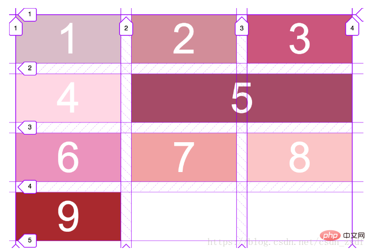
Imagine a layout with three rows and three columns. The grid lines are all the lines that make up the grid, three rows and three columns. The layout will have 4 grid lines per row.
The grid track is the part between two adjacent parallel grid lines.
Like flex layout, it will have parent containers and sub-items, here we call them grid containers and grid items.
Next, we will introduce the grid layout from the grid container to the basic properties of the grid items.

##Grid container
The grid container determines how many times the grid is divided into Rows and columns, so first to implement grid layout, the container must have the following attributes:display: grid; grid-template-columns grid-template-rows grid-gap grid-template-areas grid-auto-flow: dense | row(default) | column justify-items: start|end|center|stretch(default) align-items: start|end|center|stretch(default) grid- auto-columns:The basic properties of the parent container of grid layout are the above.
display: grid
But there is a repeat function that can simplify the same The value, such as grid-template-columns: repeat(5, 20%), represents five widths of 20%, which has exactly the same meaning as in the example.
fr is used to divide the remaining space equally. Its size is the size of the remaining space after removing all the calculable values (including various units and percentages) on the attribute.
It is recommended to use fr. It will also automatically calculate the rest except grid-gap.
For example, grid-template-columns: 100px 1fr 2fr repeat(2, 20%). For the same 5-column layout, 1fr means that the width is the total width minus 100px on the left and 20% of the two columns on the right, divided by three. That is, the width of the second column will be half that of the third column.
grid-template: 1fr 50px/1fr 4fr; //为行数/列数的形式,
This code represents a layout of two rows and two columns. The height of the first row is the remaining height after determining the 50px of the bottom row. The width of the first column divides the container into five equal parts, with the first column occupying one part and the second column occupying four parts.
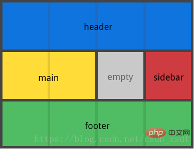
"main main . sidebar"
"footer footer footer footer";

row: tells the automatic layout algorithm to fill each row in turn, adding new rows as needed
dense:告诉自动布局算法在稍后出现较小的网格项时,尝试填充网格中较早的空缺
justify-items
沿着 行轴线(row axis) 对齐 网格项(grid items) 内的内容
align-items
沿着 列轴线(row axis) 对齐 网格项(grid items) 内的内容
grid-auto-columns:
隐式网格的宽度
grid-auto-rows:
隐式网格的高度
网格项
网格项表示网格内部的直接子元素,不包括子元素的子元素。
常用属性:
grid-column-start: 列网格线 开始,
grid-column-end: 列网格线 结束
grid-column: start/end | start/span count
order: 与z-index的属性相同,表示层叠的位置。
grid-area: 网格名,在使用grid-template-areas时比较有用。
justify-self: 单个网格项在行轴线的对齐方式
align-self: 单个网格项在列轴线的对齐方式
<div class='container'>
<div class='child'></div>
</div>
<style>
.container {
display: grid;
width: 580px;
height: 580px;
grid-gap: 3px;
grid-template-rows: repeat(5, 1fr);
grid-template-columns: repeat(5, 1fr);
background-color: blanchedalmond;
}
.child {
grid-column-start: 6;
grid-column-end: 3;
grid-row-start: 1;
grid-row-end: 5;
background: url(./babar.png);
background-size: 116px 116px;
order:1;
}
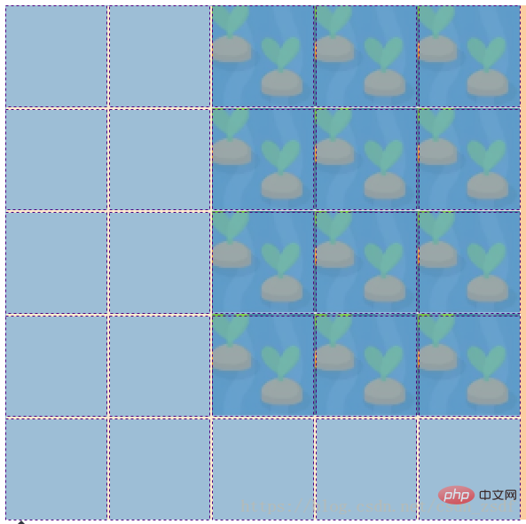
在审查元素的时候毫不意外的发现该布局为五行五列的布局,上述的child中前四行代码属性的值都是以网格线的顺序为基准,前两行代码表示第六列网格线开始,到第三列网格线结束,即表示后三列。其中的start不一定要比end小。第三四行代码表示第一个网格线开始,第五个网格线结束,即表示前四行,四行代码综合起来就如图所示。
当然,child中的前四行代码也可以简写成这样:
grid-row: 1/ 5;
grid-column: 6/ 3;
或者
grid-row: 1/ span 4; // 横向第一个网格线开始,以下的4个网格轨道
grid-column: 3/span 3; // 竖向第三条网格线开始,以后的3个网格轨道
甚至简写成这样
grid-area: 1/3/ span 4/span 3;
更多编程相关知识,请访问:编程教学!!
The above is the detailed content of Introduction to common properties of css grid layout (grid). For more information, please follow other related articles on the PHP Chinese website!