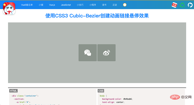

We will use CSS3 animated transitions to create a simple but engaging link hover effect that will cause a small popup to pop up when you hover your mouse over a link.
We'll also take a look at CSS3 Cubic-Bezier curves, which are CSS transitions that provide smoother motion for popovers, rather than rigid mechanical motion.
(Recommended tutorial: CSS video tutorial)
This is our final effect:

Let’s let's start!
This is the HTML of our link, the icon comes from iconfont.cn.
<p>
  <section>
    <a>
      <i></i>
      <span>Instagram</span>
    </a>
    <a>
      <i></i>
      <span>Github</span>
    </a>
  </section>
</p>
The span tag will become a popup when you hover over the link. Next, we get into CSS.
We center the p container so that the two links are centered on the screen. This also makes it easy to animate small pop-ups as they will pop up from the top of the link.
p.container {
  display: inline-block;
  position:absolute;
  top:50%;
  left:50%;
  -ms-transform:translate(-50%,-50%);
  -webkit-transform:translate(-50%,-50%);
  transform:translate(-50%,-50%);
}Next, we style the link, create a simple background hover effect, and position the social media icons.
a {
  color:#fff;
  background: #8a938b;
  border-radius:4px;
  text-align:center;
  text-decoration:none;
  position: relative;
  display: inline-block;
  width: 120px;
  height: 100px;
  padding-top:12px;
  margin:0 2px;
  -o-transition:all .5s;
  -webkit-transition: all .5s;
  -moz-transition: all .5s;
  transition: all .5s;
   -webkit-font-smoothing: antialiased;
}a:hover {
  background: #5a665e;
}i{
  font-size: 45px;
  vertical-align: middle;
  display: inline-block;
  position: relative;
  top: 20%;
}Next, we will style and animate the popup text.
a span {
  color:#666;
  position:absolute;
  font-family: 'Chelsea Market', cursive;
  bottom:0;
  left:-15px;
  right:-15px;
  padding: 15px 7px;
  z-index:-1;
  font-size:14px;
  border-radius:5px;
  background:#fff;
  visibility:hidden;
  opacity:0;
  -o-transition:all .5s cubic-bezier(0.68, -0.55, 0.265, 1.55);
  -webkit-transition: all .5s cubic-bezier(0.68, -0.55, 0.265, 1.55);
  -moz-transition: all .5s cubic-bezier(0.68, -0.55, 0.265, 1.55);
  transition: all .5s cubic-bezier(0.68, -0.55, 0.265, 1.55);
}/* 当图标处于悬停状态时,文本将弹出 */
a:hover span {
  bottom: 130px;
  visibility:visible;
  opacity:1;
}CSS3 Cubic-BezierThe curve consists of four points p0, p1, p2 and p3 definition. Point p0 is the starting point of the curve, and point p3 is the end point of the curve. The more linear the curve, the stiffer (or less fluid) the movement.
If one point is positive at first and the next point is negative, the motion will be slow at first. When the point value becomes higher than the previous point value, the movement speeds up.
This is the meaning of Cubic-Bezier points in CSS. Since the animation is short, the movements are subtle. The popover starts slowly at the bottom of the square and then starts to accelerate towards the top.
Although you can create animations without Cubic-Bezier curve transitions, the animations differ as follows:
Animation with Cubic-Bezier curve transitions
Animation without Cubic-Bezier curve transition

As you can see, the animation adds life to the hover effect.
The last set of CSS involves styling the little arrow at the bottom of the popup. To learn more about how to make triangles in CSS, check out this CSS tips article.
We created a minimalist button style link. Links have a basic background hover effect, but we don't stop there. We added a small popup to display the text of the link. With the help of CSS3 Cubic-Bezier Sel curves, the animation is smooth and pleasing to the eye.
This type of knowledge can be useful as part of the design of your website that displays your social media accounts.
Please visit the following address for the sample demonstration and complete code of this article. It is recommended to open https://coding.zhanbing.site on PC

for more programming-related knowledge , please visit: Introduction to Programming! !
The above is the detailed content of Introduction to the method of CSS3 Cubic-Bezier() to achieve link hover animation effect. For more information, please follow other related articles on the PHP Chinese website!
 css3 tutorial
 Is python front-end or back-end?
 How to implement instant messaging on the front end
 What are the css3 gradient properties?
 The difference between front-end and back-end
 Introduction to the relationship between php and front-end
 What are the virtual currencies that may surge in 2024?
 Introduction to win11 screenshot shortcut keys