1. Master the usage of text-shadow
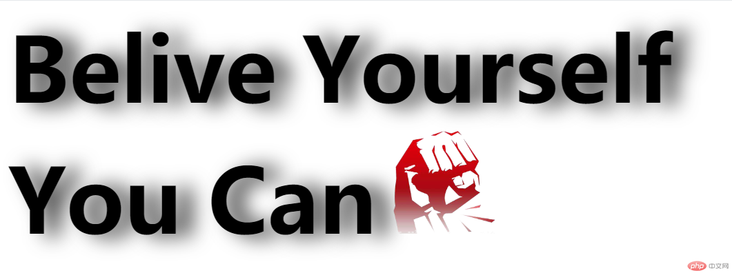
Use pure div css to achieve the following effects

Additional notes:
1. There are 4 characters in total: Belive Yourself You Can
2. The text size is 86px
3. The spacing between the text on the right and the text on the left is 20px
4. The image size and width are: 100px
5. The horizontal translation of the shadow is 15px, the vertical translation is 2, and the blur is 20. The color is #333333
1. Prepare the materials, create a new images directory, and save the picture files in this directory for easy management. The materials are
2. Create index.html, write the architecture, how to analyze the architecture
Thinking Analysis:
1. The structure is divided into upper and lower parts. The upper part displays 2 English words, one is Belive and the other is Yourself, but the text has a shadow effect
2. The lower part of the structure is also displayed 2 English words and a picture, one English word is You and the other is Can, and the text should also have a shadow effect
According to the analysis, we got the following code
<!DOCTYPE html>
<html>
<head>
<meta charset="utf-8">
<title>text-shadow实现文字阴影</title>

</head>
<body>
<div class="container">
    <div class="top">
        <strong class="word">Belive</strong>
        <strong class="word rword">Yourself</strong>
    </div>
    <div class="bottom">
        <strong class="word">You</strong>
        <strong class="word rword">Can</strong>
        <img  src="images/Text-shadow in CSS3 implements text shadow effect (code example)" / alt="Text-shadow in CSS3 implements text shadow effect (code example)" >
    </div>
</div>
</body>
</html>3. Writing style , create a css directory, and create a new file index.css in it. The idea analysis in css is as follows
Idea analysis:
1..container *
Idea analysis
1. In order to set the common styles of all elements in the container, we can write these common codes into the .container * style
So add the following code to index.css:
.container *{
    padding:0;
    margin:0;
}2. .word text
Idea analysis:
1. According to the requirements, the text size is 86px and has a shadow effect. According to the required shadow settings, it is converted into code For text-shadow: 15px 2px 20px #333333;
So add the code to index.css as follows
.word{
    font-size: 86px;
    text-shadow: 15px 2px 20px #333333;
}3. The text on the right side of rword
Idea analysis:
1. According to the requirements, the distance between the right text and the left text is 20px, so margin-left:20px;
So add the code to index.css as follows
.rword{
     margin-left:20px;
}4. Image settings
Idea analysis:
1. According to the requirements, width=100px, and then the distance between it and the text on the left is 10px
So add the code to index.css as follows
.bottom img{
    margin-left:10px;
    width:100px;
}So far, the entire content of index.css is as follows:
.container *{
    padding:0;
    margin:0;
}

.word{
    font-size: 86px;
    text-shadow: 15px 2px 20px #333333;
}

.rword{
    margin-left:20px;
}
.bottom img{
    margin-left:10px;
    width:100px;
}Next, introduce index.css into index.html
<!DOCTYPE html>
<html>
<head>
<meta charset="utf-8">
<title>text-shadow实现文字阴影</title>
<link rel="stylesheet" href="css/index.css" />
</head>
<body>
<div class="container">
    <div class="top">
        <strong class="word">Belive</strong>
        <strong class="word rword">Yourself</strong>
    </div>
    <div class="bottom">
        <strong class="word">You</strong>
        <strong class="word rword">Can</strong>
        <img  src="images/Text-shadow in CSS3 implements text shadow effect (code example)" / alt="Text-shadow in CSS3 implements text shadow effect (code example)" >
    </div>
</div>
</body>
</html>The running results are as follows:

So far, we have achieved all the requirements
1. Learn text The usage of -shadow, the main format is: text-shadow: horizontal offset vertical offset blur color
The offset can be positive or negative, positive means horizontally to the left or vertically downward, negative number means On the contrary
I hope this article can bring some help to everyone, thank you! ! !
The above is the detailed content of Text-shadow in CSS3 implements text shadow effect (code example). For more information, please follow other related articles on the PHP Chinese website!