
Grid is the basis of layout design, and CSS Grid is a two-dimensional layout system specifically designed to handle grid-based user interfaces on the Web. Grid layout can solve many layout problems on the page.
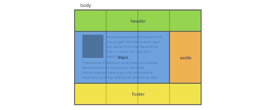
CSS Grid layout is very powerful. In this article, we will briefly introduce Grid layout to let everyone understand some basic concepts and terminology of Grid layout. I hope it will be useful to you. Helps.
The role of Grid layout:
In the relatively short life of the web, developers have been trying various methods to browse Arrange content in the container. We have always used CSS to layout web pages, but there are always problems of one kind or another. First using table based layout and then using float based layout. But these methods are workarounds at best, since neither tables nor floats are intended to be used as true layout tools.
Grid (grid) layout is the first CSS module created specifically to solve layout problems. We finally don’t need to think of ways to solve page layout styles.
CSS Grid introduces a series of properties that allow us to use CSS to create a grid structure and control the placement and sizing of grid items. This means we can use media queries to adjust our grid layout to accommodate different sized displays.
Grid also comes with a powerful automatic placement algorithm that makes it easier to fill available space without having to perform a lot of complex calculations. To a certain extent, Grid even allows for some flexibility in the z-axis, since you can overlap grid items if needed.
css Basic concepts and terminology of Grid
Because Grid is created to be very flexible and provides solutions for many different use cases, it is impossible for us to understand and use it quickly. Let's first take a look at some basic concepts and terminology of Grid.
Terms and concepts are introduced in the grid specification, so if we want to make full use of the grid, we must first know and understand these terms and concepts.
Grid Lines
Grid lines are the horizontal and vertical lines that form the basis of the grid structure. They are used to position items on the grid. We can refer to them by numerical index, starting from 1.
Grid lines also have negative exponents, which allows us to reference grid lines starting from the end of the grid. One use case for negative indexing is if we need the item in the last column regardless of the number of tracks, then giving the item a grid-column-end attribute with a value of -1 will take care of it.
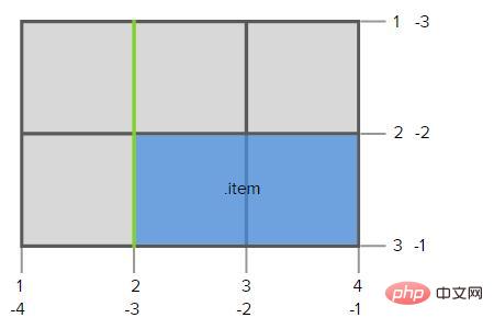
.grid-container {
display: grid;
grid-template-columns: 150px 150px 150px;
grid-template-rows: 150px 150px;
}

.item {
grid-column-start: 2;
grid-column-end: 4;
grid-row-start: 2;
grid-row-end: 3;
}We can name the grid lines so we don’t have to calculate which grid lines need to be referenced. These names can be declared as optional parameters in the grid template column and grid template row properties.
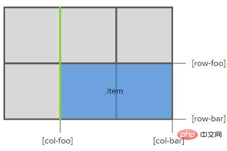
.grid-container {
  display: grid;
  grid-template-columns: 150px [col-foo] 150px 150px [col-bar];
  grid-template-rows: 150px [row-foo] 150px [row-bar];
}

.item {
  grid-column-start: col-foo;
  grid-column-end: col-bar;
  grid-row-start: row-foo;
  grid-row-end: row-bar;
}Grid Tracks and Cells
The grid track is the space between 2 adjacent grid lines, They are the rows and columns of the grid. The image below highlights the grid trace between the first and second rows of grid lines. We can use the grid-row-gap and grid-column-gap properties to separate grid tracks using row gaps and column gaps.
A grid cell is the space between 2 adjacent row grid lines and 2 adjacent column grid lines. It is conceptually similar to a table cell in that it is a single cell of the grid. The image below highlights the grid cells between the third and fourth column grid lines and the second and third row grid lines.
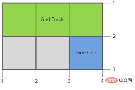
.grid-container {
  display: grid;
  grid-template-columns: 150px 150px 150px; /* three columns  */
  grid-template-rows: 150px 150px; /* two rows  */
}Grid area
The grid area consists of 1 or more grid cells and is composed of grid areas 4 grid line constraints on each side. You can refer to a grid area using the bounding grid lines defined by its grid-template-areas property or its name. Grid items can then be assigned to grid areas with grid layout properties such as: grid-area, grid-row, grid-column properties or their long-form equivalents.
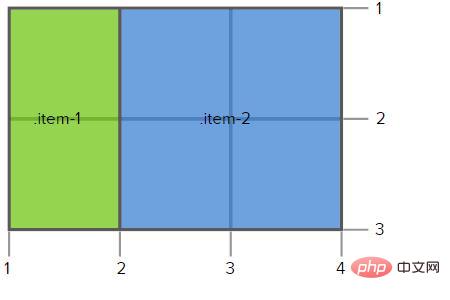
.grid-container {
  display: grid;
  grid-template-columns: 150px 150px 150px; /* three columns  */
  grid-template-rows: 150px 150px; /* two rows  */
  grid-template-areas: "a b b"
                       "a b b";
}

.item-1 {
  grid-area: a;
}

.item-2 {
  grid-area: b;
}As mentioned before, the shaded part of the chart is the groove between the grid tracks, which can be controlled using the grid-row-gap and grid-column-gap properties .
So, put them together:
Summary: The above is the entire content of this article, I hope it will be helpful to everyone's study.
The above is the detailed content of What is css grid layout? Basic introduction to grid layout. For more information, please follow other related articles on the PHP Chinese website!