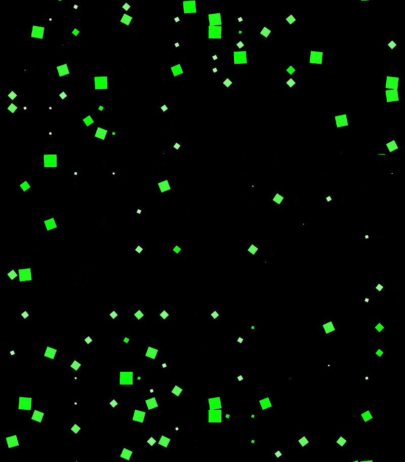
The content of this article is about how to use CSS to achieve the animation effect of seeing stars (with source code). It has certain reference value. Friends in need can refer to it. I hope it will be useful to you. helped.

https://github.com/comehope/front- end-daily-challenges
Define dom, the container contains 9 sub-elements:
<div>
    <span></span>
    <span></span>
    <span></span>
    <span></span>
    <span></span>
    <span></span>
    <span></span>
    <span></span>
    <span></span>
</div>
Centered display:
body {
    margin: 0;
    height: 100vh;
    display: flex;
    align-items: center;
    justify-content: center;
    background-color: black;
}Set the container neutron The elements are laid out to form a 3 * 3 grid, where --columns is the number of child elements on each side of the grid:
.container {
    display: grid;
    --columns: 3;
    grid-template-columns: repeat(var(--columns), 1fr);
}Define the child element style:
.container span {
    width: 25px;
    height: 25px;
    color: lime;
    background-color: currentColor;
}Increase the animation effect of child elements. The total animation duration is 5 seconds, of which the first second (0% ~ 20%) is animated, and the remaining 4 seconds (20% ~ 100%) are static:
.container span {
    transform: scale(0);
    animation: spin 5s linear infinite;
}

@keyframes spin {
    0% {
        transform: rotate(0deg) scale(1);
    }

    5%, 15% {
        transform: rotate(90deg) scale(0);
        background: white;
    }

    17.5% {
        transform: rotate(180deg) scale(1);
        background-color: currentColor;
    }

    20%, 100% {
        transform: rotate(90deg) scale(0);
    }
}Set the animation delay so that the animation of each sub-element is randomly delayed for any time within 4 seconds:
.container span {
    animation-delay: calc(var(--delay) * 1s);
}

.container span:nth-child(1) { --delay: 0.8 }
.container span:nth-child(2) { --delay: 0.2 }
.container span:nth-child(3) { --delay: 1.9 }
.container span:nth-child(4) { --delay: 3.9 }
.container span:nth-child(5) { --delay: 2.8 }
.container span:nth-child(6) { --delay: 3.5 }
.container span:nth-child(7) { --delay: 1.5 }
.container span:nth-child(8) { --delay: 2.3 }
.container span:nth-child(9) { --delay: 1.7 } At this point, the static effect is completed, and then the dom elements are processed in batches.
Introduce the d3 library:
<script></script>
Delete the --columns variable declaration in the css file, and use d3 to assign values to the variables:
const COLUMNS = 3;

d3.select('.container')
.style('--columns', COLUMNS);Delete the html file The <span></span> sub-element is dynamically generated using d3:
d3.select('.container')
    .style('--columns', COLUMNS)
    .selectAll('span')
    .data(d3.range(COLUMNS * COLUMNS))
    .enter()
.append('span');Delete the --delay variable declaration in the css file and use d3 to generate random variables. Number:
d3.select('.container')
    .style('--columns', COLUMNS)
    .selectAll('span')
    .data(d3.range(COLUMNS * COLUMNS))
    .enter()
    .append('span')
.style('--delay', () => Math.random() * 4);Finally, change the side length to 15 to generate more sub-elements and enhance the visual effect:
const COLUMNS = 15;
The above is the detailed content of How to use CSS to achieve the animation effect of stars in front of your eyes (source code attached). For more information, please follow other related articles on the PHP Chinese website!