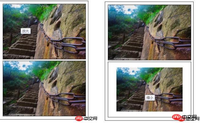
The content of this article is about how to use CSS to achieve the effect of image scaling (slow changes, with transition effects, and the scaling process has animated transitions) when the mouse passes over the image. It mainly uses CSS transform property, css3 transition property, the following implementation effects and specific implementation methods, I hope it will be helpful to you.
Let’s take a look at the effect preview first

Code interpretation
HTML part Code
<div class="content">
	<ul>
	   <li><img  class="amplify lazy"  src="/static/imghw/default1.png"  data-src="img/1.jpg"    title="放大"/ alt="CSS achieves the effect of scaling the image when the mouse passes over it (code example)" ></li>
	   <li><img  class="narrow lazy"  src="/static/imghw/default1.png"  data-src="img/1.jpg"    title="缩小"/ alt="CSS achieves the effect of scaling the image when the mouse passes over it (code example)" ></li>
	</ul>
</div>
Define the container size, overflow: hidden; you can hide the overflow part when the size of the child container exceeds the parent container
* {
				margin: 0;
				padding: 0;
				font-family: "微软雅黑";
			}
			ul li{
				list-style: none;
			}
			.content{
				width: 310px;
				height: 420px;
				padding: 5px;
				border: 1px solid #000;
				margin: 10px auto;
			}
			/*定义容器的大小*/
			.content ul li{
				display: block;
				width: 300px;
				margin: 0 auto;
				margin: 5px;
				overflow: hidden;/*隐藏溢出*/
				border: 1px solid #000;
}Define the original scaling ratio of the image transform: scale(1 ),.
The transition effect when the image is zoomed: transition: all 1s ease 0s; all styles ease (gradually slow down) changes within 1 second. In addition to ease (default value), the transition attributes include: linear (Constant speed), ease-in: (accelerate), ease-out: (decelerate), ease-in-out: (accelerate and then decelerate)
 .content ul li img{
				display: block;
				border: 0;
				width: 100%;
				transform: scale(1);
				transition: all 1s ease 0s;
				-webkit-transform: scale(1);
				-webkit-transform: all 1s ease 0s;
}When the mouse moves to the picture, the zoom effect of the picture: scale If the value in () is greater than 1, it will be enlarged; if the value in scale() is less than 1, it will be reduced.
/*图片放大*/
			.content ul li:hover .amplify{
				transform: scale(1.3);
				transition: all 1s ease 0s;
				-webkit-transform: scale(1.3);
				-webkit-transform: all 1s ease 0s;
			}
			/*图片缩小*/
			.content ul li:hover .narrow{
				transform: scale(0.8);
				transition: all 1s ease 0s;
				-webkit-transform: scale(0.8);
				-webkit-transform: all 1s ease 0s;
}The above is the detailed content of CSS achieves the effect of scaling the image when the mouse passes over it (code example). For more information, please follow other related articles on the PHP Chinese website!