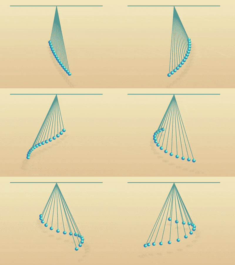
The content of this article is about how to use CSS and D3 to realize the cycloid swing effect animation. It has certain reference value. Friends in need can refer to it. I hope it will be helpful to you. .

Define dom, the container contains 3 elements, representing 3 cycloids:
<div>
    <span></span>
    <span></span>
    <span></span>
</div>
Centered display:
body {
    margin: 0;
    height: 100vh;
    display: flex;
    align-items: center;
    justify-content: center;
    background: linear-gradient(lightyellow, burlywood);
}Define the size of the container and draw a fixed cycloid to indicate the wall:
.pendulums {
    width: 40em;
    height: 30em;
    font-size: 10px;
    border-top: 0.3em solid cadetblue;
}Draw a cycloid:
.pendulums {
    position: relative;
}

.pendulums span {
    position: absolute;
    width: 0.2em;
    height: 15em;
    background-color: cadetblue;
    left: 50%;
}Use pseudo elements to draw the small ball hanging at the bottom of the cycloid:
.pendulums span::before {
    content: '';
    position: absolute;
    width: 1.5em;
    height: 1.5em;
    background: steelblue;
    border-radius: 50%;
    top: 100%;
    left: -0.75em;
}Use radial gradients to add light and shadow to the small ball:
.pendulums span::before {
    background: radial-gradient(
        circle at 70% 35%,
        white,
        darkturquoise 30%,
        steelblue 50%
    );
}Use pseudo elements to draw the shadow of the small ball:
.pendulums span::after {
    content: '';
    position: absolute;
    width: 2em;
    height: 0.3em;
    background-color: rgba(0, 0, 0, 0.2);
    top: 120%;
    left: -1em;
    filter: blur(0.4em);
}Take the vertex of the cycloid as the origin, rotate the cycloid to the left:
.pendulums span {
    transform-origin: 50% top;
    transform: rotate(25deg);
}Let the cycloid swing:
.pendulums span {
    animation: swing ease-in-out infinite;
    animation-duration: 1.5s;
}

@keyframes swing {
    50% {
        transform: rotate(-25deg);
    }
}Define subscript variables for each cycloid:
.pendulums span:nth-child(1) {
    --n: 1;
}

.pendulums span:nth-child(2) {
    --n: 2;
}

.pendulums span:nth-child(3) {
    --n: 3;
}Use variables to set the length of the cycloid and the duration of the animation, which are gradually increasing arithmetic sequences:
.pendulums span {
    height: calc((var(--n) - 1) * 1em + 15em);
    animation-duration: calc((var(--n) - 1) * 0.02s + 1.5s);
}Next, use d3 to batch process dom elements and css variables:
Introduce the d3 library:
<script></script>
Use d3 to create the dom element of the cycloid:
const COUNT = 3;

d3.select('.pendulums')
    .selectAll('span')
    .data(d3.range(COUNT))
    .enter()
.append('span')Use d3 to define the subscript variable of the cycloid:
d3.select('.pendulums')
    .selectAll('span')
    .data(d3.range(COUNT))
    .enter()
    .append('span')
.style('--n', (d) => d + 1);Delete the html The relevant dom definitions in the file and the variable definitions in the css file.
Finally, adjust the number of cycloids to 15.
const COUNT = 15;
Related recommendations:
How to use CSS to achieve the animation effect of a roller coaster loader
How to use pure CSS to achieve the effect of a green pig
The above is the detailed content of How to use CSS and D3 to achieve cycloid swing effect animation. For more information, please follow other related articles on the PHP Chinese website!


