In css, the most commonly used unit lengths are px, em, and rem. The difference between these three is:
Px is a fixed pixel. Once set, It cannot be changed to fit the page size.
Em and rem are more flexible than px. They are relative length units, which means that the length is not fixed and is more suitable for responsive layout.
The difference between em and rem can be summarized in one sentence: em is relative to the parent element, and rem is relative to the root element.
#The r in rem means root, which is not difficult to understand.
em
子The em of the element font size is relative to the font size of the parent element
The width/height/padding/margin of the element. If em is used, it is relative to the font- of the element. size
The above code:
<div>我是父元素div<p>我是子元素p<span>我是孙元素span</span></p></div>
div {
  font-size: 40px;
  width: 10em; /* 400px */
  height: 10em;
  border: solid 1px black;
}p {
  font-size: 0.5em; /* 20px */
  width: 10em; /* 200px */
  height: 10em;
  border: solid 1px red;
}span {
  font-size: 0.5em;
  width: 10em;
  height: 10em;
  border: solid 1px blue;
  display: block;
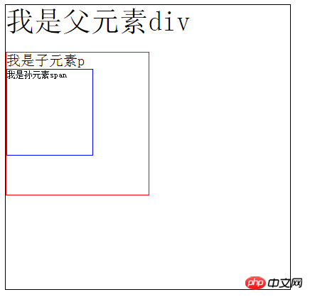
}The result is as follows :

Reinforcement test: Can you tell the font-size and width of Sun element span?
Answer: I guess you will say 10px, 100px, haha, it is actually logically correct, but if you are a chrome browser, I have to tell you that it should be 12px, 120px. Because the minimum
font size set by chrome is 12px, which means that font sizes lower than 12px will be defaulted to 12px, Of course This awkward situation can be solved by CSS3, so I won’t go into details here.
Chrome’s default font size is 12px, that is, 1em defaults to 12px. If the outermost parent element directly sets font-size to 1.5em, Then the font size of this element is 18px (12*1.5).
rem
rem is that all lengths are relative Regarding the root element, who is the root element? element. The usual approach is to set a font size for the html element, and then the length unit of other elements is rem.
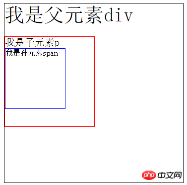
The above code: (the html code is as above, but the element length unit of the css code is changed)
html {font-size: 10px;
    }div {font-size: 4rem; /* 40px */width: 30rem;  /* 300px */height: 30rem;border: solid 1px black;
}p {font-size: 2rem; /* 20px */width: 15rem;height: 15rem;border: solid 1px red;
}span {font-size: 1.5rem;width: 10rem;height: 10rem;border: solid 1px blue;display: block;
} 
So can you tell me the specific font-size value of span?
When using rem for responsiveness, if you directly change the font-size of the HTML in the media, the size of the elements using rem as the unit will change accordingly, which is very convenient.
After seeing this, I think we all have a deeper understanding of the difference between em and rem (different reference objects).
Summary:
Use when working on projects What unit length depends on your needs, I generally look like this:
Pixels (px): used for the border or positioning of the element.
em/rem: used for responsive pages, but I prefer rem, because the references of different em elements are different (all are the parent elements of this element), so in It is inconvenient to calculate. In contrast, rem has only one reference object (html element), which makes the calculation clearer.
# Welcome everyone to communicate with me in the comment area. If you think it is good, please give it a like. Thank you.
The above is the detailed content of What is the difference between the units em and rem in css. For more information, please follow other related articles on the PHP Chinese website!
 css
css
 The difference between static web pages and dynamic web pages
 What is the difference between 4g and 5g mobile phones?
 The difference between k8s and docker
 css centered
 How to insert pictures in css
 css beyond display...
 The difference between JD.com's self-operated flagship store and its official flagship store


