


This article will give you an in-depth understanding of the three properties of CSS Flex layout: flex-grow, flex-shrink, and flex-basis. I hope it will be helpful to you!
[Recommended learning:css video tutorial,web front-end]
In our daily development, Flex layout can be said to be commonplace. For many of us (you know ^_^), maybe the one we use more often is vertical centering, which is the following code: written by
.flex-box{ display: flex; justify-content: center; align-items: center; }
Very good (^_^)! Then we all know that this is definedon the parent element, and the layout effect takes effect on the child element! Right! But have we ever thought about this question?
Let’s not worry about these two problems and how to solve them! Let’s first understand what these three elementsflex-grow,flex-shrink,flex-basisare and how to use them. Let’s do it together. Learn, learn!
expand, which is used to allocate the remaining space of the parent element relative proportions. The default value is 0. Let’s look at an example first:/* 父元素 */ .flex-box{ display: flex; width: 300px; height: 300px; margin:0 auto; background-color: #000; } /* 子元素left */ .left{ flex-grow: 1; width: 100px; background-color: orange; } /* 子元素right */ .right{ flex-grow: 0; width:100px; background-color: cyan; }
We can see from the above that the sum of the widths of the child elements left and right is 200px, while the width of the parent element is 300px, which means that the parent element still has free space. The real effect is as shown in the figure.
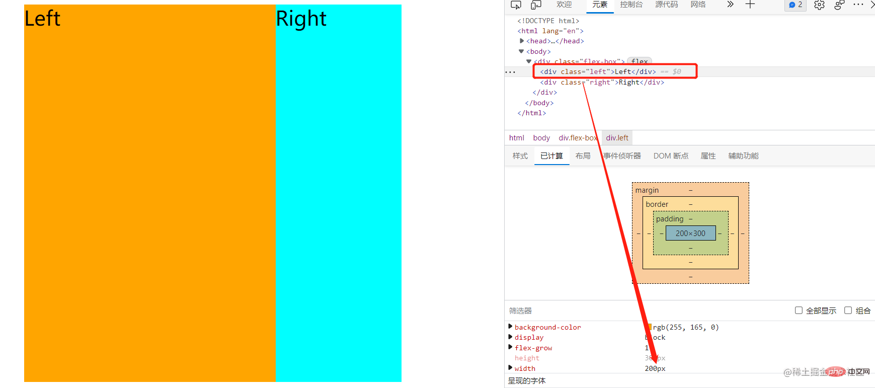 We will find that the width of the left sub-element will become 200px. This is the role of flex-grow. The flex-grow is 0 and is not processed, while the flex-grow of the left box is 1. That is to say, all the remaining width space is allocated to the left box. What if the flex-grow property becomes like this?
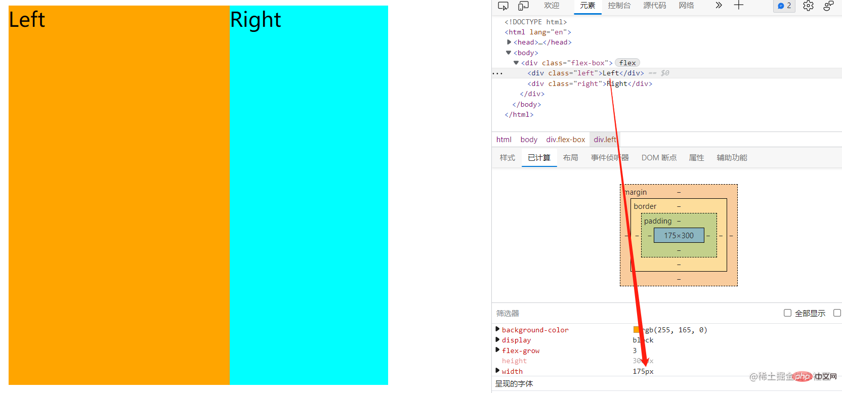
/* 子元素left */ .left{ ... flex-grow: 3; ... } /* 子元素right */ .right{ ... flex-grow: 1; ... }
If processed in this way, the remaining space will be processed according to the left:right ratio of 3:1. The extra space:300px-(100px 100px)=100px; the width of the left:100px 100px*(100px*3/(100*3 100*1)) = 175px;The width of right:100px 100px*(100px*1/(100*3 100*1)) = 125px;This explains how to handle child elements when the sum of the widths of all child elements is less than the sum of the widths of the parent elements? This is the problem.
Note that if the flex-grow values of all child elements are the same, then the remaining space will be distributed evenly.
shrink, used to specify the shrinkage rules of flex elements. The default value is 1. Let’s look at an example first:/* 父元素 */ .flex-box{ display: flex; width: 300px; height: 300px; ... } /* 子元素left */ .left{ flex-shrink: 3; width: 200px; background-color: orange; } /* 子元素right */ .right{ flex-shrink: 1; width:200px; background-color: cyan; }
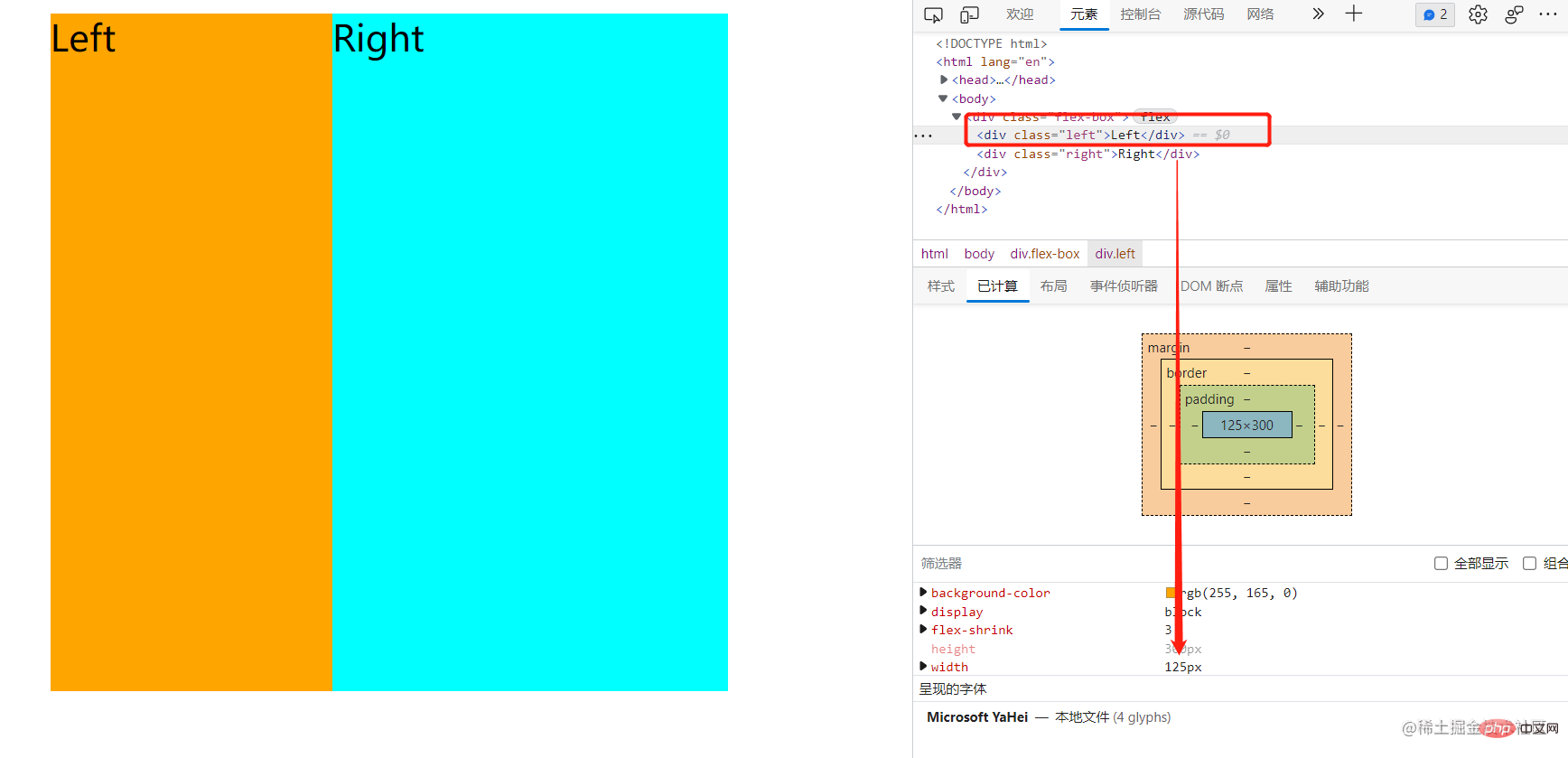 First, the sum of the widths of all child elements is greater than the width of the parent element (200px 200px>300px). Since the width and height of the parent element are fixed, the parent element cannot be enlarged and the child elements can only be reduced. The flex-shrink ratio of child elements is 3:1, so the width of child element left is:
200px-100px*(200px*3/(200px*3 200px*1)) = 125px; child element right The width of the , how the child elements deal with this problem.3 flex-basis
.flex-box{ display: flex; width: 300px; height: 300px; margin:0 auto; background-color: #000; } .left{ width: 200px; flex-basis: 100px; background-color: orange; } .right{ width:100px; background-color: cyan; }
解决父元素宽度大于所有子元素宽度之和时,子元素合理分配父元素剩余空间。值为0时,子元素盒子空间不做扩大处理。解决父元素宽度小于所有子元素宽度之和时,子元素缩小宽度以适应父元素宽度,值为0时,子元素盒子空间不做缩小处理。一个高优先级的宽度。除了上面各自分开使用这三个属性,还可以盒子一起使用也就是:
flex:flex-grow flex-shrink flex-basis; /*记忆法:g(拱)s(?)b(?)后面两个字懂了吧^_^*/
flex属性可以灵活处理这三个属性,可以单值、双值处理,这样的话,flex属性分别代表什么?
none:元素会根据自身宽高来设置尺寸。它是完全非弹性的:既不会缩短,也不会伸长来适应 flex 容器。相当于将属性设置为
flex: 0 0 auto。auto:会伸长并吸收 flex 容器中额外的自由空间,也会缩短自身来适应 flex 容器。这相当于将属性设置为
flex: 1 1 auto。initial:它会缩短自身以适应 flex 容器,但不会伸长并吸收 flex 容器中的额外自由空间来适应 flex 容器。
/*父元素*/ .flex{ display: flex; width: 200px; height: 100px; margin:0 auto; background-color: #000; } /*子元素*/ .left{ flex:3 2 50px; background-color: orange; } /*子元素*/ .right{ flex:2 1 200px; background-color: cyan; }
从上面我们可以看到子元素的flex值太复杂,其实我们可以先不看前面两值,先看最后一值(flex-basis)。如果所有子元素的flex-basis之和大于父元素之和考虑第一个值,如果所有子元素的flex-basis之和小于父元素之和考虑第二个值。上面所有子元素宽度50px+200px=250px大于父元素宽度200px,所以考虑第二个值也就是子元素left和子元素right的flex-shrink属性比2:1,超出部分50px这样处理left的宽度缩小为:50px-50px*(50px*2/(50px*2+200px*1)) = 33.34;right的宽度为:200px-50px*(200px*2/(50px*2+200px*1)) = 166.66。 所以上面题目答案为33.34:166.66 = 1:5
【推荐学习:web前端开发】
The above is the detailed content of Take you through the three attributes of Flex layout: flex-grow, flex-shrink, flex-basis. For more information, please follow other related articles on the PHP Chinese website!


![The front-end course that understands you best: HTML5/CSS3/ES6/NPM/Vue/...[Original]](https://img.php.cn/upload/course/000/000/068/632ae26b9b376240.png)


![[Web front-end] Node.js quick start](https://img.php.cn/upload/course/000/000/067/662b5d34ba7c0227.png)


