In CSS, gradient (Gradient) is one of the most powerful properties.
However, students often encounter the aliasing problem caused by gradient graphics when using gradients. [Recommended learning: css video tutorial]
What is gradient aliasing?
So, what are the jagged edges produced by gradient graphics?
A simple DEMO:
<div></div>
div {
    width: 500px;
    height: 100px;
    background: linear-gradient(37deg), #000 50%, #f00 50%, #f00 0);
}The effect is as follows:


In fact, the jagged feeling is already very obvious, let’s continue When you zoom in, the inside actually looks like this:

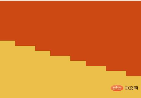
Or maybe this:


Interestingly, the aliasing phenomenon is particularly obvious on screens with a DPR of 1, but on some high-definition screens (dpr > 1), the feeling is not so obvious.
DPR (Device Pixel Ratio) is the device pixel ratio, DPR = physical pixels / device independent pixels. The device pixel ratio describes the initial proportional relationship between physical pixels and device independent pixels in the unscaled state.
So why is there a jagged feeling?
The presentation of traditional web pages is based on pixel units. For pictures where one color directly transitions to another color state, it can easily lead to a decrease in visual quality (information distortion). Therefore, for ordinary gradient elements, such as the above-mentioned writing, aliasing occurs, which is a very common thorny problem in the process of using gradients.
Simple Solutions
There are many solutions to distortion problems. The simplest way here is not to make a direct transition, but to reserve a very small gradient transition space.
We can simply transform the above code:
div {
    width: 500px;
    height: 100px;
  - background: linear-gradient(37deg), #000 50%, #f00 50%, #f00);
  + background: linear-gradient(37deg), #000 49.5%, #f00 50.5%, #f00);
}Look carefully at the changes. We have changed from a direct transition of 50% --> 50% to a reserved 1% The gradient transition space, the effect is as follows:

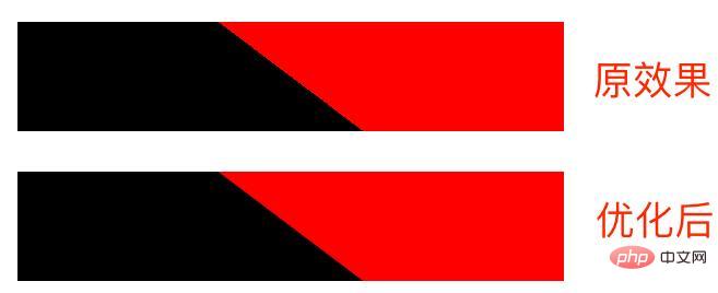
You can see that the effect has been greatly improved immediately!
Of course, if you don’t want to modify the original code, you can also achieve it by overlaying a layer of pseudo elements. Here is a comparison chart of the three methods:
<div></div>
<div class="gradient"></div>
<div class="pesudo"></div>
:root {
    --deg: 37deg;
    --c1: #000;
    --c2: #f00;
    --line-width: 0.5px;
}
div {
    margin: auto;
    width: 500px;
    height: 100px;
    background: linear-gradient(
        var(--deg),
        var(--c1) 50%,
        var(--c2) 50%,
        var(--c2) 0
    );
}
// 方法一:
.gradient {
    background: linear-gradient(
        var(--deg),
        var(--c1),
        var(--c1) calc(50% - var(--line-width)),
        var(--c2) calc(50% + var(--line-width)),
        var(--c2) 0
    );
}
// 方法二:
.pesudo {
    position: relative;

    &::before {
        content: "";
        position: absolute;
        top: 0;
        left: 0;
        right: 0;
        bottom: 0;
        background: linear-gradient(
            var(--deg),
            transparent,
            transparent calc(50% - var(--line-width)),
            var(--c1) calc(50% - var(--line-width)),
            var(--c2) calc(50% + var(--line-width)),
            transparent calc(50% + var(--line-width)),
            transparent
        );
    }
}The superposition of pseudo elements means that in Where aliasing occurs, achieve a smooth transition and cover it:


The effect is as follows:

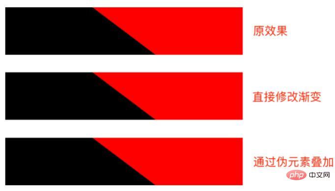
CodePen Demo -- Eliminate Gradient aliasing
Highlight the point! This method is suitable for linear gradients, radial gradients, and angular gradients, and is the simplest way to eliminate CSS aliasing.
More advanced aliasing elimination methods
Of course, there are other more advanced aliasing elimination methods.
In this article of Bionic Lion -- CSS Illusion | Anti-Aliasing, another interesting way to eliminate aliasing is also introduced. The following content is partially excerpted from the article.
We can establish a edge jagged edge->reconstruct jagged edge anti-aliasing method.
What we need to do is to superimpose another layer of content on the jagged areas to make the jagged feeling less intense. It's called Pixel-Offset Anti-Aliasing (POAA).
在Implementing FXAA这篇博客中,解释了 FXAA 具体是如何运作的。对于一个已经被找到的图形边缘,经过 FXAA 处理后会变成这样,见下两幅图:

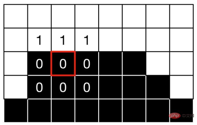

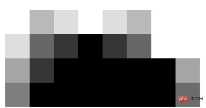
FXAA(Fast Approximate Anti-Aliasing),快速近似抗锯齿,它找到画面中所有图形的边缘并进行平滑处理。
我们可以轻易找到找到渐变的边缘地方,就是那些渐变的颜色改变的地方。有了边缘信息后,接着就要重建边缘。重建边缘也许可以再拆分,分为以下几个步骤:
- 需要通过某种方法得到透明度的点
- 这些点需要能够组成线段
- 线段完全吻合我们的 Gradient
- 使线段覆盖在 Gradient 的上一层以应用我们的修改
这就是大体思路,我们并没有参与浏览器的渲染,而是通过像 FXAA 一样的后处理的方法。在已渲染的图像上做文章。
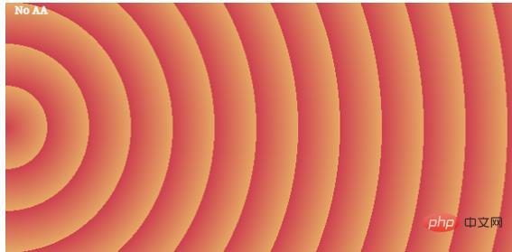
比如说,我们有这样一张图:
.circle-con {
    $c1: #cd3f4f;
    $c2: #e6a964;
    position: relative;
    height: 300px;
    background-image: repeating-radial-gradient(
        circle at 0% 50%,
        $c1 0,
        $c2 50px
    );
}

边缘信息如下:

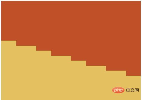
我们要做的,就是在它的边缘处,利用渐变再生成一段渐变,通过准确叠加,消除渐变!原理图如下:


原理可行,但是实操起来非常之复杂,计算量会比较大。感兴趣的可以拿这段代码尝试一下:
.repeat-con {
    --c1: #cd3f4f;
    --c2: #e6a964;
    --c3: #5996cc;
    position: relative;
    height: 300px;
    background-image: repeating-linear-gradient(
        var(--deg),
        var(--c1),
        var(--c1) 10px,
        var(--c2) 10px,
        var(--c2) 40px,
        var(--c1) 40px,
        var(--c1) 50px,
        var(--c3) 50px,
        var(--c3) 80px
    );

    &.antialiasing {
        &:after {
            --offsetX: 0.4px;
            --offsetY: -0.1px;
            --dark-alpha: 0.3;
            --light-alpha: 0.6;
            --line-width: 0.6px;
            content: '';
            position: absolute;
            top: var(--offsetY);
            left: var(--offsetX);
            width: 100%;
            height: 100%;
            opacity: 0.5;
            background-image: repeating-linear-gradient(
                var(--deg),
                var(--c3),
                transparent calc(0px + var(--line-width)),
                transparent calc(10px - var(--line-width)),
                var(--c2) 10px,
                var(--c1) 10px,
                transparent calc(10px + var(--line-width)),
                transparent calc(40px - var(--line-width)),
                var(--c1) 40px,
                var(--c2) 40px,
                transparent calc(40px + var(--line-width)),
                transparent calc(50px - var(--line-width)),
                var(--c3) 50px,
                var(--c1) 50px,
                transparent calc(50px + var(--line-width)),
                transparent calc(80px - var(--line-width)),
                var(--c1) 80px
            );
        }
    }
}最后
简单总结一下,本文介绍了几种 CSS 中可行的消除渐变锯齿的方法。
好了,本文到此结束,希望本文对你有所帮助 :)


![[Web front-end] Node.js quick start](https://img.php.cn/upload/course/000/000/067/662b5d34ba7c0227.png)


