


This article will introduce a way to usebackgroundandbackdrop-filterto create an interesting perspective background effect. I hope it will be helpful to everyone!

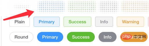
#This technique comes from a question from a group friend, how to build a top bar background effect like an ElementUI document, see the effect:

Look carefully, during the scrolling process of the page, the background of the top bar is not white, nor is it a frosted glass effect, but the background can be granulated:
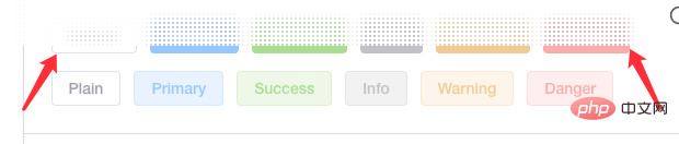
To be precise, it is a frosted glass effect based ongranulation. The elements are first granulated, and secondly, the edges of the elements are also blurred to a certain extent. . So, how do we achieve this effect?
The above effect may seem magical, but the principle is actually very simple. The main thing isgranular background backgroundplusbackdrop-filter: blur().
First, we need to implement the particle background.
We usebackgroundto achieve such a background:
div { background: radial-gradient(transparent, #000 20px); background-size: 40px 40px; }
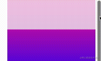
The radial gradient effect from transparent to black is as follows:

It should be noted that the white part in the picture is actually transparent and can reveal the background behind it. At this time, if there are elements behind the background, the effect will be like this:

Okay, we willbackground: radial-gradient(transparent, #000 20px)# Replace theblack in ## with white, the effect is as follows:

div { background: radial-gradient(transparent, rgba(255, 255, 255, 1) 2px); background-size: 4px 4px; }
backdrop-filter: blur(). Let’s try it by adding one:
div { background: radial-gradient(transparent, rgba(255, 255, 255, 1) 2px); background-size: 4px 4px; backdrop-filter: blur(10px); }

background-sizeand the differentbackdrop-filter: blur( 10px)value will affect the effect.

background: radial-gradient()graphics, and change thebackground-size, and try various different shapes of perspective backgrounds. Just give a few examples:
div { background: linear-gradient(45deg, transparent, #fff 4px); background-size: 6px 6px; backdrop-filter: saturate(50%) blur(4px); }
linear-gradient()is used instead ofradila-gradient():
Original address: https://www.cnblogs.com/coco1s/p/16549752.html Author: ChokCocoMore programming For related knowledge, please visit:
programming video! !
The above is the detailed content of Let's talk about how to use CSS to build fancy perspective backgrounds. For more information, please follow other related articles on the PHP Chinese website!


![The front-end course that understands you best: HTML5/CSS3/ES6/NPM/Vue/...[Original]](https://img.php.cn/upload/course/000/000/068/632ae26b9b376240.png)


![[Web front-end] Node.js quick start](https://img.php.cn/upload/course/000/000/067/662b5d34ba7c0227.png)


