


How to use CSS to achieve rounded corners and wave effects? The following article will show you how to skillfully use CSS filters to create rounded corners and wave effects. I hope it will be helpful to you!
This article will take a different approach and introduce a unique way to use filters to build rounded corners. [Recommended learning: css video tutorial]
First, let’s look at a graphic like this:

A rectangle, nothing special , the code is as follows:
div {
    width: 200px;
    height: 40px;
    background-color: #000;
}If we now need to add rounded corners to both ends of this rectangle, like this, what should we do:

So easy, just add a border-radius:
div {
    width: 200px;
    height: 40px;
  + border-radius: 40px;
    background-color: #000;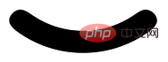
}Okay, then if it is no longer a straight line, but a curve, I hope the curve has two end, with rounded corners, like this, what should I do:

At this point, I have basically touched the ceiling of traditional CSS, and I want to solve this through one attribute The effect is unlikely.
Of course, there is a way to use two pseudo-elements at the beginning and end to realize two circles and superimpose them:

emm , this is also a feasible solution, mainly because positioning will be a little troublesome. So besides this method and using SVG directly, is there any other way to achieve curves with rounded corners?
have! In CSS, we can also achieve this graphic through the combination of filter: contrast() and filter: blur().
filter: contrast() Combined with the wonderful chemical effect of filter: blur() is a magical filter in ! In the article Cleverly Achieving Concave Smooth Rounded Corners, we have already introduced alternative uses of this combination.
Friends who often read my articles must be familiar with the combination of filter: contrast() and filter: blur(). Here is a classic one Picture:
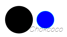
Take out the two filters separately. Their functions are:
filter: blur (): Set a Gaussian blur effect to the Lets talk about how to use CSS filters to achieve rounded corners and wave effects..
filter: contrast(): Adjust the contrast of the Lets talk about how to use CSS filters to achieve rounded corners and wave effects..
However, when they "fitted together", a wonderful fusion phenomenon occurred.
Look carefully at the process of intersecting two circles. When the edges touch each other, a boundary fusion effect will be produced. Use the contrast filter to remove the blurred edges of Gaussian blur, and use Gaussian blur to achieve the fusion effect. .
Of course, here comes the key point. The combination of blur and contrast filters can not only be used for this blending effect, but their special properties allow their combination to turn right angles into rounded corners!
Let’s take a look at the previous example:
First of all, we only need to implement such a graphic:
.g-container {
    position: relative;
    width: 300px;
    height: 100px;

    .g-content {
        height: 100px;

        .g-filter {
            height: 100px;
            background: radial-gradient(circle at 50% -10px, transparent 0, transparent 39px, #000 40px, #000);
        }
    }
}Get such a simple graphic:

When you see this, you will definitely wonder why this graphic needs to be nested with 3 layers of divs? Wouldn't a div be enough?
is because we have to use the magical combination of filter: contrast() and filter: blur().
Let’s simply transform the above code and carefully observe the similarities and differences with the above CSS:
.g-container {
    position: relative;
    width: 300px;
    height: 100px;

    .g-content {
        height: 100px;
        filter: contrast(20);
        background-color: white;
        overflow: hidden;

        .g-filter {
            filter: blur(10px);
            height: 100px;
            background: radial-gradient(circle at 50% -10px, transparent 0, transparent 29px, #000 40px, #000);
        }
    }
}We added filter: contrast(20 ) and background-color: white, added filter: blur(10px) to .g-filter. The magic happened, we got such an effect:
 Use the contrast filter to remove the blurred edges of the Gaussian blur,
, Amazing. Get a more intuitive feeling through a Gif:
完整的代码你可以戳这里:CodePen Demo - Smooth concave rounded corners By filter
https://codepen.io/Chokcoco/pen/JjroBPo
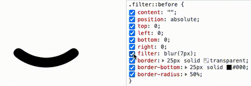
到这里,你应该知道如何通过直角圆弧得到圆角圆弧了。就是借助 filter: contrast() 配合 filter: blur() 的组合。
直接上代码:
div {
    position: relative;
    width: 250px;
    height: 250px;
    filter: contrast(20);
    background-color: #fff;
    overflow: hidden;
}
div::before {
    content: "";
    position: absolute;
    top: 0;
    left: 0;
    bottom: 0;
    right: 0;
    filter: blur(7px);
    border: 25px solid transparent;
    border-bottom: 25px solid #000;
    border-radius: 50%;
}效果如下:
通过 Gif 看,更加直观:
CodePen Demo -- Arc with rounded corners
https://codepen.io/Chokcoco/pen/bGveoPY
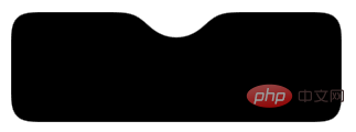
filter: contrast() 配合 filter: blur() 实现波浪效果好了,有了上面的铺垫,我们再来看一个有意思的。使用 filter: contrast() 配合 filter: blur() 实现波浪效果。
在之前,我们如果想使用纯 CSS,实现下述的波浪效果,是非常的困难的:
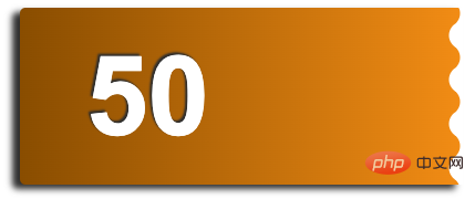
这种波浪效果,通常会使用在优惠券等切图中:
在之前,我们是怎么去做的呢?如果不切图,使用纯 CSS 的话,需要使用两层渐变进行叠加,大概是这样,感受一下:

其代码也比较复杂,需要不断的调试渐变,使两个径向渐变吻合:
div {
    position: relative;
    width: 400px;
    height: 160px;
    background: linear-gradient(90deg, #945700 0%, #f49714 100%);

    &::before,
    &::after {
        content: "";
        position: absolute;
        top: 0;
        right: 0;
        bottom :0;
    }
    &::before {
        width: 10px;
        background-Lets talk about how to use CSS filters to achieve rounded corners and wave effects.: radial-gradient(circle at -5px 10px, transparent 12px, #fff 13px, #fff 0px);
        background-size: 20px 20px;
        background-position: 0 15px;
    }
    &::after {
        width: 15px;
        background-Lets talk about how to use CSS filters to achieve rounded corners and wave effects.: radial-gradient(circle at 15px 10px, #fff 12px, transparent 13px, transparent 0px);
        background-size: 20px 40px;
        background-position: 0 15px;
    }
}那么,如果使用 filter: contrast() 配合 filter: blur() 的话,整个过程将会变得非常简单。
我们只需要实现这样一个图形:
这个图形使用渐变是容易得到的:
div {
    background: radial-gradient(circle at 20px 0, transparent, transparent 20px, #000 21px, #000 40px);
    background-size: 80px 100%;
}按照上文介绍的技巧,只需要应用上 filter: contrast() 配合 filter: blur(),就能将锐利的直角转化成圆角。我们尝试一下:
.g-container {
    position: relative;
    margin: auto;
    height: 200px;
    padding-top: 100px;
    filter: contrast(20);
    background-color: #fff;
    overflow: hidden;
}

.g-inner {
    position: relative;
    height: 200px;
    background: radial-gradient(circle at 20px 0, transparent, transparent 20px, #000 21px, #000 40px);
    background-size: 80px 100%;
    filter: blur(10px)
}可以写在 1 个 DIV 里面(通过元素和它的伪元素构造父子关系),也可以用 2 个,都可以,问题不大。
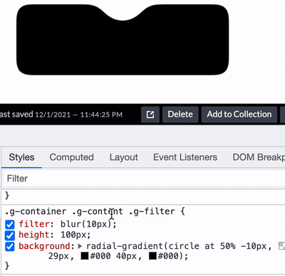
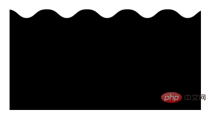
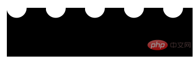
得到如下所示的波浪图形:
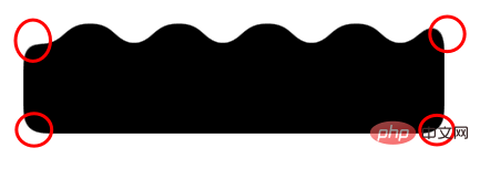
我们希望它波浪的地方的确是波了,但是我们不希望的地方,它也变成了圆角:
这是 filter: blur() 的一个问题,好在,我们是可以使用 backdrop-filter() 去规避掉这个问题的,我们简单改造下代码:
.g-container {
position: relative;
width: 380px;
padding-top: 100px;
filter: contrast(20);
background-color: #fff;
overflow: hidden;
&::before {
content: "";
position: absolute;
top: 0;
left: 0;
bottom: 0;
right: 0;
backdrop-filter: blur(10px);
z-index: 1;
}
}
.g-inner {
position: relative;
width: 380px;
height: 100px;
background: radial-gradient(circle at 20px 0, transparent, transparent 20px, #000 21px, #000 40px);
background-size: 80px 100%;
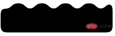
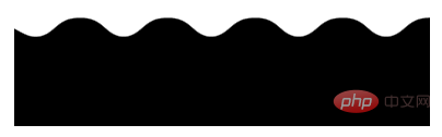
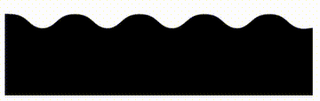
}这样,我们就实现了一份完美的波浪效果:
部分同学可能对上面的 padding-top 100px 有所疑惑,这个也是目前我所发现的一个 BUG,暂未解决,不影响使用,你可以尝试将 padding-top: 100px 替换成 height: 100px。基于这种方式实现的波浪效果,我们甚至可以给它加上动画,让他动起来,也非常的好做,简单改造下代码:
.g-inner {
    position: relative;
  - width: 380px;
  + width: 480px;
    height: 100px;
    background: radial-gradient(circle at 20px 0, transparent, transparent 20px, #000 21px, #000 40px);
    background-size: 80px 100%;
  + animation: move 1s infinite linear;
}

@keyframes move {
    100% {
        transform: translate(-80px, 0);
    }
}通过一个简单的位移动画,并且使之首尾帧一致,看上去就是连续的:
完整的代码,你可以戳这里:CodePen Demo -- Pure CSS Wave
https://codepen.io/Chokcoco/pen/PoRzeav
这就结束了吗?没有!上述双滤镜的组合固然强大,确实还是有一点麻烦。
在强大的群友的补充下,再补充一种 SVG 滤镜的方案。这里,对于大部分场景,我们可以借助 SVG 滤镜,在 CSS 中一行引入,实现同样的功能。
看这样一个 DEMO,我们有这样一个三角形:

我们想通过它得到一个圆角三角形:

借助 SVG 滤镜,其实也可以快速达成,省去了上面还需要叠加一个 filter: contrast() 的烦恼:
div {
        border: 60px solid transparent;
        border-left: 120px solid #f48;
        filter: url(#blur);
}效果如下:

是的,利用 filter: url(xxx) 可以快速引入一个定义好的 SVG 滤镜。也可以这样,直接嵌入到 URL 中:
div {
        border: 60px solid transparent;
        border-left: 120px solid #f48;
        filter: url("data:Lets talk about how to use CSS filters to achieve rounded corners and wave effects./svg+xml,%3Csvg xmlns='http://www.w3.org/2000/svg'%3E%3Cfilter id='blur' color-interpolation-filters='sRGB'%3E%3CfeGaussianBlur stdDeviation='10'/%3E%3CfeComponentTransfer%3E%3CfeFuncA type='table' tableValues='0 0 10'/%3E%3C/feComponentTransfer%3E%3C/filter%3E%3C/svg%3E#blur");
}完整的代码,你可以戳这里:CodePen Demo -- triangle with rounded corners and shadow
https://codepen.io/Chokcoco/pen/QWmEXPY
本文介绍了一种使用 filter: contrast() 配合 filter: blur() 的方式,将直角图形变为圆角图形的方式,在一些特定的场景下,可能有着妙用。同时,在很多场景下,可以使用 SVG 滤镜简化操作。
不过,这种方式也有几个小缺陷:
使用了 filter: contrast() 之后,图形的尺寸可能相对而言会缩小一点点,要达到固定所需尺寸的话,要一定的调试
此方式产生的图形,毕竟经过了一次 filter: blur(),放大来看图形会有一定的锯齿,可以通过调整 contrast 和 blur 的大小尽可能的去除,但是没法完全去掉
当然,我觉得这两个小缺点瑕不掩瑜,在特定的场景下,此方式还是有一定的用武之地的。
原文地址:https://segmentfault.com/a/1190000042217200
作者:chokcoco
(学习视频分享:web前端入门)
The above is the detailed content of Let's talk about how to use CSS filters to achieve rounded corners and wave effects.. For more information, please follow other related articles on the PHP Chinese website!


![[Web front-end] Node.js quick start](https://img.php.cn/upload/course/000/000/067/662b5d34ba7c0227.png)


