
In the process of front-end development, linear-gradient is sometimes used to achieve various effects. This chapter will introduce to you What does the linear-gradient() function in css do? Implement a linear gradient circular border (code) . It has certain reference value. Friends in need can refer to it. I hope it will be helpful to you.
1. What is css linear-gradient()?
1. Define the
css linear-gradient function, which is used to create a linear gradient "image".
2. Usage
In order to create a linear gradient, you need to set a starting point and a direction (specified as an angle) of the gradient effect. You also need to define the end color. The stop color is the smooth transition you want Gecko to make, and you must specify at least two, although you can specify more colors to create more complex gradient effects.
Example (specify 3 termination colors):
background: -webkit-linear-gradient(red,yellow,blue); /* Safari 5.1 to 6.0 */
background: -o-linear-gradient(red,yellow,blue); /* Opera 11.1 to 12.0 */
background: -moz-linear-gradient(red,yellow,blue); /* Firefox 3.6 to 15 */
background: linear-gradient(red,yellow,blue); /* 标准语法 */
Rendering:
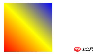
The example does not specify a direction to achieve linear gradient , so the default is to achieve the effect from top to bottom, you can also specify a direction (angle) to achieve the effect, for example:
Specify a direction (from left to right):
background: -webkit-linear-gradient(right,red,yellow,blue); /* Safari 5.1 to 6.0 */
background: -o-linear-gradient(right,red,yellow,blue); /* Opera 11.1 to 12.0 */
background: -moz-linear-gradient(right,red,yellow,blue); /* Firefox 3.6 to 15 */
background: linear-gradient(to right,red,yellow,blue);/* 标准语法 */

Specify a direction (45-degree angle):
background: linear-gradient(45deg,red,yellow,blue); /* 标准语法 */

At the same time, you can also achieve a gradient transparency effect (define a transparency):
background: -webkit-linear-gradient(right,rgba(255,0,0,1),rgba(255,0,0,0)); /*Safari 5.1-6*/
background: -o-linear-gradient(right,rgba(255,0,0,1),rgba(255,0,0,0)); /*Opera 11.1-12*/
background: -moz-linear-gradient(right,rgba(255,0,0,1),rgba(255,0,0,0)); /*Fx 3.6-15*/
background: linear-gradient(to right, rgba(255,0,0,1), rgba(255,0,0,0)); /*Standard*/
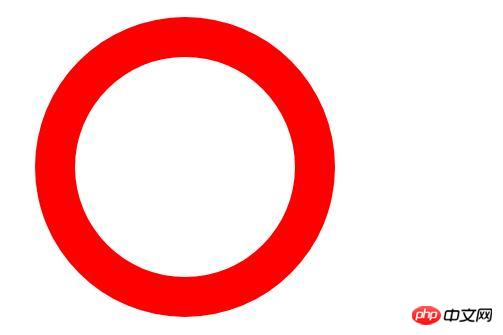
2. CSS setting of linear gradient circular border (code)
Principle:
First make two squares , different sizes, superimposed together

Use the border rounded corner attribute: border-radius to set the rounded angle of the border to 100%

After using linear-gradient() to add the gradient color of the outer circle, it is made:
Code:
<!DOCTYPE html>
<html>
<head>
<meta charset="UTF-8">
<title>边框渐变的圆形</title>
<style>
.border1{
width: 200px;
height: 200px;
margin:100px auto;
position: relative;
border: 1px solid transparent;
border-radius: 100%;
background: white;
background-clip: padding-box;
padding: 10px;
}
.border1::after{
position: absolute;
top: -40px;
bottom: -40px;
left: -40px;
right: -40px;
background: linear-gradient(45deg,red, blue);
content: '';
z-index: -1;
border-radius: 100%;
}
</style>
</head>
<body>
<div class="border1"></div>
</body>
</html>Example It's very simple. You can practice it or make modifications on this basis, such as: semicircle...
The above is the detailed content of What does the linear-gradient() function in css do? Implement circular border with linear gradient (code). For more information, please follow other related articles on the PHP Chinese website!