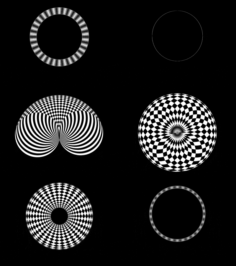
The content of this article is about how to use CSS and D3 to achieve the black and white overlapping animation effect. The article introduces the understanding of this in js, which has certain reference value. Friends in need You can refer to it, I hope it will be helpful to you.

Define dom, the container contains 3 sub-elements, each sub-element represents a circle:
<div>
    <span></span>
    <span></span>
    <span></span>
</div>
Centered display:
body {
    margin: 0;
    height: 100vh;
    display: flex;
    align-items: center;
    justify-content: center;
    background-color: black;
}Define container size:
.circles {
    width: 60vmin;
    height: 60vmin;
}Draw a circle in the container:
.circles {
    position: relative;
}

.circles span {
    position: absolute;
    box-sizing: border-box;
    width: 50%;
    height: 50%;
    background-color: white;
    border-radius: 50%;
    left: 25%;
}Define variables and draw multiple circles, each The circle rotates around the bottom midpoint of the first circle to form a larger circle:
.circles {
    --particles: 3;
}

.circles span {
    transform-origin: bottom center;
    --deg: calc(360deg / var(--particles) * (var(--n) - 1));
    transform: rotate(var(--deg));
}

.circles span:nth-child(1) {
    --n: 1;
}

.circles span:nth-child(2) {
    --n: 2;
}

.circles span:nth-child(3) {
    --n: 3;
}Add animation effects to sub-elements:
.circles span {
    animation: rotating 5s ease-in-out infinite;
}

@keyframes rotating {
    0% {
        transform: rotate(0);
    }

    50% {
        transform: rotate(var(--deg)) translateY(0);
    }

    100% {
        transform: rotate(var(--deg)) translateY(100%) scale(2);
    }
}Set the sub-element color mixing mode so that The overlapping parts between sub-elements are displayed in black:
.circles span {
    mix-blend-mode: difference;
}Add animation effects to the container to offset the enlargement of sub-elements and make the animation smoothly connected:
.circles {
    animation: zoom 5s linear infinite;
}

@keyframes zoom {
    to {
        transform: scale(0.5) translateY(-50%);
    }
}Next, use d3 to batch process dom elements and css variables.
Introducing the d3 library:
<script></script>
Use d3 to assign values to variables representing the number of circles:
const COUNT_OF_PARTICLES = 30;

d3.select('.circles')
.style('--particles', COUNT_OF_PARTICLES)Use d3 to generate dom elements:
d3.select('.circles')
    .style('--particles', COUNT_OF_PARTICLES)
    .selectAll('span')
    .data(d3.range(COUNT_OF_PARTICLES))
    .enter()
.append('span');Use d3 to represent sub-elements Subscript variable assignment:
d3.select('.circles')
    .style('--particles', COUNT_OF_PARTICLES)
    .selectAll('span')
    .data(d3.range(COUNT_OF_PARTICLES))
    .enter()
    .append('span')
.style('--n', (d) => d + 1);Delete the relevant dom elements in the html file and the relevant css variables in the css file.
Finally, adjust the number of circles to 30:
const COUNT_OF_PARTICLES = 30;
You’re done!
Related recommendations:
How to use pure CSS to implement an animation effect without DOM elements
How to use pure CSS to implement a mobile animation The little white rabbit animation effect
How to use CSS to achieve the effect of the truck loaderThe above is the detailed content of How to use CSS and D3 to achieve black and white overlapping animation effects. For more information, please follow other related articles on the PHP Chinese website!