How to use pure CSS to achieve interesting like animation? The following article will take you through how to cleverly use transitions to realize like animations. I hope it will be helpful to you!

On various short video interfaces, we often see like animations like this:

It is very interesting, and interesting interactions will make users more willing to interact.
So,is it possible to implement such an interesting like animation using pure CSS? Of course it is necessary. In this article, we will cleverly usetransitionto complete such a like animation using only CSS. [Recommended learning:css video tutorial]
If you use pure CSS to realize this complete set of animations. Wefirst need to implement an infinite loop of animationwith a large number of different expressions floating upwards.
Like this:

This whole thing is relatively easy to implement. The core principle is the same animation, setting differenttransition-duration,transition-dalay, and rotation angle within a certain range.
We first need to implement multiple expressions, and put a random expression into a DOM tag.
We can add them one by one manually:
Of course, I personally think this is too troublesome. I am used to using SASS's loop function and random function, and using thecontentof pseudo elements to randomly generate different expressions. Like this:
$expression: "?", "?", "❤️", "?", "?", "?", "?", "?", "??", "?", "?", "?", "?", "?"; .g-wrap { position: relative; width: 50px; height: 50px; } @for $i from 1 to 51 { li:nth-child(#{$i}) { position: absolute; top: 0; left: 0; width: 50px; height: 50px; &::before { content: nth($expression, random(length($expression))); position: absolute; font-size: 50px; } } }
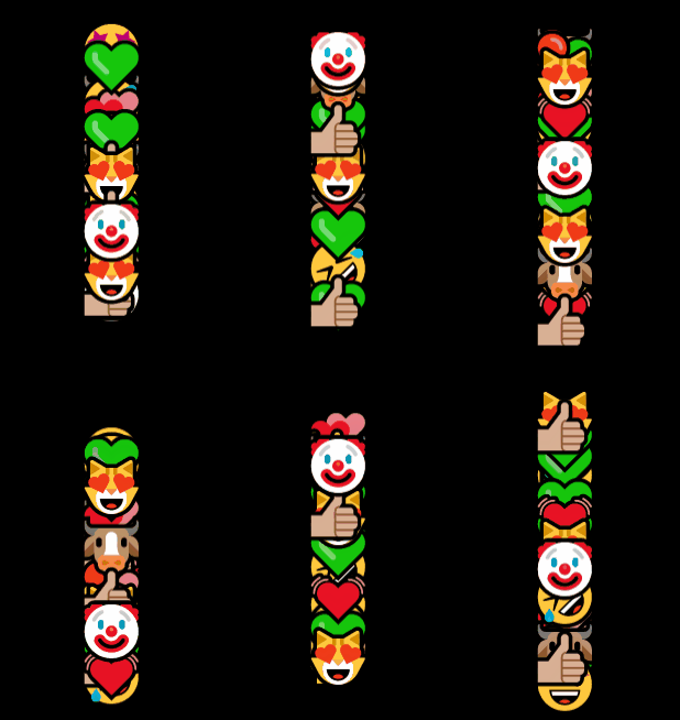
In this way, we can get 50 superimposed expressions:

Because the transparency is 1, it can only be seen Going to the top few expressions, there are actually 50 different expressions superimposed here.
The core here iscontent: nth($expression, random(length($expression))), we use SASS’s random and length and nth methods to randomly$expressionThe expressions in the list are added to the content of the before pseudo-element of different li.
Next, we need to make themmove.
This is simple, just add an infinitetransform: translate()animation:
@for $i from 1 to 51 { li:nth-child(#{$i}) { animation: move 3000ms infinite linear; } } @keyframes move { 100% { transform: translate(0, -250px); } }
The effect is as follows:

OK, since the 50 elements are all stacked together, we need to distinguish the animations. We add random animation durations to them, and assign different negativetransition-delayvalues:
@for $i from 1 to 51 { li:nth-child(#{$i}) { animation: move #{random() * 2500 + 1500}ms infinite #{random() * 4000 / -1000}s linear; } } @keyframes move { 100% { transform: translate(0, -250px); } }
The effect is as follows:

The effect is very close to what we want! There is a little jump here that needs to be understoodmove #{random() * 2500 1500}ms infinite #{random() * 4000 / -1000}s linearHere is a large piece of code:
#{random() * 2500 1500}msGenerate a random number between 1500ms ~ 4000ms, indicating the duration of the animation
#{random() * 4000 / -1000}sGenerate a random number between -4000ms ~ 0s, indicating a negative animation delay. The purpose of this is to allow the animation to proceed in advance
If you don’t understand the role of negative
transition-delay, you can read my article--
In-depth explanation of CSS animation
At this point, it’s still not enoughrandom. Let’s randomly add a smaller rotation angle to make the overall effect more random:
@for $i from 1 to 51 { li:nth-child(#{$i}) { transform: rotate(#{random() * 80 - 40}deg); animation: move #{random() * 2500 + 1500}ms infinite #{random() * 4000 / -1000}s linear; } } @keyframes move { 100% { transform: rotate(0) translate(0, -250px); } }
Heretransform: rotate The function of (#{random() * 80 - 40}deg)is to randomly generate a random number from -40deg ~ 40deg to generate a random angle.
So far, we have achieved such an effect:

To here. Many students may not understand yet. Although likes generate one expression at a time, why do you need to generate so many constantly moving expressions at once?
This is because CSS cannot directly click once to generate an expression, so we need to change the way of thinking.
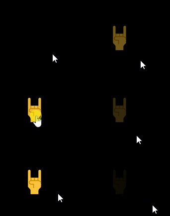
如果这些表情一直都是在运动的,只不过不点击的时候,它们的透明度都为 0,我们要做的,就是当我们点击的时候,让它们从opacity: 0变到opacity: 1。
要实现这一点,我们需要巧妙的用到transition。
我们以一个表情为例子:
默认它的透明度为opacity: 0.1
点击的时候,它的透明度瞬间变成opacity: 1
然后,通过transition-delay让opacity: 1的状态保持一段时间后
逐渐再消失,变回opacity: 0.1
看上去有亿点点复杂,代码会更容易理解:
li { opacity: .1; transition: 1.5s opacity 0.8s; } li:active { opacity: 1; transition: .1s opacity; }
效果如下:

一定要理解上面的代码!巧妙地利用transition在正常状态和active状态下的变化,我们实现了这种巧妙的点击效果。
如果我们把初始的opacity: 0.1改成opacity: 0呢?就会是这样:

好,我们结合一下上面两个动画:
我们将所有的表情,默认的透明度改为0.1
被点击的时候,透明度变成1
透明度在1维持一段时间,逐渐消失
代码如下:
@for $i from 1 to 51{ li:nth-child(#{$i}) { position: absolute; top: 0; left: 0; width: 50px; height: 50px; transform: rotate(#{random() * 80 - 40}deg); animation: move #{random() * 2500 + 1500}ms infinite #{random() * 4000 / -1000}s linear; opacity: .1; transition: 1.5s opacity .8s; &::before { content: nth($expression, random(length($expression))); position: absolute; } } li:active { opacity: 1; transition: .1s opacity; } } @keyframes move { 100% { transform: rotate(0) translate(0, -250px); } }
效果如下:

嘿,是不是有那么点意思了!
好最后一步,我们通过一个点击按钮引导用户点击,并且给与一个点击反馈,每次点击的时候,点赞按钮放大 1.1 倍,同时,我们把默认表情的透明度从opacity: 0.1彻底改为opacity: 0。
这样,整个动画的完整的核心代码:
$expression: "?", "?", "❤️", "?", "?", "?", "?", "?", "??", "?", "?", "?", "?", "?"; .g-wrap { position: relative; width: 50px; height: 50px; &::before { content: "??"; position: absolute; width: 50px; height: 50px; transition: 0.1s; } &:active::before { transform: scale(1.1); } } @for $i from 1 to 51 { li:nth-child(#{$i}) { position: absolute; width: 50px; height: 50px; transform: rotate(#{random() * 80 - 40}deg); animation: move #{random() * 2500 + 1500}ms infinite #{random() * 4000 / -1000}s cubic-bezier(.46,.53,.51,.62); opacity: 0; transition: 1.5s opacity .8s; &::before { content: nth($expression, random(length($expression))); position: absolute; } } li:active { transition: .1s opacity; opacity: 1!important; } } @keyframes move { 100% { transform: rotate(0) translate(0, -250px); } }
这里,需要注意的是:
点赞的按钮,通过了父元素.g-wrap的伪元素实现,这样的好处是,子元素 li 的:active点击事件,是可以冒泡传给父元素的,这样每次子元素被点击,我们都可以放大一次点赞按钮,用于实现点击反馈;
稍微修改一下缓动函数,让整体效果更为均衡合理。
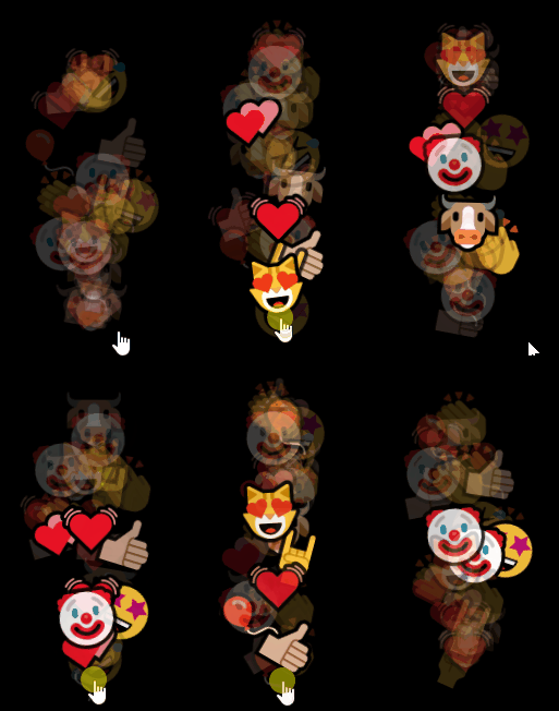
这样,我们就得到了题图一开始的效果,利用纯 CSS 实现的点赞动画:

完整的代码,你可以戳这里:CodePen Demo -- Like Animation
当然,这个方案是有一点点问题的。
1、就是如果当点击的速率过快,是无法实现一个点击,产生一个表情的
这是由于 CSS 方案的本质是通过点击一个透明表情,让它变成不透明。而点击过快的话,会导致两次或者多次点击,点在了同一个元素上,这样,就无法实现一个点击,产生一个表情。所以上面代码中修改缓动cubic-bezier(.46,.53,.51,.62)的目的也是在于,让元素动画前期运动更快,这样可以有利于适配更快的点击速率。
2、不仅仅是点击按钮,点击按钮上方也能出现效果
这样也很好理解,由于本质是个障眼法,所以点击按钮上方,只要是元素运动路径的地方,也是会有元素显形的。这个硬要解决也可以,通过再叠加一层透明元素在按钮上方,通过层级关系屏蔽掉点击事件。
3、表情的随机只是伪随机
利用 SASS 随机的方案在经过编译后是不会产生随机效果的。所以,这里只能是伪随机,基于 DOM 的个数,当 DOM 数越多,整体而言,随机的效果越好。基本上 50 个 DOM 是比较足够的。
4、CSS 版本的点赞效果是单机版
无法多用户联动,可能是影响能不能实际使用最为关键的因素。
However, all in all, the overall effect of the solution implemented using pure CSS is good.
(Learning video sharing:web front-end)
The above is the detailed content of Teach you step by step how to use transition to implement the like animation of short video APP. For more information, please follow other related articles on the PHP Chinese website!