


Today, let’s implement such an interesting interactive effect. Let’s talk about front-end mouse pointer interaction through this exchange effect. I hope it will be helpful to everyone!

Modify the original mouse pointer style to the effect you want, and add some special interactive effects. [Recommended learning: css video tutorial]
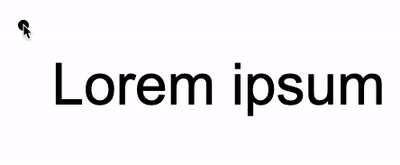
First of all, the first question, we can see that in the picture above , the style of the mouse pointer is modified to a dot:
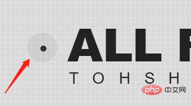
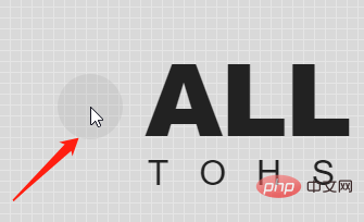
Normally it should be like this:
Of course, this is relatively simple. In CSS, we can modify the mouse pointer shape through the cursor style.
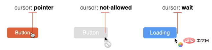
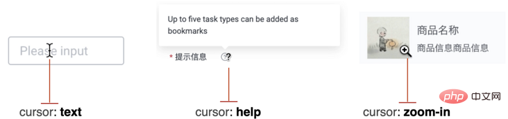
cursor to modify the mouse stylecursor CSS property sets the type of the mouse pointer and displays the corresponding style when the mouse pointer hovers over the element .
cursor: auto;
cursor: pointer;
...
cursor: zoom-out;
/* 使用图片 */
cursor: url(hand.cur)
/* 使用图片,并且设置 fallback 兜底 */
cursor: url(hand.cur), pointer;
Everyone should know this. Generally speaking, choosing different mouse pointer styles in different scenarios is also a way to improve the user experience.
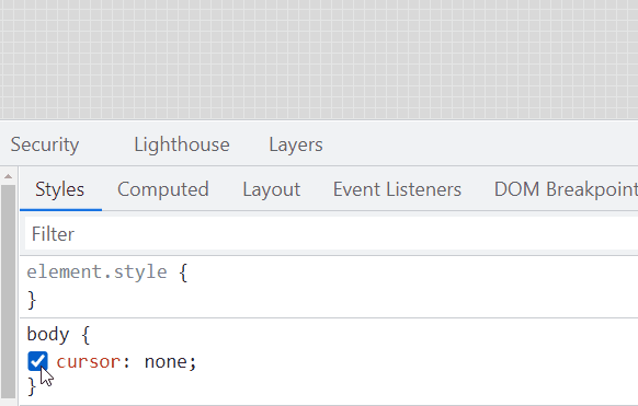
We are not trying to set the cursor In any way, just the opposite, we need to hide it.
cursor: none:
{
    cursor: none;
}
10px x 10px circular div, set to absolute positioning based on
: <div></div>
#g-pointer {
    position: absolute;
    top: 0;
    left: 0;
    width: 10px;
    height: 10px;
    background: #000;
    border-radius: 50%;
}mousemove## on the body. #, coincide the position of the small circle with the real-time mouse pointer position: <div class="code" style="position:relative; padding:0px; margin:0px;"><pre class="brush:php;toolbar:false">const element = document.getElementById("g-pointer");
const body = document.querySelector("body");
function setPosition(x, y) {
element.style.transform = `translate(${x}px, ${y}px)`;
}
body.addEventListener('mousemove', (e) => {
window.requestAnimationFrame(function(){
setPosition(e.clientX - 5, e.clientY - 5);
});
});</pre><div class="contentsignin">Copy after login</div></div> In this way, if
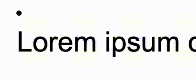
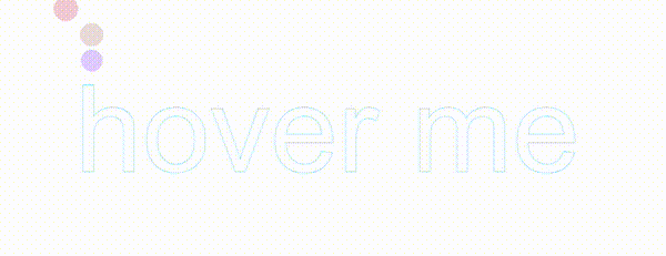
is not set, the effect will be like this:
 Add
Add
to the body, which is equivalent to simulating a mouse pointer:
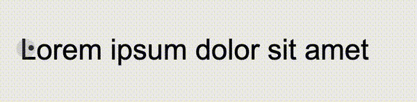
 On this basis, since the current mouse pointer is actually a
, so we can add any interactive effect to it. Taking the example at the beginning of the article as an example, we only need to use the mix mode
to enable the simulated mouse pointer to intelligently move between different background colors. Next change your color.
https:// github.com/chokcoco/iCSS/issues/169
Complete code:
Lorem ipsum dolor sit amet
<div></div>
<div></div>
body {
    cursor: none;
    background-color: #fff;
}
#g-pointer-1,
#g-pointer-2
{
    position: absolute;
    top: 0;
    left: 0;
    width: 12px;
    height: 12px;
    background: #999;
    border-radius: 50%;
    background-color: #fff;
    mix-blend-mode: exclusion;
    z-index: 1;
}
#g-pointer-2 {
    width: 42px;
    height: 42px;
    background: #222;
    transition: .2s ease-out;
}const body = document.querySelector("body");
const element = document.getElementById("g-pointer-1");
const element2 = document.getElementById("g-pointer-2");
const halfAlementWidth = element.offsetWidth / 2;
const halfAlementWidth2 = element2.offsetWidth / 2;
function setPosition(x, y) {
element.style.transform = `translate(${x - halfAlementWidth}px, ${y - halfAlementWidth}px)`;
element2.style.transform = `translate(${x - halfAlementWidth2}px, ${y - halfAlementWidth2}px)`;
}
body.addEventListener('mousemove', (e) => {
window.requestAnimationFrame(function(){
setPosition(e.clientX, e.clientY);
});
});
https://codepen.io/Chokcoco/pen/rNJQXXV
有一点需要注意的是,利用模拟的鼠标指针去 Hover 元素,Click 元素的时候,会发现这些事件都无法触发。
这是由于,此时被隐藏的指针下面,其实悬浮的我们模拟鼠标指针,因此,所有的 Hover、Click 事件都触发在了这个元素之上。
当然,这个也非常好解决,我们只需要给模拟指针的元素,添加上 pointer-events: none,阻止默认的鼠标事件,让事件透传即可:
{
    pointer-events: none;
}当然,这里核心就是一个鼠标跟随动画,配合上 cursor: none。
而且,鼠标跟随,我们不一定一定要使用 JavaScript。
我在 不可思议的纯 CSS 实现鼠标跟随 一文中,介绍了一种纯 CSS 实现的鼠标跟随效果,感兴趣的也可以看看。
https://github.com/chokcoco/iCSS/issues/46
基于纯 CSS 的鼠标跟随,配合 cursor: none,也可以制作出一些有意思的动画效果。像是这样:
CodePen Demo -- Cancle transition & cursor none
https://codepen.io/Chokcoco/pen/gOvZoVv
(学习视频分享:web前端)
The above is the detailed content of An in-depth exploration of CSS mouse pointer interaction effects. For more information, please follow other related articles on the PHP Chinese website!


![[Web front-end] Node.js quick start](https://img.php.cn/upload/course/000/000/067/662b5d34ba7c0227.png)


