How to implement linear gradient in CSS? The following article will introduce to you how to use theCSSlinear-gradient() linear gradient function, and talk about the various applications of linear gradients. I hope it will be helpful to everyone!

1. Syntax
linear- gradient([[to
-webkit-linear-gradient([[
These two types are different in usage and expression. When usingdirection, the former should be accompanied byto, and the latter without; useangle, the performance is inconsistent. [Recommended learning:css video tutorial]
1) Default
Both defaults are from top to bottom
background-image:linear-gradient(#00ffff, #ff1493, #006699); background-image:-webkit-linear-gradient(#00ffff, #ff1493, #006699)
2)
The opposite direction of expression
background-image:linear-gradient(to left, #00ffff, #ff1493, #006699); background-image:-webkit-linear-gradient(left, #00ffff, #ff1493, #006699);
background-image:linear-gradient(to left top, #00ffff, #ff1493, #006699); background-image:-webkit-linear-gradient(left top, #00ffff, #ff1493, #006699);
##3) The use of
Correspondence between degreeanddirection.-webkit-The corresponding direction is450°-angle
##
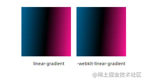
background-image:linear-gradient(275deg, #ff1493, #000000, #006699); background-image:-webkit-linear-gradient(175deg, #ff1493, #000000, #006699);
 in CSS) 450°-175° =275°
450°-175° =275°
, so the two behave the same, as shown below:

can use a percentage or a specific value to indicate that this color reachessaturation## at this position#
background-image:linear-gradient(to right, #ff1493 10%, #000000 40%, #006699 60%); background-image:-webkit-linear-gradient(to right, #ff1493 10%, #000000 40%, #006699 60%);
You can see the color change process from the picture above:
0% --> 10%: #ff1493
Has beensaturated10% --> 40%: #ff1493
#000000, at40%# At ##,#000000reachessaturation40% --> 60%: #000000gradually becomes
, at60%,#006699reachessaturation##60% --> 100%: # 006699Always inSaturation
Using this feature, you can draw stripes
background-image:linear-gradient(to right, #ff1493 33%, #000000 33%, #000000 66%, #006699 66%); background-image:-webkit-linear-gradient(to right, #ff1493 33%, #000000 33%, #000000 66%, #006699 66%);
stop in CSS)
, the effect is consistent with the picture above.If the latter value is smaller than the former, the former shall prevail. As follows,20pxis smaller than60px
60px. The effect is as shown below:
background-image:linear-gradient(right, #ff1493 60px, #000000 20px); background-image:-webkit-linear-gradient(right, #ff1493 60px, #000000 20px);
 in CSS)
/* 3种颜色平分,渐变中心为1/3和2/3处 */ background-image:linear-gradient(to right, #ff1493, #000000, #006699); /* 渐变中心在10%和20%处 */ background-image:linear-gradient(to right, #ff1493, 10%, #000000, 20%, #006699);
Note:-webkit-linear-gradient
does not support this usageExtension 2: repeating-linear-gradient
 in CSS)
background-image:repeating-linear-gradient(0deg, #ff1493, #000000 10px, #006699 20px); background-image:-webkit-repeating-linear-gradient(0deg, #ff1493, #000000 10px, #006699 20px)
2. Commonly used styles
(1) Multi-color starry sky
background-image: linear-gradient(45deg, rgba(255, 0, 76, 0.7), rgba(0, 0, 255, 0) 80%), linear-gradient(135deg, rgba(106, 0, 128, 1), rgba(0, 128, 0, 0) 80%), linear-gradient(225deg, rgba(0, 255, 255, 1), rgba(0, 255, 255, 0) 80%), linear-gradient(315deg, rgba(255, 192, 203, 0.7), rgba(255, 192, 203, 0) 80%);
(2) Plaid pattern
background-image: repeating-linear-gradient(0deg, rgba(0, 255, 255, 0.3) 0px 5px, transparent 5px 10px), repeating-linear-gradient(90deg, rgba(0, 255, 255, 0.3) 0px 5px, transparent 5px 10px); background-image: repeating-linear-gradient(45deg, rgba(0, 255, 255, 0.3) 0px 5px, transparent 5px 10px), repeating-linear-gradient(135deg, rgba(0, 255, 255, 0.3) 0px 5px, transparent 5px 10px);
 in CSS) Use color and transparent color to alternately render
Use color and transparent color to alternately render
(3)边框渐变
内部背景透明,但是不支持设置border-radius
注:可以使用clip-path裁剪出圆角, 但是这种方式不适用于角度较大的圆角
这几种方式都能做到圆角渐变边框,但是无法做到内部背景透明

(4)文字渐变
Darker CMJ
background-clip规定背景的绘制区域,我们设置其值为text,就是在文字区域绘制,然后将文字color或者-webkit-text-fill-color设置为透明色,渐变区域就能显示出来了
好了,over,第一次写文章,希望能坚持下去=.=
(学习视频分享:web前端)
The above is the detailed content of A brief analysis of how to implement linear gradient (linear-gradient) in CSS. For more information, please follow other related articles on the PHP Chinese website!