This article brings you relevant knowledge about the css architecture SMACSS. It will also talk about what smacss is and related issues about the classification of this architecture. I hope it will be helpful to everyone.

Because CSS has only one scope, if we do not pay attention to maintaining the CSS code, it will make the code we write difficult to read and maintain, so we use the web page itself to be hierarchical , abstracting the BEM methodology.
BEM's simple three-layer classification method has no problem in dealing with small and medium-sized websites, but it may be more difficult to deal with the styles of complex websites. We need to find a better way.
So SMACSS was born. The relationship between SMACSS and BEM is a bit like the relationship between Flex layout and Grid layout in layout.
But please note that SMACSS and BEM have never been a matter of inclusion and inclusion before. Just like when applying Flex layout and Grid layout, when laying out the website structure, we will tend more to Grid, ordinary and simple two-dimensional The layout will use Flex, and we will use the appropriate method at the right time. SMACSS and BEM are similar. Once you master the idea, application is a trivial matter.
If you haven’t learned BEM yet, you can refer to the article BEM on CSS Architecture.
It is not difficult to think that SMACSS is the abbreviation. This abbreviation is the opening of the website. Note: Scalable and Modular Architecture for CSS. The meaning of the name is very clear, which is to write modularity and structure. Customized and scalable CSS.

When you finish learning SMACSS, you will have a deeper understanding of Scalable and Modular Architecture for CSS.
How to pronounce SMACSS? Although SMACSS is not a word, it has its own pronunciation, which is pronounced the same as {smacks}.
If you find a core word for BEM, it is layering. If you also find a core word for SMACSS, it must be classification. There is a one-word difference. Let’s take a look. See how SMACSS classifies.
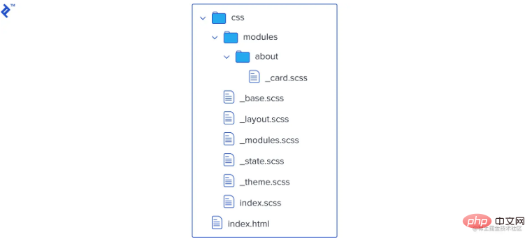
The core of SMACSS is classification, which specifically divides project styles into five categories:
Base (Basic)
Layout
Module
State
html {
    margin: 0;
    font-family: sans-serif;
}
a {
    color: #000;
}
button {
    color: #ababab;
    border: 1px solid #f2f2f2;
}
Layout > ModuleIf the website is complex, it can actually be like this :> Layout > Module > Layout > Module...So, the layout (Layout) rule is to split the page into several parts, each part may There are one or more modules. General layout class names start with .l-. It should be noted that the official statement says that the main layout can use the ID selector, and the secondary layout uses the class selector. I absolutely cannot accept this. I think all classes should be used. Take an example:
##
.l-header {}
.l-primarynav {}
.l-main-content {} Note that in actual project development, Layout is often used directly as a component, such as
 Module
Module is the reusable and modular part of our design. Illustrations, sidebars, product lists, etc. all belong to modules.
Module From an engineering perspective, it doesn’t matter if you call it component.
Take an example, a POST component:
<div class="l-article">
    <article class="post">
        <header class="post-header">
            <h2 class="post-title"></h2>
            <span class="post-author"></span>
        </header>
        <section class="post-body">
            <img  class="post-image" src="..." alt="Teach you step by step the CSS structure of SMACSS" >
            <div class="post-content">
                <p class="post-paragraph"></p>
                <p class="post-paragraph"></p>
            </div>
        </section>
        <footer class="post-footer"></footer>
    </article>
</div>The class name is very simple, just prefix it with moudle-name or component-name.
对于 Module 甚至是 Layout,里面不可避免需要动态交互,比如按钮是不是禁用 disable,布局是不是激活 active,tab 组件是不是展开 expand 等,于是我们需要维护 state 来操作动态变化的部分,这就是第四个部分 State。
State 的类名,一般使用 .is- 来开头,例如:
.is-collapsed {}
.is-expanded {}
.is-active {}
.is-highlighted {}
.is-hidden {}
.is-shown {}
.is-successful {}大家多多少少都用过网站的换肤功能,所以 Theme 也算比较常见的了,整个网站上重复的元素,比如颜色、形状、边框、阴影等规则基本都在 Theme 的管辖下,换句话说 Theme 是定义公共类名的地方。
大多数情况下,。我们不想每次创建它们时都重新定义它们。相反,我们想要定义一个唯一的类,我们稍后才将其添加到默认元素中。
.button-large {
    width: 60px;
    height: 60px;
}<button class="button-large">Like</button>
不要将这些 SMACSS 主题规则与基本规则混淆,因为基本规则仅针对默认外观,并且它们往往类似于重置为默认浏览器设置,而主题单元更像是一种样式,它提供最终外观,这种特定的配色方案是独一无二的。
如果站点具有多个样式或多个用于不同状态的主题,主题规则也很有用,因此可以在页面上的某些事件期间轻松更改或交换,例如使用主题切换按钮。至少,它们将所有主题样式保存在一个地方,因此您可以轻松更改它们并保持它们井井有条。
项目中使用了 SMACSS 的命名规范,目的大概就是这样的:

因为 CSS 只有一个作用域,会导致代码很混乱,很难阅读,也很难扩展,于是出现了BEM ,但是当项目更加复杂的时候,我们需要一个新的更上一个台阶的样式管理方案,这就是 SMACSS ,不用于 BEM 的分层,它把采用的办法是分类,项目中的样式文件被它分为五类,让我样式管理变得更加的方便了。
(学习视频分享:css视频教程)
The above is the detailed content of Teach you step by step the CSS structure of SMACSS. For more information, please follow other related articles on the PHP Chinese website!