


How to center the box horizontally in css3

css3 Method to center the box horizontally: 1. Use the margin attribute and add the "margin: 0 auto;" style to the box element to center it horizontally; 2. Use flex elastic layout to achieve horizontal centering; 3. Use the position and transform properties to achieve horizontal centering.

The operating environment of this tutorial: Windows 7 system, CSS3&&HTML5 version, Dell G3 computer.
How to center the box horizontally in CSS is a very common interview question. The centering of the box is relative to the parent element. Therefore, when we center the box, we often use nesting to let the parent box nest. With child box.
How to center the child box when the parent and child boxes are nested:
The first method: margin: 0 auto, using the border, but the use of margin will affect The use of other boxes is not recommended;
The second method: position, use positioning, the child must be the same as the parent, then left: 50%, margin-left: negative box Half of the width, this is the most commonly used method;
The third method: flex, elastic layout, center the child box, but the style must be written in the parent box, display:flex,just-content:center;
Fourth method: Based on position, replace margin-left with transform in CSS3: translate(-50px );
-
The fifth method: Based on the position, only keep the child and parent, and then add margin:auto, left:0, right:0 to the child box ;
Supplement: In the fifth method, add top:0, bottom:0, you can achieve both vertical and horizontal centering
<div id="father">
    <div id="son"></div>
</div>
<style>
#father{
width: 400px;
height: 200px;
border: 3px solid pink;
}
#son{
width: 100px;
height: 100px;
border: 2px solid red;
}
</style>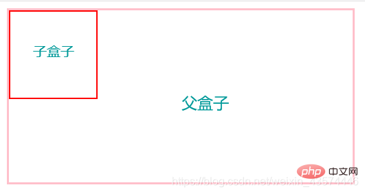
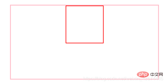
Use margin to achieve horizontal centering:
<style>
#father{
    width: 400px;
    height: 200px;
    border: 3px solid pink;
    margin: 30px auto; /* 让父元素相对于body居中 */
}
#son{
    width: 100px;
    height: 100px;
    border: 2px solid red;
    margin: 0 auto;/* 让子元素相对于father居中 */
}
</style>
Use positioning, the child must be the same as the parent, then left: 50%, margin-left: half of the negative box width:
<style>
#father{
    width: 400px;
    height: 200px;
    border: 3px solid pink;
    margin: 0 auto;
    position: relative;
}
#son{
    width: 100px;
    height: 100px;
    border: 2px solid red;
    position: absolute;
    left: 50%;
    margin-left: -50px;
}
</style>
Flex, flexible layout, centers the child box, but the style must be written in the parent box :
<style>
#father{
    width: 400px;
    height: 200px;
    border: 3px solid pink;
    margin: 0 auto;
    display: flex;
    justify-content: center;
}
#son{
    width: 100px;
    height: 100px;
    border: 2px solid red;
}
</style>
On the basis of position, only the child and parent aspects are retained, and then in the child box Add margin: auto, left: 0, right: 0:
<style>
#father{
    width: 400px;
    height: 200px;
    border: 3px solid pink;
    margin: 0 auto;
    position: relative;
}
#son{
    width: 100px;
    height: 100px;
    border: 2px solid red;
    position: absolute;
    margin: auto;
    left: 0;
    right: 0;
}
</style>
The above methods can achieve the horizontal centering of the box. If you have other excellent (odd) and showy (pai) methods, you are welcome to share them. !
The fifth method is added: adding top:0, bottom:0 can achieve both horizontal and vertical centering:
<style>
#father{
    width: 400px;
    height: 200px;
    border: 3px solid pink;
    margin: 0 auto;
    position: relative;
}
#son{
    width: 100px;
    height: 100px;
    border: 2px solid red;
    position: absolute;
    margin: auto;
    left: 0;
    right: 0;
    top: 0;
    bottom: 0;
}
</style>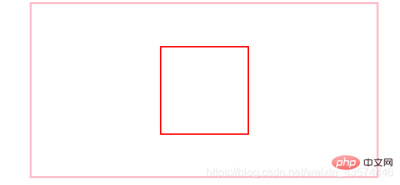
(Learning video sharing: css video tutorial)
The above is the detailed content of How to center the box horizontally in css3. For more information, please follow other related articles on the PHP Chinese website!

Hot AI Tools

Undress AI Tool
Undress images for free

Undresser.AI Undress
AI-powered app for creating realistic nude photos

AI Clothes Remover
Online AI tool for removing clothes from photos.

Clothoff.io
AI clothes remover

Video Face Swap
Swap faces in any video effortlessly with our completely free AI face swap tool!

Hot Article
Hot Tools

Notepad++7.3.1
Easy-to-use and free code editor

SublimeText3 Chinese version
Chinese version, very easy to use

Zend Studio 13.0.1
Powerful PHP integrated development environment

Dreamweaver CS6
Visual web development tools

SublimeText3 Mac version
God-level code editing software (SublimeText3)


 How to use the CSS backdrop-filter property?
Aug 02, 2025 pm 12:11 PM
How to use the CSS backdrop-filter property?
Aug 02, 2025 pm 12:11 PM
Backdrop-filter is used to apply visual effects to the content behind the elements. 1. Use backdrop-filter:blur(10px) and other syntax to achieve the frosted glass effect; 2. Supports multiple filter functions such as blur, brightness, contrast, etc. and can be superimposed; 3. It is often used in glass card design, and it is necessary to ensure that the elements overlap with the background; 4. Modern browsers have good support, and @supports can be used to provide downgrade solutions; 5. Avoid excessive blur values and frequent redrawing to optimize performance. This attribute only takes effect when there is content behind the elements.
 What is the CSS aspect-ratio property and how to use it?
Aug 04, 2025 pm 04:38 PM
What is the CSS aspect-ratio property and how to use it?
Aug 04, 2025 pm 04:38 PM
Theaspect-ratioCSSpropertydefinesthewidth-to-heightratioofanelement,ensuringconsistentproportionsinresponsivedesigns.1.Itisapplieddirectlytoelementslikeimages,videos,orcontainersusingsyntaxsuchasaspect-ratio:16/9.2.Commonusecasesincludemaintainingres
 How to create a bouncing animation with CSS?
Aug 02, 2025 am 05:44 AM
How to create a bouncing animation with CSS?
Aug 02, 2025 am 05:44 AM
Define@keyframesbouncewith0%,100%attranslateY(0)and50%attranslateY(-20px)tocreateabasicbounce.2.Applytheanimationtoanelementusinganimation:bounce0.6sease-in-outinfiniteforsmooth,continuousmotion.3.Forrealism,use@keyframesrealistic-bouncewithscale(1.1
 How to use the CSS :empty pseudo-class?
Aug 05, 2025 am 09:48 AM
How to use the CSS :empty pseudo-class?
Aug 05, 2025 am 09:48 AM
The:emptypseudo-classselectselementswithnochildrenorcontent,includingspacesorcomments,soonlytrulyemptyelementslikematchit;1.Itcanhideemptycontainersbyusing:empty{display:none;}tocleanuplayouts;2.Itallowsaddingplaceholderstylingvia::beforeor::after,wh
 What are the virtual currency trading apps?_The top ten recommended official virtual currency trading apps in 2025
Aug 08, 2025 pm 06:42 PM
What are the virtual currency trading apps?_The top ten recommended official virtual currency trading apps in 2025
Aug 08, 2025 pm 06:42 PM
1. Binance is known for its huge transaction volume and rich trading pairs. It provides diversified trading models and perfect ecosystems. It also ensures the security of user assets through SAFU funds and multiple security technologies and attaches great importance to compliant operations; 2. OKX Ouyi provides a wide range of digital asset trading services and unified trading account models, actively deploys the Web3 field, and improves transaction security and experience through strict risk control and user education; 3. gate.io Sesame opens the door and has good currency speed and rich currency, provides diversified trading tools and value-added services, adopts multiple security verification mechanisms and adheres to the transparency of asset reserves to enhance user trust; 4. Huobi provides one-stop digital asset services with deep industry accumulation, with strong transaction depth and
 How to use CSS clip-path for creative shapes?
Aug 04, 2025 pm 02:55 PM
How to use CSS clip-path for creative shapes?
Aug 04, 2025 pm 02:55 PM
Use CSSclip-path to create non-rectangular shapes in the browser without additional images or complex SVG; 2. Common shape functions include inset(), circle(), ellipse() and polygon(), where polygon() implements custom shapes by defining coordinate points, which is suitable for creating creative designs such as dialog bubbles; 3. clip-path can achieve dynamic effects through CSS transition or keyframe animation, such as circle expansion during hovering, but only supports inter-shape animations of the same type and number of vertices; 4. Pay attention to responsiveness and accessibility to ensure that the content is still available when not supported, the text is readable, avoid excessive cropping, and control the number of polygon vertices to optimize performance. At the same time, it is necessary to know that
 How to create a CSS-only accordion menu?
Aug 03, 2025 pm 01:48 PM
How to create a CSS-only accordion menu?
Aug 03, 2025 pm 01:48 PM
Use hidden checkboxes and CSS's :checked pseudo-class combined with adjacent sibling selectors ( ) to control content display; 2. The HTML structure contains input, label and content div for each collapsed item; 3. Smooth expansion/collapse animations by setting max-height transition; 4. Add open/close status icons with pseudo-elements; 5. Use radio types to implement single-open mode, while checkbox allows multiple openings. This is an interactive foldable menu implementation that requires no JavaScript and is compatible with modern browsers.
 How to create a text gradient with CSS?
Aug 01, 2025 am 07:39 AM
How to create a text gradient with CSS?
Aug 01, 2025 am 07:39 AM
Use background-image and background-clip:text to achieve CSS text gradient effect; 2. You must set -webkit-background-clip:text and -webkit-text-fill-color:transparent to ensure browser compatibility; 3. You can customize linear or radial gradients, and it is recommended to use bold or large text to improve visual effect; 4. It is recommended to set color as an alternative color for unsupported environments; 5. Alternatives can use -webkit-mask-image to achieve more complex effects, but they are mainly suitable for advanced scenarios; this method is simple, has good compatibility and visual
