Attributes to achieve animation effects in CSS: 1. "animation" attribute, which can be used in conjunction with the "@keyframes" rule to set animation effects for elements; 2. "transition" attribute, which can give Elements are animated excessively.

The operating environment of this tutorial: Windows 10 system, CSS3&&HTML5 version, Dell G3 computer.
What are the properties used to achieve animation effects in css3
In css, if you want to achieve animation effects, you can use the animation attribute and transition attribute.
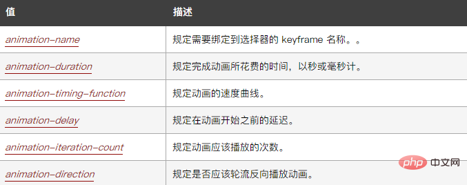
1. The animation attribute is an abbreviated attribute, used to set six animation attributes. The syntax is as follows:
animation: name duration timing-function delay iteration-count direction;
The attribute value is as follows:

Examples are as follows:
<html>
<head>
<style>
div
{
width:100px;
height:100px;
background:red;
position:relative;
animation:mymove 5s infinite;
-webkit-animation:mymove 5s infinite; /*Safari and Chrome*/
}
@keyframes mymove
{
from {left:0px;}
to {left:200px;}
}
@-webkit-keyframes mymove /*Safari and Chrome*/
{
from {left:0px;}
to {left:200px;}
}
</style>
</head>
<body>
<p><strong>注释:</strong>Internet Explorer 9 以及更早的版本不支持 animation 属性。</p>
<div></div>
</body>
</html>Output results:

2. The transition attribute is an abbreviated attribute used to set four transition attributes. The syntax is as follows :
transition: property duration timing-function delay;
The attribute value is as follows:

The example is as follows:
<html>
<head>
<style>
div
{
width:100px;
height:100px;
background:blue;
transition:width 2s;
-moz-transition:width 2s; /* Firefox 4 */
-webkit-transition:width 2s; /* Safari and Chrome */
-o-transition:width 2s; /* Opera */
}
div:hover
{
width:300px;
}
</style>
</head>
<body>
<div></div>
<p>请把鼠标指针移动到蓝色的 div 元素上,就可以看到过渡效果。</p>
<p><b>注释:</b>本例在 Internet Explorer 中无效。</p>
</body>
</html>Output result:

(Learning video sharing: css video tutorial)
The above is the detailed content of What are the properties that implement animation effects in css3. For more information, please follow other related articles on the PHP Chinese website!