


In CSS, you can use the border-radius attribute to set the border rounded corners. The function of this attribute is to add a rounded corner effect to the border. You only need to add "border-radius: rounded corner radius value;" to the element. Style, you can set the rounded corners of four borders at the same time.

The operating environment of this tutorial: Windows 7 system, CSS3&&HTML5 version, Dell G3 computer.
The most common and simplest way to set border rounded corners in css is to use the border-radius attribute.
CSS border-radius property defines the radius of the corner of the element. Through the CSS border-radius property, the "rounded corner" style of any element can be achieved.
Syntax:
border-radius: none | length{1,4} [/ length{1,4}
Each value can be in the form of a numerical value or a percentage.
length/length The first length represents the radius in the horizontal direction, and the second represents the radius in the vertical direction.
If it is a value, then the four values of top-left, top-right, bottom-right, and bottom-left are equal.
If there are two values, then top-left and bottom-right are equal and are the first value, and top-right and bottom-left are equal and are the second value.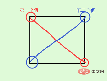
If there are three values, then the first value is to set top-left, and the second value is top-right and bottom-left and they will be equal, and the third value is to set bottom-right.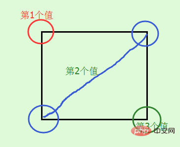
If there are four values, then the first value is to set top-left, and the second value is to set top-right, the third value is to set bottom-right, and the fourth value is to set bottom- left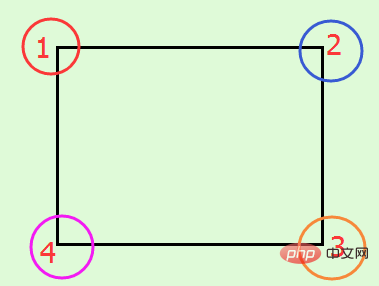
In addition to the above abbreviations, you can also write the four corners separately like border, as follows:
border-top-left-radius: //左上角 border-top-right-radius: //右上角 border-bottom-right-radius: //右下角 border-bottom-left-radius: //左下角
are the horizontal directions respectively and the vertical radius. When the second value is omitted, the horizontal and vertical radii are equal.
border-radius only supports the border-radius standard syntax format in the following versions of browsers: Firefox4.0, Safari5.0, Google Chrome 10.0, Opera 10.5, and IE9. For older browsers, border-radius needs to be based on Different browser kernels add different prefixes. For example, the Mozilla kernel needs to add "-moz", and the Webkit kernel needs to add "-webkit", etc. However, IE and Opera do not have private formats, so in order to maximize browser compatibility , we need to set it as follows:
-webkit-border-radius: 10px 20px 30px; -moz-border-radius: 10px 20px 30px; border-radius: 10px 20px 30px;
Please write the standard form after the browser private form.
Give a few examples to see the effect:
Effect:
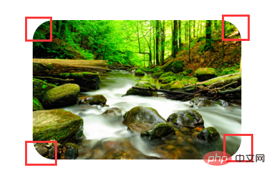
The radius of the four corners is 30px;
Look at a standard circle and ellipse again:
Effect:
The difference between the first and second p mainly lies in whether it is a square or a rectangle. The circle is in When carouseling, it can be used instead of the circle picture.
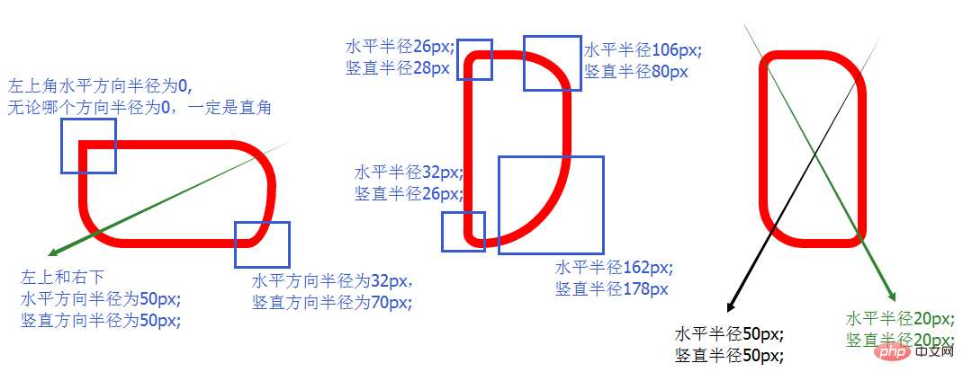
The above are examples of equal radii in the horizontal and vertical directions. Here are two examples of different radii in the horizontal and vertical directions:
The effect is as follows:
(Learning video sharing:css video tutorial)
The above is the detailed content of How to set border rounded corners in css. For more information, please follow other related articles on the PHP Chinese website!


![[Web front-end] Node.js quick start](https://img.php.cn/upload/course/000/000/067/662b5d34ba7c0227.png)


