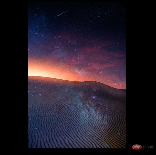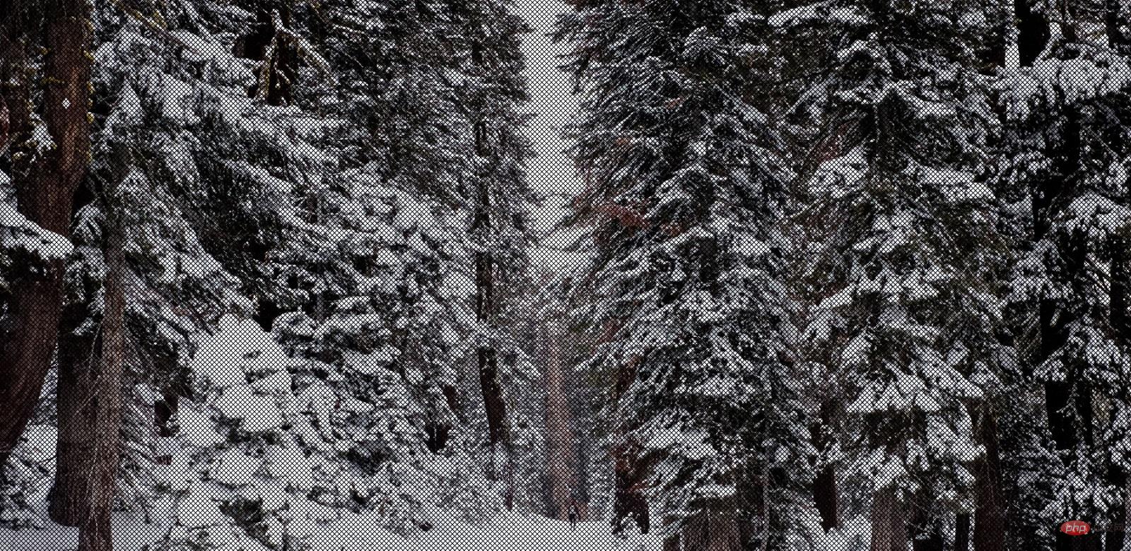
In the previous article "Using CSS3 to create practical loading animation effects (two types)", we shared two loading animation effects achieved using CSS3. This time we will introduce to you how to use CSS to superimpose and fuse two images together to create a beautiful effect. If you are interested, you can learn about it~
Today, this article will share with you two ways to use CSS3 to combine two images. Special effects that are superimposed and fused together to display. Without further ado, let’s get started~
The first method: use the mix-blend-mode attribute
<!DOCTYPE html>
<html>
	<head>
		<meta charset="utf-8">
		<style>
			body {
				background-color: black;
			}

			.center {
				text-align: center;
				display: block;
			}

			.cool_effect img:first-child {
				position: absolute;
				mix-blend-mode: soft-light;
			}
		</style>
	</head>
	<body>
		<div class="center">
			<div class="cool_effect">
				<img  src="https://img.php.cn/upload/article/000/000/024/61289cbf3781b804.jpg" alt="Super practical! Use CSS3 to overlay two images and display them together" >
				<img  src="https://img.php.cn/upload/article/000/000/024/61289ccb2cf43141.jpg" alt="Super practical! Use CSS3 to overlay two images and display them together" >
			</div>
		</div>
	</body>
</html>Use:first-childSelect the first img image with the selector and set absolute positioning for it; then use the add key code mix-blend-mode: soft-light;Set the blending mode to blend the upper and lower images in Together.
The rendering is as follows:

Explanation: The mix-blend-mode attribute describes that the content of the element should be consistent with the content of the element's direct parent element and the element's How the background blends.
取值情况:
mix-blend-mode: normal; // 正常
mix-blend-mode: multiply; // 正片叠底
mix-blend-mode: screen; // 滤色
mix-blend-mode: overlay; // 叠加
mix-blend-mode: darken; // 变暗
mix-blend-mode: lighten; // 变亮
mix-blend-mode: color-dodge; // 颜色减淡
mix-blend-mode: color-burn; // 颜色加深
mix-blend-mode: hard-light; // 强光
mix-blend-mode: soft-light; // 柔光
mix-blend-mode: difference; // 差值
mix-blend-mode: exclusion; // 排除
mix-blend-mode: hue; // 色相
mix-blend-mode: saturation; // 饱和度
mix-blend-mode: color; // 颜色
mix-blend-mode: luminosity; // 亮度

按效果来分可以分为这几类:
 基础混合模式  normal  利用图层透明度和不透明度来控制与下面的图层混合
 降暗混合模式   darken,multiply,color-burn  减色模式,滤掉图像中高亮色,从而达到图像变暗
 加亮混合模式  screen,lighten,color-dodge  加色模式,滤掉图像中暗色,从而达到图像变亮
 融合混合模式  overlay,soft-light,hard-light   用于不同程度的对上、下两图层的融合
 变异混合模式  difference,exclusion,hard-light 用于制作各种变异的图层混合
 色彩叠加混合模式    hue,saturation,color,luminosity 根据图层的色相,饱和度等基本属性,完成图层融合
Method 2: Use the background attribute
<!DOCTYPE html>
<html>
	<head>
		<meta charset="utf-8">
		<style>
			body {
			  background-image: url(https://img.php.cn/upload/article/000/000/024/6128a4d8808ab560.png),
			  url(https://img.php.cn/upload/article/000/000/024/6128c89393fce968.jpg);
			  background-position: top, top;
			  background-repeat: repeat, no-repeat;
			  background-size: contain, cover;
			}
		</style>
	</head>
	<body>
	</body>
</html>Just specify multiple background paths directly in the background-image. The effect is as follows:

PHP Chinese website platform has a lot of video teaching resources. Welcome everyone to learn "css Video Tutorial"!
The above is the detailed content of Super practical! Use CSS3 to overlay two images and display them together. For more information, please follow other related articles on the PHP Chinese website!