In the previous article "Teach you step by step how to use CSS3 to achieve animation effects (code sharing)", I will introduce to you how to use CSS3 animation effect setting experience. The following article will introduce to you how to use css3 to add gradient effects to images. Let’s take a look.

The first time I came into contact with css3 gradient was a long time ago. I thought this thing was very interesting. It is like playing PS and you can make many gorgeous things.
| IE | FF | Chrome | Safari | Opera | iOS | Android | Android Chrome |
|---|---|---|---|---|---|---|---|
| 6-9(no) | 2-3.5(no) | 4-9(part-webkit-) | 3.1-3.2(no) | - | 3.2-4.3(Part) | 2.1-3.0(-webkit-) | 10-25(-webkit-) |
| 10 | 3.6-15(-webkit-) | 10-25(-webkit-) | 4-5(part)5-6.1(-webkit-) | - | 5 | 4-4.3(-webkit-) | 26 |
| - | 15 | 25 | 5-6 | 15 | - | 4.4 | - |
Use syntax
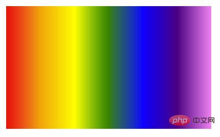
linear-gradient([ [ [| to [top | bottom] || [left | right] ],]?[,]+);
The following codes can be run, and the execution results are the same
linear-gradient(#fff, #333); linear-gradient(to bottom, #fff, #333); linear-gradient(to top, #333, #fff); linear-gradient(180deg, #fff, #333); linear-gradient(to bottom, #fff 0%, #333 100%);
You can define the angle, starting direction, color, and color proportion
demo


Use syntax
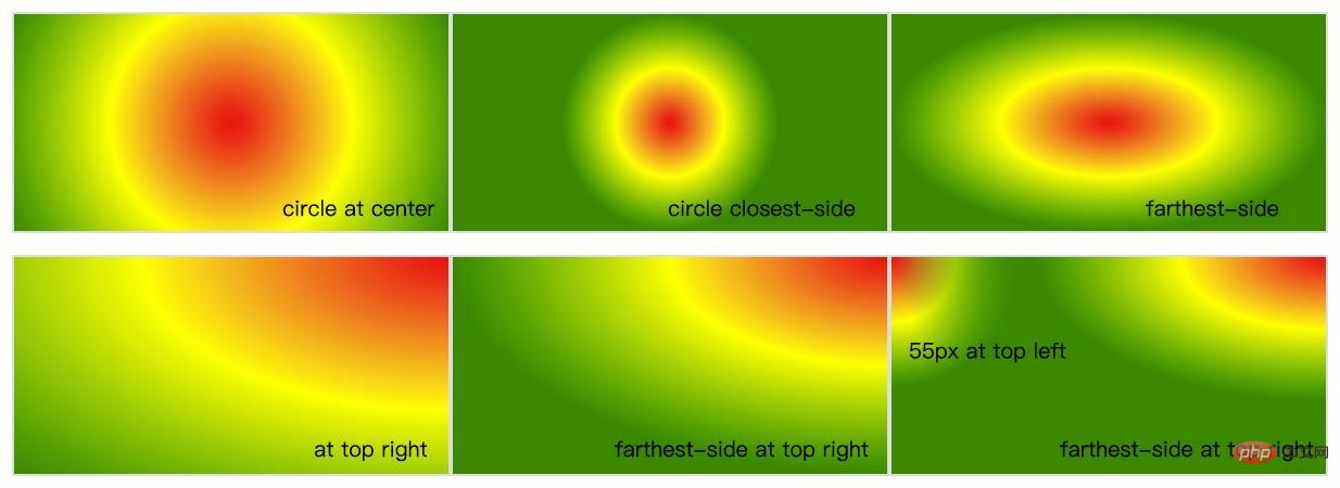
radial-gradient( [ circle ||][ at]? , | [ ellipse || [|]{2}][ at]? , | [ [ circle | ellipse ] ||][ at]? , | at,[ ,]+ )
radial-gradient(circle, #f00, #ff0, #080); radial-gradient(circle at center, #f00, #ff0, #080); radial-gradient(circle at 50%, #f00, #ff0, #080); radial-gradient(circle farthest-corner, #f00, #ff0, #080);
You can quickly locate the position of the shape throughlengthclosest-side The edge shape of the gradient and the container are closest to the gradient center point is tangent to one side (circle) or at least to the vertical and horizontal sides closest to the center point of the gradient (ellipse).
closest-corner The edge shape of the gradient intersects the corner of the container closest to the center point of the gradient. farthest-side The opposite of closest-side, the edge shape is tangent to the side of the container farthest from the center point of the gradient (or the furthest vertical and horizontal sides). farthest-corner The edge shape of the gradient intersects the corner of the container farthest from the center point of the gradient.You can useatto quickly determine the position of the center of the circlecircle at left topThe center of the circle is in the upper left corner
Get the following
 Filled radial gradient repeating-radial-gradient
Code example
Get the following
 You can use gradients to create many effects
Code example
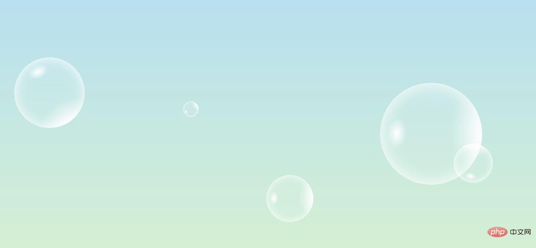
As shown below, you can make a beautiful bubble
 and then use the animation from the previous article to make it move.
Click here to see the effect https://k-ui.cn The animation is delayed and will take a while to appear.
Recommended learning:
CSS3 video tutorialThe above is the detailed content of Teach you how to use css3 to add gradient effects to images (detailed code explanation). For more information, please follow other related articles on the PHP Chinese website!