How to set css beyond automatic line wrapping: 1. Use the "word-break: break-all;" style, based on letters, to force automatic line wrapping; 2. Use "word-wrap: break-word;" "Style, based on words, forces automatic line wrapping.

The operating environment of this tutorial: Windows 7 system, CSS3&&HTML5 version, Dell G3 computer.
In HTML, when div, p, h tags, etc. encounter a continuous large block of English and numbers, they will not automatically wrap according to the box width limit under normal circumstances. So how to set beyond automatic line wrapping in cssz?
In CSS, you can use word-wrap: break-word; or word-break:break-all; to force English to wrap.
word-break: break-all; Sets forced automatic line wrapping of text, but only works in English, using letters as the basis for line wrapping.
word-wrap: break-word; Sets forced automatic line wrapping of text, but only works in English, using words as the basis for line wrapping.
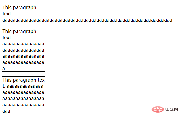
Example:
<!DOCTYPE html>
<html>
<head>
<meta charset="utf-8">
<style>
p
{
	width:9em;
	border:1px solid #000000;
}
p.test1
{
	word-wrap:break-word;
}

p.test2
{
	word-break:break-all;
}
</style>
</head>
<body>
<p>
 This paragraph text. aaaaaaaaaaaaaaaaaaaaaaaaaaaaaaaaaaaaaaaaaaaaaaaaaaaaaaaaaaaaaaaaa
 </p>
<p class="test1">
 This paragraph text. aaaaaaaaaaaaaaaaaaaaaaaaaaaaaaaaaaaaaaaaaaaaaaaaaaaaaaaaaaaaaaaaa
 </p>
<p class="test2">
 This paragraph text. aaaaaaaaaaaaaaaaaaaaaaaaaaaaaaaaaaaaaaaaaaaaaaaaaaaaaaaaaaaaaaaaa
 </p>
</body>
</html>Rendering:

(Learning video sharing: css video tutorial)
The above is the detailed content of How to set css to exceed automatic line wrapping. For more information, please follow other related articles on the PHP Chinese website!