
Negative margins, that is, setting the value of the margin attribute to a negative value, is a very useful technique in CSS layout. Scenarios with positive values are very common, and everyone is familiar with its performance
When margin-top and margin-left are negative values, the element will be moved up and left, and at the same time The position in the document flow also changes accordingly, which is different from the position:relative element that still occupies its original position after setting top and left.
When margin-bottom and margin-right are set When it is a negative value, the element itself has no position change, and subsequent elements will move down and to the right
Look at a few application scenarios
Absolutely positioned elements
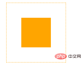
When an element is set to absolutely positioned, its top, right, bottom, and left values refer to the distance from the nearest non-static element. The classic vertical centering This method is achieved by using the negative margins of absolutely positioned elements.
Set the element to absolute positioning, and then set the top and left to 50%. At this time, the top and left sides of the element will reach the top and left of the parent element. At 50%, set negative margins to the element's own height and length, moving the center of the element to the center of the parent element to achieve center alignment

float element
The impact of negative margins on float elements is also as mentioned above, but it has its own particularities. Let’s look at an example to make it clear
Floating element negative margin
In a div with a width of 280px, there are three float:left sub-elements on the right, with a width of 100px. Since they cannot fit in one row, the last one has been moved to Next line
We slightly modify the code
Add a negative margin of -20px to the third element
At this time, I found that the third element moved up and covered the second element by 20px. The classic multi-column layout uses this principle
Multiple columns Layout
Content Content Content Content Content Content Content Content Content Content Content Content Content Content ContentRight
The code is very simple
Add a parent element to the content element, set left floating, width 100%
The content element sets the right margin, the value is equal to the width of right
right floats left, and then sets the negative margin of its width
Originally, right should be displayed on the second line, but the left floating of its width brought it to the rightmost side of the first line, covering part of the wrap, but the content has a right margin of right width, and the covered area has no content, so Implemented two-column layout
Ordinary elements
Negative margins have a great impact on different block elements It’s interesting. Let’s take a look at a few examples.
Multi-column list
The common approach is definitely to implement it through floating. It shouldn’t be difficult with the knowledge just introduced. It’s okay to understand why this is the case. It seems that there is nothing unusual about ordinary elements
Amplified elements
What? Negative margins can also make elements larger! ! !
inner inner inner inner inner inner inner inner inner inner inner inner
This example looks ordinary, but the effect is amazing. The inner div becomes larger after setting horizontal negative margins

PS. The prerequisite for the effect to be achieved is that the width of the element cannot be set to a value other than auto
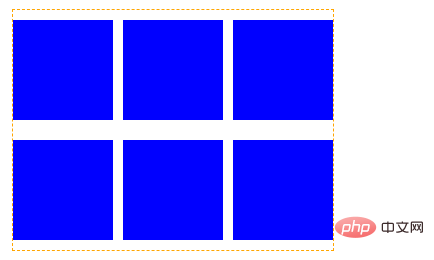
A list of floating child elements with right margin

What was your first thought when you saw this effect? Could it be that margin-right is set for the child elements, and nth-child(3n) is set to 0 during traversal? Let’s see how we can handle it using the above knowledge.
We did not set nth-child( 3n) has 0 margins, but uses negative margins to make the parent element "larger".
Isn’t negative margin very interesting? Teenagers who don’t know much about it should learn it!
For more programming-related knowledge, please visit:Programming Learning! !
The above is the detailed content of Practical tips for CSS layout: negative margin values. For more information, please follow other related articles on the PHP Chinese website!