
(Recommended tutorial:CSS tutorial)
background-image is probably for all of us (front-end developers) One of the CSS properties that we all use at least a few times in our careers. Most people think there is nothing unusual about background images, but after research, the answer is not.
So this article collects 7 of the tips that I find most useful and creates some code examples where you can see what's going on.
Let’s start with something more technical than just a trick. How many times have you had to fight with your background image to make it fit perfectly without feeling stretched and attractive?
Here's show you how to make your background image always fit perfectly in your browser window!
css
body { background-image: url('https://images.unsplash.com/photo-1573480813647-552e9b7b5394?ixlib=rb-1.2.1&ixid=eyJhcHBfaWQiOjEyMDd9&auto=format&fit=crop&w=2253&q=80'); background-repeat: no-repeat; background-position: center; background-attachment: fixed; background-size: cover; -webkit-background-size: cover; -moz-background-size: cover; -o-background-size: cover; }
Case source code: https://codepen.io/duomly/pen/xxwYBOE
Well, what if I want to add more than one image to the background? ?
It is possible and not very difficult, but when you have the idea of blending two shapes into something beautiful, you can get a nice result.
It is very useful when we want to add a pattern on top of a background image, so will show you that in this example.

Multiple background paths can be specified directly in CSS3, as shown below:
body { background-image: url(https://image.flaticon.com/icons/svg/748/748122.svg), url(https://images.unsplash.com/photo-1478719059408-592965723cbc?ixlib=rb-1.2.1&auto=format&fit=crop&w=2212&q=80); background-position: center, top; background-repeat: repeat, no-repeat; background-size: contain, cover; }
Case source code: https://codepen.io/ duomly/pen/eYpVoJR
Another cool CSS background image trick is the triangle background picture. It creates very beautiful effects, especially when we want to show some completely different options (such as day and night or winter and summer).
The idea is this, first create twodiv, then add both backgrounds to them, and then, useclip for the seconddiv-pathattribute draws a triangle.

html
css
body { margin: 0; padding: 0; } div { position: absolute; height: 100vh; width: 100vw; } .day { background-image: url("https://images.unsplash.com/photo-1477959858617-67f85cf4f1df?ixlib=rb-1.2.1&ixid=eyJhcHBfaWQiOjEyMDd9&auto=format&fit=crop&w=2613&q=80"); background-size: cover; background-repeat: no-repeat; } .night { background-image: url("https://images.unsplash.com/photo-1493540447904-49763eecf55f?ixlib=rb-1.2.1&ixid=eyJhcHBfaWQiOjEyMDd9&auto=format&fit=crop&w=2250&q=80"); background-size: cover; background-repeat: no-repeat; clip-path: polygon(100vw 0, 0% 0vh, 100vw 100vh); }
Case source code: https ://codepen.io/duomly/pen/RwWQmwW
Sometimes we I want to add some text to the background, but some pictures are too bright and the words cannot be seen clearly, so here we need to overlay some dark music on the background image to highlight the text effect.
For example, you can enhance a sunset image by adding a pink-orange gradient or a red-to-transparent gradient. These situations are easy to do using overlay gradients.

Let’s see how to easily add a gradient overlay to a background image!
css
body { background-image: linear-gradient(4deg, rgba(38,8,31,0.75) 30%, rgba(213,49,127,0.3) 45%, rgba(232,120,12,0.3) 100%), url("https://images.unsplash.com/photo-1503803548695-c2a7b4a5b875?ixlib=rb-1.2.1&auto=format&fit=crop&w=2250&q=80"); background-size: cover; background-repeat: no-repeat; background-attachment: fixed; background-position: center }
Case source code: https://codepen.io/duomly/pen/rNOJgQE
What if you could decide which color to use as an overlay for the background image? Then animation on the background image is very useful of.
Using an animated overlay can give your website a great final effect and of course, people will remember it.
Let's see what you can do with background images and animations in CSS!

css
@keyframes background-overlay-animation { 0% { background-image: linear-gradient(4deg, rgba(255,78,36,0.3) 50%, rgba(255,78,36,0.3) 100%), url("https://images.unsplash.com/photo-1559310589-2673bfe16970?ixlib=rb-1.2.1&ixid=eyJhcHBfaWQiOjEyMDd9&auto=format&fit=crop&w=2250&q=80"); } 25% { background-image: linear-gradient(4deg, rgba(213,49,127,0.3) 50%, rgba(213,49,127,0.3) 100%), url("https://images.unsplash.com/photo-1559310589-2673bfe16970?ixlib=rb-1.2.1&ixid=eyJhcHBfaWQiOjEyMDd9&auto=format&fit=crop&w=2250&q=80"); } 50% { background-image: linear-gradient(4deg, rgba(36,182,255,0.3) 50%, rgba(36,182,255,1) 100%), url("https://images.unsplash.com/photo-1559310589-2673bfe16970?ixlib=rb-1.2.1&ixid=eyJhcHBfaWQiOjEyMDd9&auto=format&fit=crop&w=2250&q=80"); } 100% { background-image: linear-gradient(4deg, rgba(0,255,254,0.3) 50%, rgba(0,255,254,0.3) 100%), url("https://images.unsplash.com/photo-1559310589-2673bfe16970?ixlib=rb-1.2.1&ixid=eyJhcHBfaWQiOjEyMDd9&auto=format&fit=crop&w=2250&q=80"); } } @-webkit-keyframes background-overlay-animation { 0% { background-image: linear-gradient(4deg, rgba(255,78,36,0.3) 50%, rgba(255,78,36,0.3) 100%) url("https://images.unsplash.com/photo-1559310589-2673bfe16970?ixlib=rb-1.2.1&ixid=eyJhcHBfaWQiOjEyMDd9&auto=format&fit=crop&w=2250&q=80"); } 25% { background-image: linear-gradient(4deg, rgba(213,49,127,0.3) 50%, rgba(213,49,127,0.3) 100%), url("https://images.unsplash.com/photo-1559310589-2673bfe16970?ixlib=rb-1.2.1&ixid=eyJhcHBfaWQiOjEyMDd9&auto=format&fit=crop&w=2250&q=80"); } 50% { background-image: linear-gradient(4deg, rgba(36,182,255,0.3) 50%, rgba(36,182,255,1) 100%), url("https://images.unsplash.com/photo-1559310589-2673bfe16970?ixlib=rb-1.2.1&ixid=eyJhcHBfaWQiOjEyMDd9&auto=format&fit=crop&w=2250&q=80"); } 100% { background-image: linear-gradient(4deg, rgba(0,255,254,0.3) 50%, rgba(0,255,254,0.3) 100%), url("https://images.unsplash.com/photo-1559310589-2673bfe16970?ixlib=rb-1.2.1&ixid=eyJhcHBfaWQiOjEyMDd9&auto=format&fit=crop&w=2250&q=80"); } } body { background-image: url("https://images.unsplash.com/photo-1559310589-2673bfe16970?ixlib=rb-1.2.1&ixid=eyJhcHBfaWQiOjEyMDd9&auto=format&fit=crop&w=2250&q=80"); background-size: cover; background-repeat: no-repeat; background-attachment: fixed; background-position: center; animation-name: background-overlay-animation; animation-duration: 5s; animation-iteration-count: infinite; animation-direction: alternate; animation-timing-function: linear; }
Case source code: https://codepen.io/duomly/pen/gOavNOv
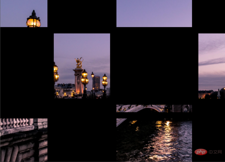
Sometimes we encounter some projects that require art or photography. They generally require The website must have artistic information and be creative. The network background is quite creative, and the effect is as follows:

HTML
scss
body { margin: 0; padding: 0; } .container { position: absolute; width: 100%; height: 100%; background: black; display: grid; grid-template-columns: 25fr 30fr 40fr 15fr; grid-template-rows: 20fr 45fr 5fr 30fr; grid-gap: 20px; .item_img { background-image: url('https://images.unsplash.com/photo-1499856871958-5b9627545d1a?ixlib=rb-1.2.1&ixid=eyJhcHBfaWQiOjEyMDd9&auto=format&fit=crop&w=2207&q=80'); background-repeat: no-repeat; background-position: center; background-attachment: fixed; background-size: cover; } }
Case source code: https://codepen.io/duomly/pen/MWaQNWb
使用background-image与background-clip,可以实现背景图像对文字的优美效果。 在某些情况下,它可能非常有用,尤其是当我们想创建一个较大的文本标题而又不如普通颜色那么枯燥的情况。
HTML
Hello world!
CSS
body { display: flex; align-items: center; justify-content: center; flex-direction: column; width: 100%; text-align: center; min-height: 100vh; font-size: 120px; font-family:Arial, Helvetica, sans-serif; } h1 { background-image: url("https://images.unsplash.com/photo-1462275646964-a0e3386b89fa?ixlib=rb-1.2.1&ixid=eyJhcHBfaWQiOjEyMDd9&auto=format&fit=crop&w=2600&q=80"); background-clip: text; -webkit-background-clip: text; color: transparent; }
事例源码:https://codepen.io/duomly/pen/wvKyVjG
英文原文地址:https://dev.to/duomly/discover-7-amazing-tips-and-tricks-about-the-css-background-image-39b0
作者:ryanmcdermott
更多编程相关知识,请访问:编程入门!!
The above is the detailed content of 7 practical CSS background-image tips. For more information, please follow other related articles on the PHP Chinese website!


