1. Master the implementation method of linear-gradient in CSS3
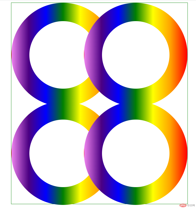
Required to achieve the following effects, use pure DIV CSS , you must use the knowledge point linear-gradient, and display it in the center

Additional notes:
1. The size of a colored ring is 400px *400px, the size of the blank ring inside is 260px*260px
2, the left movement distance between the right ring and the left ring is 120px
3, the distance between the lower ring and the upper ring is The moving distance is 20px
1. The outermost layer is a div with a green border, which is wrapped with 4 rings
2. The div is divided into upper and lower parts. Both parts are actually the same. As long as the upper part is implemented, the lower part can actually be copied, but the margin-top needs to be changed.
3. Each ring is actually It’s the same, but the position is different, so as long as one gradient ring is implemented, all other rings can copy the first ring
Now let’s do the specific operation
1 . Create index.html and write the architecture
Architectural ideas:
1. The outer container is called the .container container, which is divided into two parts: .top and .bottom. Each part contains two ring divs.
The two parallel div rings must be arranged horizontally, so they must be float. Since it is float, a .clear needs to be added at the end of the container. div, clear the float, so that the container can still wrap the two float rings div
2. Each ring is actually composed of two parts, an outer colored ring and an inner one The small white ring
According to the analysis, the following architecture code is obtained
<!DOCTYPE html>
<html lang="en">
<head>
    <meta charset="UTF-8">
    <meta name="viewport" content="width=device-width, initial-scale=1.0">
    <title>渐变圆环</title>

</head>
<body>
    <div class="container">
        <div class="top">
             <!-- 第一个圆环 -->
            <div class="colorcircle circle1">
                <div class="smallcircle">
                </div>
            </div>
            <!-- 第二个圆环 -->
            <div class="colorcircle circle2">
                <div class="smallcircle">
                </div>
            </div>
            <div class="clear"> </div>
        </div>
        <div class="bottom">
            <!-- 第一个圆环 -->
           <div class="colorcircle circle1">
               <div class="smallcircle">
               </div>
           </div>
           <!-- 第二个圆环 -->
           <div class="colorcircle circle2">
               <div class="smallcircle">
               </div>
           </div>
           <div class="clear"> </div>
       </div>
    </div>
</body>
</html>2. Next, write the style
1. Create the css file folder to facilitate the management of all css files. Create index.css. How to write the styles in it? The ideas are as follows:
1. .container *
Idea analysis
1 . In order to set the common styles of all elements in the container, we can write these common codes into the .container * style
So add the following code to index.css:
.container *{
    padding:0;
    margin: 0;
}2. Outside Layer color circle.colorcircle
Idea Analysis
1. According to the requirements, width: 400px, height: 400px, because it is circular, so the border fillet needs to be set to 400px, that is border-radius: 400px;,
2. Because the background is seven colors, a line gradient is needed, and the color gradient from left to right is red, orange, yellow, green, blue, blue, and purple, so it is converted into code That is, background-image:linear-gradient(to left, red, orange,yellow,green,blue,indigo,violet);
3. Then when rounded corners are used, border needs to be set, otherwise it will not take effect. But its border is transparent, so the code is border:1px solid transparent;
4. In order to ensure that the rings are arranged in parallel, it needs to be float:left
According to analysis, Continue to add the following code to index.css:
.colorcircle{
    width:400px;
    height:400px;
    border-radius: 400px;
    background-image:linear-gradient(to left, red, orange,yellow,green,blue,indigo,violet);
    border:1px solid transparent;
    float: left;
}3. Small white circle inside the ring.smallcircle
Idea analysis:
1. Obtained according to requirements , width: 260px, height: 260px, because it is circular, so you need to set the border rounded corners to 260px, that is, border-radius: 260px;, background-color: white;
Because it needs to be centered, so Its left spacing and top spacing are 70px=(400-260)/2
2. Then rounded corners are used, and the border needs to be set, otherwise it will not take effect, but its border is transparent, so the conversion The code is border: 1px solid transparent;
Continue to add the code in index.css as follows:
.smallcircle{
    width: 260px;
    height: 260px;
    border-radius: 260px;
    background-color: white;
    margin:70px auto;
    border:1px solid transparent;
}4..clear style
Idea analysis:
1. Floats need to be cleared, so float:none, clear:both
2. There is no content in this div. In order not to affect the layout, width and height need to be set to 0
Continue to add the following code to index.css:
.clear{
    clear: both;
    float: none;
    width: 0;
    height: 0;
}5. Right circle.circle2
Idea analysis:
1. According to the requirements, move left The amount is 120px, so margin-left:-120px
Continue to add the code in index.css as follows:
.circle2{
    margin-left:-120px;
}6. The following part.bottom
Idea analysis:
1. According to the requirements, the upward movement is 20px, so margin-top:-20px
Continue to add the following code to index.css:
.bottom{
    margin-top:-20px;
}7. The outermost Layer.container
Idea Analysis
1. Because the whole thing needs to be centered, it is converted into code: margin:0 auto; because it is a green border, border:1px solid green;
2. The default width of div is 100%. In order to center it, you need to set the width, width=684px (400 400 4 [ring 4 borders] -120), height = 784 (400 400 4 [ring 4] border】-20)
Continue to add the following code to index.css:
.container{
    border:1px solid green;
    width:684px;
    margin:0 auto;
    height: 784px;
}So far, all the contents of index.css are as follows:
.container *{
    padding:0;
    margin: 0;
}

.colorcircle{
    width:400px;
    height:400px;
    border-radius: 400px;
    background-image:linear-gradient(to left, red, orange,yellow,green,blue,indigo,violet);

    border:1px solid transparent;
    float: left;
}
.smallcircle{
    width: 260px;
    height: 260px;

    border-radius: 260px;
    background-color: white;
    margin:70px auto;
    border:1px solid transparent;
}
.clear{
    clear: both;
    float: none;
    width: 0;
    height: 0;
}
.circle2{
    margin-left:-120px;
}


.bottom{
    margin-top:-20px;
}
.container{
    border:1px solid green;
    width:684px;
    margin:0 auto;
    height: 784px;
}Then index. css is introduced into index.html
<!DOCTYPE html>
<html lang="en">
<head>
    <meta charset="UTF-8">
    <meta name="viewport" content="width=device-width, initial-scale=1.0">
    <title>渐变圆环</title>
    <link rel="stylesheet" href="css/index.css" />
</head>
<body>
    <div class="container">
        <div class="top">
             <!-- 第一个圆环 -->
            <div class="colorcircle circle1">
                <div class="smallcircle">
                </div>
            </div>
            <!-- 第二个圆环 -->
            <div class="colorcircle circle2">
                <div class="smallcircle">
                </div>
            </div>
            <div class="clear"> </div>
        </div>
        <div class="bottom">
            <!-- 第一个圆环 -->
           <div class="colorcircle circle1">
               <div class="smallcircle">
               </div>
           </div>
           <!-- 第二个圆环 -->
           <div class="colorcircle circle2">
               <div class="smallcircle">
               </div>
           </div>
           <div class="clear"> </div>
       </div>
    </div>
</body>
</html> and the running results are as follows:

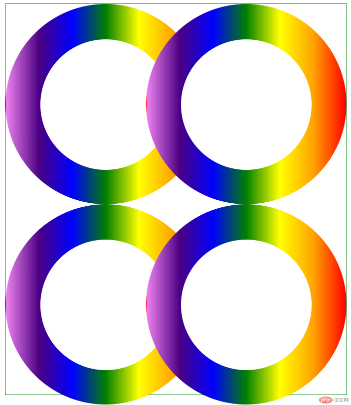
发现下面部分.bottom的margin-top好像失效了,其实如果我们将.bottom的border设置成红色,可以看出,其实也是上移了20px,但是因为里面圆环是float的,且默认的postion为relative,所以圆环是无法再上移的,怎么办呢?这里提供两种解决方案:
1、我们将.bottom的postion设置为absoute
index.css中.bottom代码修改如下:
.bottom{
    margin-top:-20px;
    position: absolute;
}我们再来运行效果:

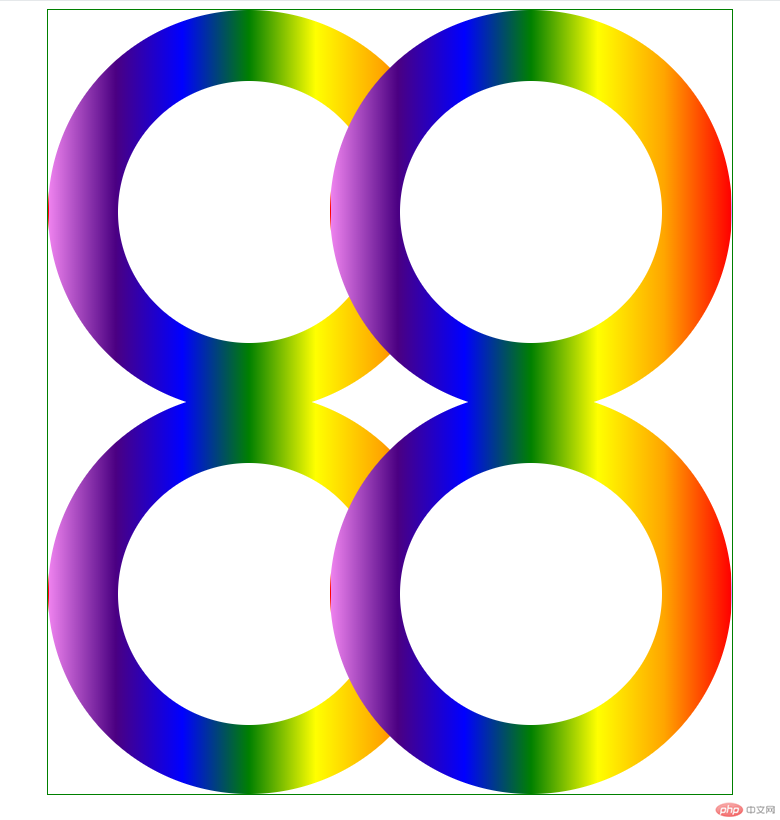
我们发现效果实现了
还有一种方法就是
2、通过让.top,.bottom上下两个div都float:left,也可以解决,只不过这样在.container的最后需要添加.clear 块
index.html代码修改如下:
<!DOCTYPE html>
<html lang="en">
<head>
    <meta charset="UTF-8">
    <meta name="viewport" content="width=device-width, initial-scale=1.0">
    <title>渐变圆环</title>
    <link rel="stylesheet" href="css/index.css" />
</head>
<body>
    <div class="container">
        <div class="top">
             <!-- 第一个圆环 -->
            <div class="colorcircle circle1">
                <div class="smallcircle">
                </div>
            </div>
            <!-- 第二个圆环 -->
            <div class="colorcircle circle2">
                <div class="smallcircle">
                </div>
            </div>
            <div class="clear"> </div>
        </div>
        <div class="bottom">
            <!-- 第一个圆环 -->
           <div class="colorcircle circle1">
               <div class="smallcircle">
               </div>
           </div>
           <!-- 第二个圆环 -->
           <div class="colorcircle circle2">
               <div class="smallcircle">
               </div>
           </div>
           <div class="clear"> </div>
       </div>
       <!--如果.top,.bottom都float了,需要加上此行-->
       <div class="clear"> </div>
    </div>
</body>
</html>index.css代码如下:
.container *{
    padding:0;
    margin: 0;
}

.colorcircle{
    width:400px;
    height:400px;
    border-radius: 400px;
    background-image:linear-gradient(to left, red, orange,yellow,green,blue,indigo,violet);

    border:1px solid transparent;
    float: left;
}
.smallcircle{
    width: 260px;
    height: 260px;

    border-radius: 260px;
    background-color: white;
    margin:70px auto;
    border:1px solid transparent;
}
.clear{
    clear: both;
    float: none;
    width: 0;
    height: 0;
}
.circle2{
    margin-left:-120px;
}

/* 解决上移问题 */
.bottom{
    margin-top:-20px;
    float: left;
}
.top{
    float: left;
}
/* end */
.container{
    border:1px solid green;
    width:684px;
    margin:0 auto;
    height: 784px;
}运行结果为:

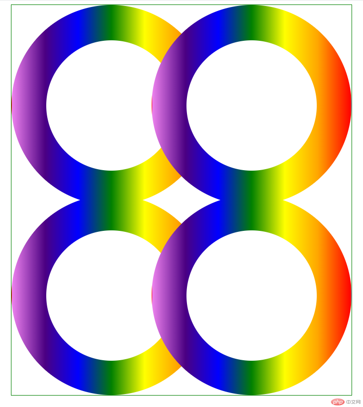
效果还是一样的
到此为止,我们就实现了全部的需求
1、学习了CSS3中线线渐变的语法如
linear-gradient(to left, red, orange,yellow,green,blue,indigo,violet);
其中方向left也可以是right,后面的颜色,可以2个或者3个都可以自定义
希望本文能给大家带来一定的帮助,谢谢!!!
The above is the detailed content of CSS3 linear gradient realizes 4 connected rings (code example). For more information, please follow other related articles on the PHP Chinese website!